Final Cut Pro and Gigantic Frames

Recently, one of our producers needed to cut a 20+ minute planetarium show down to a 3 minute trailer. So he needed a way to edit an image sequence comprised of extremely large, non-standard frames. We decided to use Final Cut Pro for the editing software, but Final Cut is decidedly not built for working far beyond the confines of its presets. Nevertheless, it is a flexible enough tool to get the job done, with a little effort and a fast computer. Here's a blow-by-blow of what we did.

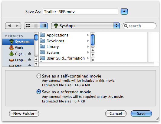
  1. Make Reference Movies of Frames The first step in the process was to make reference movies of the near-30,000 or so frames. Nothing about this entire process was straightforward, and this first step was certainly no exception. Attempting to import the entire range of frames invariably crashed Quicktime. But we were able to work with a subset of frames. So we ended up breaking the frames into folders of 5000. Of course, trying to move that many large files in the Finder would overwhelm the GUI, causing it to hang for vast stretches of time, so we moved the files via the command-line. This went exceedingly quickly. The Finder still really needs some help handling large groups of files apparently. But in the end, thanks to Mac OS X's UNIX core, we had six folders full of images, and each folder was opened as an image sequence in Quicktime, then saved as a reference movie.

    Quicktime: Create a Reference Movie

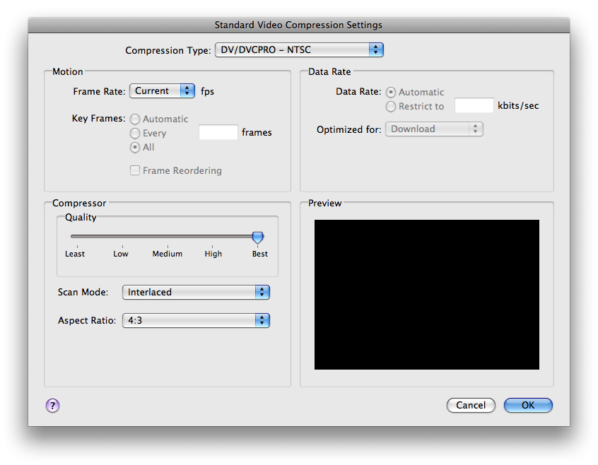
  2. Make DV-NTSC Movies from Reference Movies Since we were going to be editing this material, we wanted to get it into a good, edit-friendly CODEC. We chose DV-NTSC since it looks pretty good and is really easy to work with in Final Cut. Making our DV-NTSC movies actually went pretty well. Quicktime has done better at keeping current with the latest hardware capabilities than has the Finder. And, once we'd broken our image sequence down a bit, Quicktime made relatively short work of exporting them to DV-NTSC. And, blessedly, Quicktime was able to load and export multiple movies at once and take full advantage of our eight cores to process them.

    Quicktime: DV Movie Export

  3. Import and Edit at DV-NTSC Quality Well, okay... This was the easy part... In fact, making this easy was the whole point of all those other steps.
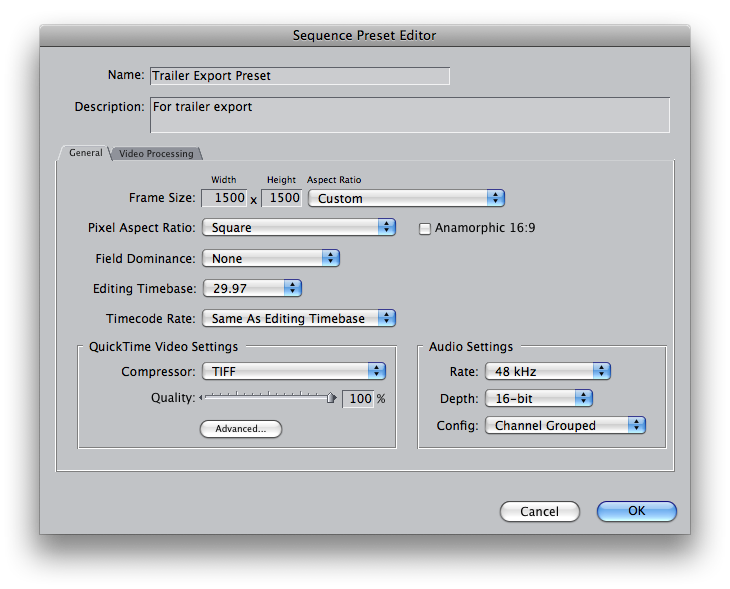
  4. Create Custom Sequence Settings DV-NTSC was nowhere near the resolution we needed for our final product. We just bumped down to it in order to make editing more feasible. Eventually we wanted to output this puppy back out to gigantic frames once the editing was done, so we needed a custom sequence preset that matched the properties of said frames. Later we'd use this preset to create our final, high-res output.

    Final Cut Pro: Custom Sequence

  5. Create Offline Project with Custom Settings Final Cut has a nifty feature called Media Manager, which allows you to consolidate your media and get rid of unused clips in order to reclaim disk space. It also can be used to conform from an offline — or low quality — version of your project to an online — or high quality version. Which is what we did. In Final Cut, we went to the Media Manager (under the "File" menu) and chose "Create offline" in the pulldown in the Media section where it says "media referenced by duplicated items."

    Final Cut Pro: Creating an Offline Project

  6. Reconnect Media to High-Res Source Once we had our offline project, we needed to re-associate our DV-NTSC clips with the original, full-quality media, i.e. our reference movies. This was fairly easy to do: simply right-click the media and choose "Make Offline..." from the menu. Then right-click the movies again and choose "Reconnect Media..."

    Final Cut Pro: Reconnect Media

    When prompted for the clips, we chose "Locate," and then selected our high-quality material. Be sure to uncheck "Matched Name and Reel Only" when selecting the high-res clip.

  7. Export Back Out to Frames with Compressor Once the movies were reconnected to the original source material, we needed to output back out to the original source type, which in our case was a TIFF sequence. There are a few ways to do this, but we had the best luck (i.e., the fewest crashes and slowdowns) sending the job right from Final Cut to — believe it or not — Compressor. This is certainly the first time in my storied history that I can say Compressor was the right tool for the job, but indeed it was. It knocked it out of the park. We, of course, had to set up a preset in Compressor that exported TIFF frames and apply that to our job. But once that was done, Compressor did it's thing and did it well.

In the end, what we got was a virtually lossless edit of our show. Because we used the original TIFF frames to render out our final trailer cut, and because Final Cut and Compressor shouldn't need to recompress those frames unless they've been altered somehow (which they only were in spots where effects or transitions occurred), our final output looks just as good as the original, even though we edited in the edit-friendly DV-NTSC CODEC. Which is exactly what we were going for.

There were a lot of hiccups along the way. One thing we noticed is that Final Cut does not take advantage of multiple processors, though, blessedly, Quicktime and Compressor now both do. Also, the Finder is still pretty damned abominable when it comes to dealing with a very large number of large files, which is a real shame since it's main job is file management. Quicktime, too, had some performnace issues with the large number of files. These things certainly slowed us down a bit. But, with some ingenuity and tenacity we were able to accomplish a pretty difficult task in a relatively short time. It was pretty cool, and now, if something like this ever comes up again, I'll have a process for it.

I want to say, too, that this is just the sort of challenge SysAdmins look for. Or at least SysAdmins like me. It's projects like this that make me happy I am where I am in my job and my career.

ScreenFlow and Opacity Redux

I recently wrote some criticism of a couple very promising new applications: ScreenFlow and Opacity. Both these apps came out at roughly the same time, and each was of particular interest to me. Each also had some pretty glaring bugs.

One of the great things about being a member of the Mac Community is that it actually is a community. Loosely, It's a group of people with similar interests and ideas about the computing experience. And Mac software developers — perhaps more than anyone — feel keenly this bond. At least the good ones do.

So, in true Mac Community fashion, shortly after my initial reviews (like, the next day) I got comments from the developers of ScreenFlow and Opacity. And those comments basically said, "Hey, I addressed the bugs you mentioned, and have released an update to my software. Check it out!"

I have checked it out. And it is good.

Unfortunately, I don't have time to do a complete review of these products. And I'm sure that someone more qualified will beat me to it in any case. But I did want to mention a few things about each.

ScreenFlow
ScreenFlow is a revolutionary approach to screen capturing and screen-based presentation. It is a complete environment for creating computer-screen-based presentations, in fact, letting you capture both your computer screen, its audio, and the video and audio from an external camera all at the same time. ScreenFlow then drops you into a very elegant editing mode that allows you to do all sorts of tricks specifically designed for screencasts (the Callout Actions are particularly nice).

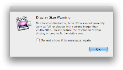
I had a few problems with the 1.0 version, but I'm happy to report that the latest update, v. 1.0.1, fixes them all. I've been playing around with it a lot, and I can't say I've really had any problems at all, at least on my home machine. My work machine sports a 30" monitor, however, and ScreenFlow has problems with its native resolutions. The good news is, it says so:


ScreenFlow Alert: Better Late than Never
(click image for larger view)

The bad news is that this alert comes up after you've captured your too-big screen. Still, it's absolutely crucial information, and this alert is better than the nothing we had in version 1.0. I'll take it.

Otherwise, ScreenFlow has been a complete joy to use, and I do anticipate buying it for our lab at some point, probably in the summer. I've even showed it to my boss, who was duly impressed.

If you're looking for such a beast, ScreenFlow makes all the others I've tried pale in comparison.

Opacity
Opacity is a graphics app dedicated to creating, editing and outputting screen graphics — for the web, applications or desktop icons. As an occasional icon creator I can tell you, something like this has been a long time coming. In the past I've used a combination of Illustrator, Photoshop and the IconBuilder plug-in for Photoshop to create icons. Opacity costs only slightly more than IconBuilder, and it doesn't require Photoshop. In fact, it doesn't require anything. It, like ScreenFlow, is a dedicated environment for doing one thing. Unified, task-based apps like this are all the rage right now, and I for one think it's great.


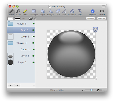
Opacity Interface: Simple and Specific
(click image for larger view)

Opacity is more personally interesting to me than it is something we'd need for the lab. It's also something I need more time to explore. ScreenFlow is almost instantly intelligible. But Opacity will require a bit more investigation on my part before I decide whether or not I need it. Since many of my icons are hand drawn with a Wacom, I'll need to investigate the level to which this will be possible in Opacity.

But there are two things I want to point out about Opacity. One, I like the idea of it very much, and I think it's actually fairly novel on the Mac. I'm sure professional icon designers are loving that this exists and that it might actually turn out to be good. Two, it seems to be a very well-though out application. I think icon design is actually a much more complex task than screencast recording. But Opacity strikes a really good balance between the complexity of the task and a clean, elegant UI. It might not be right for me in the end, but if you design computer graphics of any kind, you should certainly take Opacity for a spin.

Oh, and one other thing about Opacity I'd like to mention: Its latest version (1.0.1) resolves every issue I mentioned in my initial article.

So, my thanks to the creators of these fine applications. Not only have they made what look like a couple of really neat apps, but they've handled initial criticism with the aplomb worthy of a Mac Developer.

Great work, guys!

UPDATE:
Testing of Opacity continues, and not without issue. The program is a good deal more solid than it was in version 1.0, but, for the record, attempting to import very large Illustrator documents causes the "Out of memory" alert to rear its ugly head once again. This alert will cause the application to quit. And, unfortunately, the default behavior of Opacity is to open the previous document on launch. If that document happens to be a large Illustrator file that causes the alert and subsequent quit of the program, you will be unable to successfully launch Opacity without moving the offending file. Bummer.

Also of note, Opacity is not currently pressure-sensitive when used with a Wacom tablet, which may be a bit of a problem for some — myself included — though perhaps not a deal-breaker. I'm certainly not averse to creating line-art in pressure-sensitive programs (like Illustrator) and importing them into an app like Opacity if it beats my previous workflow. But obviously this won't work if the Illustrator file essentially kills Opacity.

In any case, like I said, this is all for the record. I still feel Opacity has great potential. That's why I'm testing it so rigorously.

ScreenFlow

Holy poo! ScreenFlow is one of the nicest, most polished, yet useful applications I've seen a really long time.

On the surface, Vara Software's ScreenFlow appears to be just another in a series of applications designed to capture your computer screen to a Quicktime movie as you work. Typically such captures are then used for demonstration purposes for new products, or workflows, or videocasts, or what-have-you. But ScreenFlow is much more than just another screen capturing app. ScreenFlow is really an entire environment for creating and finishing computer demonstration videos.

And it's gorgeous!

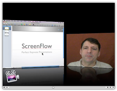
The most obvious thing that sets ScreenFlow apart from its competitors is the fact that, along with the computer screen, it can capture iSight (or DV camera) video and audio at the same time. By default it sticks this video in a reduced-size window in the lower right hand corner, though, as you'll discover, this can easily be changed. That's because ScreenFlow, in addition to being a screen capturing application is also a presentation editor.


ScreenFlow: Capture Screen and Camera
(click image for larger view)

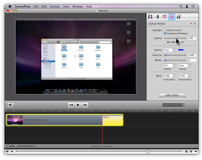
Once you've captured your computer screen actions and your iSight video, ScreenFlow presents you with an editing interface. Here you can perform all sorts of actions, including zooms, pans and something called "Callout Actions," which allow you to highlight specific windows as well as the mouse cursor. Vara has a nice demo of this feature (in a video, of course, which by the way, is where I pulled these screen shots from) on their site. But the application is so smart and well thought out, that if you've ever used a screencast app, you'll find the learning curve incredibly gentle.


ScreenFlow: Edit Your Presentation
(click image for larger view)

I do want to point out that this is a 1.0 release, and I have experienced numerous bugs. On my work computer (a Quad Intel box with copious amounts of RAM), the application completely crashes my machine. Force quit will not rectify the crash; a hard reboot is required. On my home system (an 8-core Intel with 2 GBs of RAM) ScreenFlow functions well enough, but there are still problems. The iSight registers video and audio in the setup screen, but no audio gets captured for some reason. Also, when exporting my final product to DV-NTSC, I was presented with a set of options, one of which was "Letterbox Content." Though I checked it, ScreenFlow did not honor the "Letterbox Content" option, and my movie came out squished. In fact, I exported the same movie without the box checked and there was no difference between the two movies. Clearly this function is broken. Clearly, ScreenFlow has some kinks to work out.

Still, once the problems are solved — and I sincerely hope that happens soon — ScreenFlow is poised to be the application of choice for regular producers of screen-based videos. And beyond. I admit, I don't do a lot of screen-based capturing, but I'm starting to wonder if the reason is because there haven't been any great apps out there for doing it. ScreenFlow is one of those apps that gives you ideas. It instantly makes you want to use it and then you start thinking of ways to do so. Being in education, this has been pretty easy for me to do. Something tells me I'll be buying and using ScreenFlow in the very near future.

UPDATE:
Version 1.0.1 has just been released, and it seems to fix at least some of the problems mentioned above, in particular the iSight audio problem. Expect a re-review sometime in the near future.

Apple, Wonka, Steve and Willy

At this point I'm surprised no one's ever made more of the analogy, but a quick (very quick) Google search reveals few comparisons to Apple and the mythological Chocolate Factory of Willy Wonka fame. And yet, the similarities are striking: a large, secretive, highly prestigious company that produces the best, most innovative products almost as if by magic, and that is heralded by an eccentric but extremely charismatic leader. In fact, substitute computers for candy and you'd be hard pressed to tell the companies apart. You start to wonder if, perhaps, Jobs was, himself, a big fan of the 1971 Mel Stuart masterpiece in his youth.

Today's presentation is exactly the kind of thing I'm talking about. A big, huge media event, shrouded in mystery and hyped so expertly that candy lovers can barely contain their excitement. What will today's announcements bring? The Apple-faithful crowd around the virtual castle doors for the answer to that question.

The first thing on today's agenda was new iPods. Is there a more candy-like Apple product? I think not. Why, the shuffle was once even compared to a pack of gum, though the new model is now too tiny for such a comparison. And now we have colors — candy colors you might say — for the nano. Again. Whoopee. But I know a lot of people will be thrilled — literally thrilled — about this update.

The iTunes application itself is also apparently getting a facelift, both visually — in the form of multiple views, including a cool-sounding cover art view — and functionally — in the form of synchronization between computers. Can I just say? Finally! This has been the major reason I've never used an iPod. I may just have to start. Video in iTunes is now apparently higher resolution, which would seem to compliment the new iPod's brighter screen. And the "One more thing..."

Which would be, of course, movies. Movies are now available for purchase and download from the iTunes store in the new iTunes 7. Currently, Disney, Pixar, Touchstone and Miramax are the only studios offering movies on the iTunes store, but I'm sure more will follow. The image is purported to be "near-DVD quality" and audio is Dolby Surround Sound. Nice. Movies are priced in the $9.99-$14.99 range, which ain't bad.

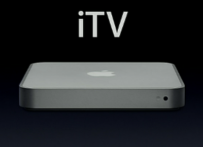
Perhaps not as Wonka-esqe as one might have hoped, but still, I'd say these are some pretty exciting and even significant advances for Apple's push in the consumer electronics and entertainment market. It's a gradual push that seems to come incrementally — probably never as fast as anyone would like — but Apple is great at this stuff, and they only seem to be getting better. And today is another baby step in the right direction. I'm still looking forward to things like an Apple-crafted cell phone. Or a media center — which, it now looks like, is in the works for release in the first quarter of 2007, and which would be about half the height of the Mac mini (wow!) and feature "wireless component video" over 802.11, optical audio and HDMI ports, and analog RCA audio ports, and which will work with Mac or PC, according to a very rare sneak peek at today's event. Now that's pretty exciting.


Codename: "iTV": Apple's Sneak Peek at Their Upcoming Media Center Hardware
(click image for larger view)

So yeah, I'm still looking forward. But if there's anything that Apple makes me do better than any company out there, it's just that: look forward. And that really is half the fun.

Now let's let those Oompa-Loompas get back to work, shall we?

UPDATE:
I just got done watching the stream, and today's event was, really, one of the most impressive presentations from Apple I've seen in a while. Not only were there a plethora of exciting and significant product updates, but we got a rare glimpse into a product that's still under development, and that looks quite ingenious. I wanted to quickly share some additional observations on what I saw in the broadcast, particularly with regards to iTunes 7 and "iTV".

On iTunes 7:
Some quick thoughts on what is probably the most important development in Apple's media — nee music — manager.

  • This is a significant overhaul of the iTunes application, but still — in true Apple fashion — appears to leave all the things that make iTunes such a great media player and manager.
  • Both album view and cover flow are wonderful implementations of a concept that's been brewing for sometime – the visual searching of media. Such a basic idea, and just the kind of thing that has made Apple synonymous with ease-of-use. And it's beautiful, of course.
  • iTunes 7 allows any user with an iTunes account to get free album art, even for albums not purchased via the store. This is great news for folks like me, who tend not to buy via the iTunes store, and it's great for the Apple/iTunes/iPod brand. One more reason to go with Apple products, even if you don't use the store.
  • The "Music" has been stripped from the iTunes Music Store. It's now just the iTunes Store. One wonders if they'll somehow figure out a way to get rid of the "Tunes" in iTunes without mangling the brand. Can you say MacBook?
  • Video purchased from the iTunes Store is now at a resolution of 640x480, which I realize I mentioned before, but I feel that's quite a significant improvement. And probably necessary to convince folks to fork over $10-15 bucks for movies.
  • iPod synchronization and management looks much, much smarter and includes sync-management and software/hardware management. Nice! It's good to see that Apple doesn't let their significant market lead in this area keep them from adding great new management features. As long as they keep up like this, they'll remain on top.
  • iPod Auto-Sync also looks immensely cool. I only hope it works for tracks ripped from CD as well as those purchased from the iTunes Store.

On "iTV":
Thoughts on the newest Apple non-computer electronic device. Possibly the most exciting thing since the iPod.

  • This looks like another great implementation of a really interesting idea.
  • I was surprised that they chose to go with a connector box that ties your computer in to your TV, rather than a separate box, but after the presentation, I really think that's the way to go: integrating existing components, tying it all together. Brilliant!
iTV Concept: This Graphic Says it All
(click image for larger view)

  • It also looks like it should be fairly easy to set up.
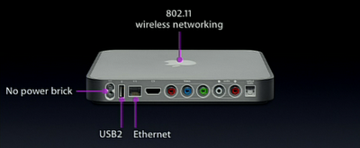
  • Video trailers are streamed live off the internet, thanks to 802.11 wireless connections on the box. Neat-O!

"iTV" Data Ports
(click image for larger view)

  • And sent to the TV via a variety of video port options.

"iTV" Video Ports
(click image for larger view)

  • It begs the question, though: Is this a cable killer? Or will the reverse happen?
  • But for $299, it'll be hard not to get one.

"iTV": A Bargain at $299
(click image for larger view)

On Steve Jobs:
A couple quick final thoughts on the man himself.

  • Mr. Jobs looks healthy again, at least compared to how he looked in the Developer's Keynote. His presentation was as riveting as ever. Nice to see.
  • Jobs thanked quite a few people, including his software, hardware and development teams, and, of all things, artists. Also nice to see.
  • Jobs, at one point in the presentation used the term "The Sexy." Which was just a little weird to see. For me anyway.

So anyway, some pretty exciting stuff, I must say. One of the best Apple presentations I've seen in a long time. And three (count 'em, three!) "One more things..." Ya gotta love it.

Video Compression for the Web: A Basic Primer

Recently I've gotten some questions from clients (and for years from students) regarding the best method for compressing video for posting on the web. While the technology of video compression is always changing, and doing an article on what exact settings and CODECs to use would be dated in the next year or so, there are some basic rules and concepts to consider when compressing video, and so I thought I'd jot some of these down.

This post will deal with non-streaming movie creation using Quicktime Pro and its included CODECs. I'm not into all that DiVX stuff, nor am I into other proprietary formats. I am a lazy cheap-ass. Nevertheless, the basic tenets discussed here should apply to most web-video situations. If you really don't want to worry about all this, your best bet is a YouTube-like solution. But if you're interested, here's what I know.

The Basic Idea
There are two basic goals of compressing video for the web, and they are intertwined: maintaining the highest quality and finagling the lowest file size. So, at the heart of it all, you are considering file size and quality, and the relation between these two factors.

CODECs
The CODEC (COmpression-DECompression scheme) that you choose is hugely important to the quality and file size of your video. Each year more efficient CODECs appear on the scene. This is great news for would-be video posters, but it does confuse the issue to some extent. I won't go into a lengthy description of the various CODECs available as it would only be obsolete by year's end. I will say that, generally speaking, the newest video CODECs for web compression are usually the best, but they also require the latest version of the media player in order to view them, as you'll soon see.


Quicktime "Options" Window: Select a CODEC and a Frame Size
(click image for larger view)

A brief breakdown of the latest and greatest CODECs for the web:

  • Sorenson 3
    The venerable Sorenson 3 CODEC has been around for years. It's fairly efficient, creating reasonably small videos at reasonably good quality, though motion and transitions are usually very blocky. It's compatible with Quicktime 5 and later, so if you need to reach the widest possible audience, Sorenson 3 is a good bet.

  • H263
    This is the same CODEC once used by default in Quicktime Broadcaster for streaming live video. It's a very nice CODEC. File sizes are dramatically smaller than Sorenson 3, and the quality is comparable. I find that H263 enhances contrast a great deal, though, so in some ways it may not look as good as Sorenson 3, but it still holds up fairly nicely. And transitions look better in H263. H263 is compatible with Quicktime 6 and up.
  • H264
    This is one of the latest and greatest CODECs. H264 is a variant of MPEG-4 (know as MPEG-4 Part 10 in some circles) and is very similar to the MPEG-2 CODEC used for DVDs. But H264 is twice as efficient. That is, H264 can deliver twice the image quality for the same file size as MPEG-2. Or, put another way, H264 can deliver video equal in quality to DVD at half the size. Twice as efficient. Get it? H264 (or some variant of it, maybe, I forget the details) is planned for use on HD DVDs. But it's also a great web CODEC. Just remember, it requires Quicktime 7 or later to encode and view.


Quicktime CODECs: So Many from which to Choose
(click image for larger view)

What to Consider
After you've chosen your CODEC, and depending on what that CODEC is, you will have numerous options and settings from which to choose for creating video of optimal size and quality. What is "optimal" for you will depend on your particular circumstance. If you have file size restrictions, that will obviously come into play. And you surely have quality requirements that are unique to your situation and aesthetic values.

Despite the huge number of settings available for the various CODECs, there are really only a handful that are of utmost importance when encoding video for the web. They are:

  • Frame Size
    The number one way to reduce the size of your video is to reduce the frame size — that is, the actual size, in pixels, of the image. Standard DV-NTSC video has a frame size of 720x480. Cutting this in half will drastically (by half, in fact) reduce the size of your video file. Yet 320x240 is still plenty big by web standards. If necessary, you can go even lower.

  • Frames Rate (fps)
    The frame rate (or frames per second) setting refers to the number of video frames that will play each second. (Really. I swear.) Adjusting the fps can greatly reduce the file size, yet has little appreciable affect on video quality. In fact, the video image itself goes unaltered. When reducing fps, frames of video are simply removed. Playback will be a bit less smooth than normal, but this is generally considered acceptable when it comes to web-based video. Reducing fps to around 12-15 can give you huge reduction in file size. You can even go as low as 10 fps and still have things looking pretty decent.
  • Quality
    The quality setting refers to the amount of data removed from each individual image in your video, each frame. This affects the overall quality of the video the most, but also has a significant affect on the file size, and is the setting that requires the most care. High and medium settings are usually pretty good looking; things tend to go steadily downhill from there, but maybe not so much that it is a problem for your particular situation. You'll need to judge for yourself here.


H264 Settings
(click image for larger view)

Do a Test; Do Some Math
That brings me to my sagest piece of advice on this topic: Do a test. Seriously. There's no way for you to figure out the file size-to-quality ratio without testing it out a bit. There's no set standard. I recommend copying a minute-long section of your video project to a new Quicktime movie and testing with that. Testing on a minute-long clip will make the math easier for calculating the size of the final file, but you really could use any length if you're not afraid of the math. You're just trying to get an average (which is really all you can get anyway, as web CODECs are generally variable bit CODECs whose output will vary in size d epending on the type of images in your video). So take your minute-long test clip and export it using a variety of settings. You can multiply the minute-long exports by the actual length of your final movie file to get a ballpark figure for the final file size. Find the best balance between these settings — the best balance of file size and quality — for your needs. It's a pain, but it's worth it. And don't forget to write down your optimal settings for next time.

So those are the basic concepts and settings to consider when compressing video for the web. Hopefully this helps someone out. If anyone has information to add to this topic, I'd love to hear about it in the comments section. I am by no means and expert on the subject and am always curious to hear people's experiences.