At long a last the time has come for me to post my impressions of Mac OS X 10.7, affectionately referred to as Lion. Lion is a mixed bag, for me. There are few areas where I think it really impresses and then some areas that are a bit less well thought out. Overall it's a decent release with some really nice features, but the fact is, Snow Leopard was really, really good. Maybe one of the best, most capable and stable OSes I've ever had the pleasure to use. It's a tough act to follow.
Preparation & Installation
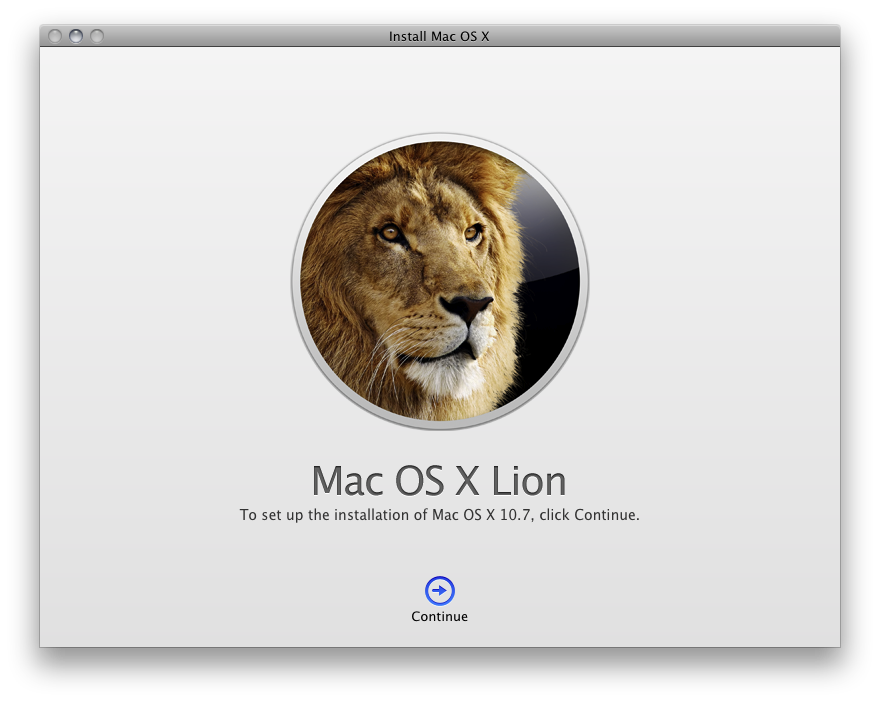
I want to begin by talking a bit about my preparation for the upgrade, as well as the installation process itself. As everyone knows by now, the primary avenue for installing Lion is the Mac App Store. When it comes to complicated monolithic installs, I've had some issues with the Mac App Store. But Apple has nailed it this time. Installing Lion from the Mac App Store was quite painless, and on two machines went largely without issue.
I want to point out that, before installing Lion, I downloaded the installer from the Mac App Store, where it was saved in my Applications folder. I then cloned my system partition to an external drive, making a fully bootable backup of my Snow Leopard system and, at the same time, a backup of the Lion installer itself. Since the Lion installer deletes itself after installation, this may be something the more paranoid among you want to do.

I also did some house cleaning before installing Lion, deleting old apps that I no longer use, and particularly PPC apps, which are no longer supported in the new OS.

I first installed Lion on my work computer. The installation itself took about 30 minutes, during which my computer was unusable, naturally. But if you've ever installed a Mac OS from an external drive, it was much like that. Just like a typical DVD installation, only much faster.
Of course, now there are no alternative install options; no Erase and Install, no Archive and Install. Lion is an upgrade only process, which, at this stage in the game, frankly, I'm comfortable with. This was, however, the first time I've ever not used either Erase and Install or Archive and Install; it was my first Upgrade. Very exciting.
At Home & At Work
My work computer has three partitions. The first contains my system and application files; the second contains my user account data; the third is a Boot Camp partition. While I was able to install Lion on this system there were some features that will be unavailable to me without changing my partition configuration.
For the most part the install went without issue. But, because of the way my work machine is set up, I did experience some exceptions worth mentioning. In particular, I am not able to take advantage of the new full Disk Encryption feature, nor can I use the Restore Partition functionality. The workaround is to redo my partition scheme, upgrade to Lion, and then install Boot Camp. But I think I'll pass for now. While those features do sound intriguing to me, I think I'll manage without them. I just don't have the time to redo everything right now.

The other point of contention was that after installing Lion on my work machine it began running very, very slowly. I had assumed that this was a side affect of the rather lengthy Spotlight indexing process that happens after any update, but the problem persisted even after the indexing had stopped. What ultimately made the problem go away was an upgrade of my Parallels install, of all things. So if you're having performance issues after your Lion upgrade, you may want to make sure you've updated all your software, particularly Parallels. Once I did that, things ran much more smoothly.

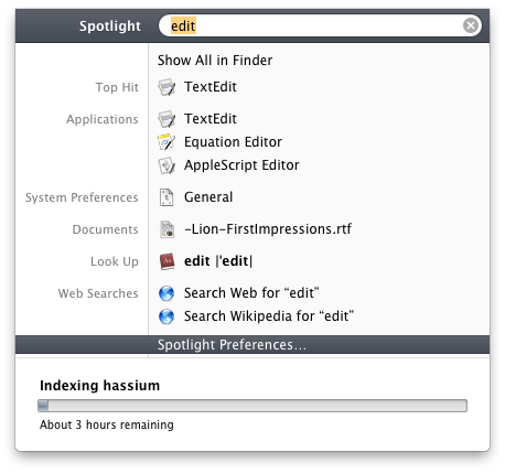
I should also point out that at home, where I have the same partition scheme sans Boot Camp, and no Parallels, my Lion upgrade was about as perfect as you could imagine. Which is to say I had no problems or oddities whatsoever. My only complaint is that the Spotlight indexing took several hours to complete, but this is a very minor gripe.
Recovery
Because I don't have a Boot Camp partition at home I now get the Recovery partition. The Recovery partition is really cool. When you boot holding the option key you'll now see the Recovery drive. Booting from it is just like booting from the Mac OS X Install DVDs of days gone by, only with the speed of a local disk. The usual suspects are there: Terminal, Disk Utility. But now Safari is there as well. This is because Lion allows you to surf the Internet to research whatever problem you might be having. That's right, the Lion Recovery partition is Internet-connected. This is exceptionally cool.
Disk Encryption
I have not tried Disk Encryption yet. While I can use the feature, my understanding is that it will only encrypt my boot drive, and since I keep all my personal data on a secondary partition, there's not a huge advantage to doing this. I may try it at some point, just to see how it works, but for now I've left it off.
General
Once Lion is up and running, there is a lot to take in. Let's start with some general observations.
iOS Scrolling ("Natural Scrolling")
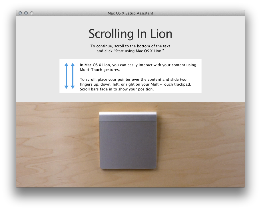
I was surprised by the fact that Natural Scrolling, as Apple calls it, actually feels pretty natural indeed. This is probably because it makes more sense than the way we've learned to scroll for the past decade. But, while the idea of Natural Scrolling does make sense, and I'm sure I'd eventually get used to it, I'm not sure what the point is. Is there some reason to relearn this oldest of behaviors? Some advantage? Because if not then it's just another novelty I just don't need. I am leaving it off until there's a reason for it.

Scrollbars
Much ado has been made about the new scrollbars, which, like those on iOS, are invisible until you begin scrolling, at which point they fade up as a translucent overlay, only to fade out again when scrolling has stopped. The switch to this new scrollbar style is in line with the premise that permeates Lion: a focus on content. The big complaint is that the old-style scrollbars provided always-available information — position in a window, amount of content, and the simple fact that scrolling was an option in whatever view you happened to be in.

Personally, I like the new scrollbars. I do think they remove visual clutter in a subtle but significant way. The information we've lost is still very easy to obtain — a trivial swipe of the trackpad is all it takes — and frankly, when was the last time you looked at a scrollbar for information. It's a tradeoff, sure, but I think it's a good one.
In-App Resume
Quit an application, then relaunch it, and you'll notice that your windows are all back in place, exactly as they were during your last session. It's a simple addition, but a sweet one that has greatly simplified my life and reduced the amount of time I spend at login each day setting everything up the way I had it when I left.
Oh, and in case you're wondering (I certainly was), In-App Resume works for all apps, even ones that haven't been updated to take advantage of Lion's new features.
Saving (Or Not Saving) Documents
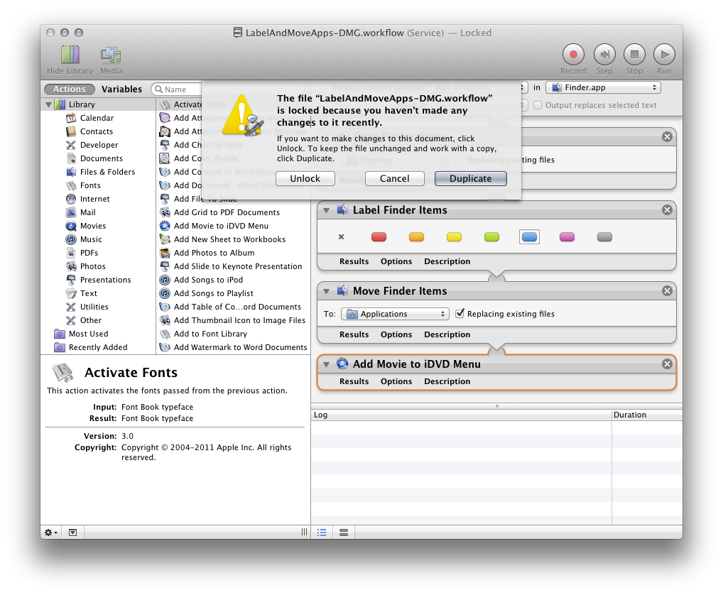
Along those same lines, applications that support Lion's Versions functionality simply don't require you to save your work anymore. Moreover, as the name implies, these applications will now seamlessly and invisibly keep versions of the document saved at sensible intervals. These versions can be accessed in a Time Machine-esque interface that's both fun to look at and easy to use. I really like this direction, and feel like it's been a long time coming. For years I've wondered, from time to time: "Why do I have to save this document? Isn't that something that computers can do?" And versioning is a really terrific icing on this document saving cake.

Still, it's going to take some time to learn to stop hitting the Save button every couple of minutes.
Login Resume
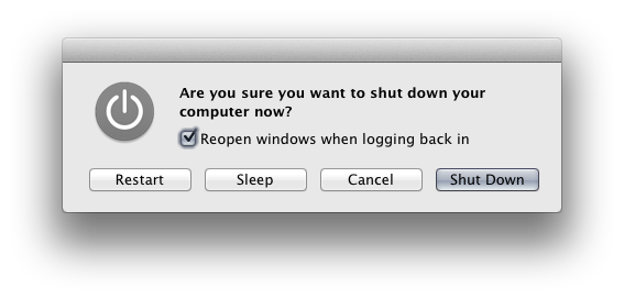
Log out of your computer and you'll see a new tick box that says "Reopen windows when logging back in" in the confirmation dialog. Leaving this checked will enable what I call Login Resume, which is just like In-App Resume for logins. Next time you log in the OS will reopen all the apps you had open at logout. Coupled with In-App Resume it's a real time- and brain-saver. I highly approve of this new direction. It just makes good sense.

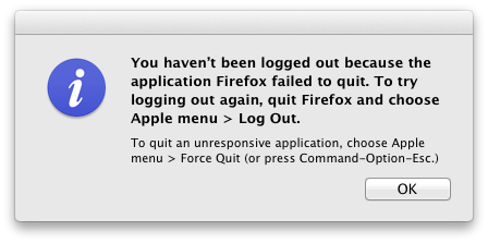
The only problem I have with Login Resume is that sometimes an application will take a long time to quit (Firefox, I'm looking at you) and when that happens, logout gets cancelled. But the logout process has already closed a bunch of apps, so now, when the problem app finally quits and you log out, your session only includes the problem application, and that's what gets saved. It doesn't happen often, but when it does, boy is it annoying.

Oh, and just for the record, Login Resume can be bypassed post-logout by holding the shift key while logging in.
Gestures
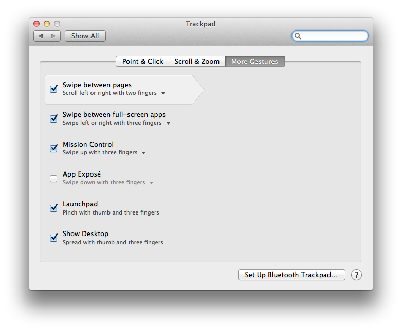
While I like a lot of the new gestures in Lion, there's still some work to be done in the consistency area before I can fully endorse them. Gestures, when they make sense, are terrific and work great. But inconsistency is their downfall, and there is much of it in Lion's implementation.
For instance, some gestures when reversed will back out of the action; others will back out when repeated. And this means that some gestures trigger different behaviors depending on context. I've set Launchpad to activate with a four-finger pinch in. To deactivate Launchpad, I reverse the gesture, a four-finger pinch out. But if I'm not in Launchpad, four-finger pinch out activates Exposé's Show Desktop. Same gesture, different behavior depending on context. It's confusing, and that confusion will likely make gesture adoption less likely.
Switching Spaces, on the other hand (no pun intended), is supremely natural and intuitive, mainly because it relates to the physical. I use that gesture all the time, because it just makes sense. But gestures that don't make sense are harder to learn than key-commands, for me anyway, and I predict the difficult ones will fall by the wayside.

Odds 'N' Ends
A few other things I've noticed, apropos of nothing in particular.
- Badge text for apps like Mail is now thinner, uglier and less legible. I don't think I like it.

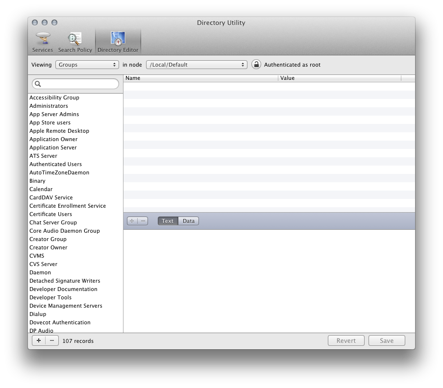
- Directory Utility now features Directory Editor, presumably for editing your local (or otherwise) ODDB.

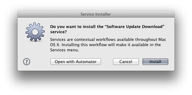
- Here's a weird one: the softwareupdate command now requires root.
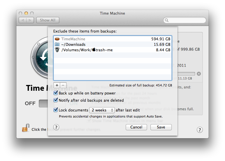
- Limited local Time Machine, which makes local backups on laptops while the Time Machine disk is absent, is very cool.
- Lion uses a lot of RAM, about 2 GBs at login.
Finder
The Finder has received another fairly significant overhaul, with numerous visual changes and a handful of new features.
The new Finder graphics are, overall, flatter, lighter and less intrusive. The rounded rectangle is everywhere; buttons now use the shape as opposed to the ovular incarnation we've had since the inception of Mac OS X. The bottoms of windows even use the shape now.

The Finder window Sidebar now uses the flat, monochromatic icons we've seen in the latest version of iTunes, making it also less visually obtrusive than before. In some ways this hinders functionality by making the icons less distinct targets, but it's also in keeping with Lion's goal of reducing visual clutter. Indeed, this does all have a cumulative affect, and that affect is to focus one's attention on the contents of the Finder window itself. Personally, I think it works well, and I like this new direction.

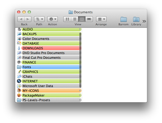
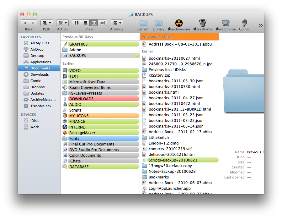
Column view in the Finder — the view I use almost exclusively — gets some love in the form of a few new views. You can now arrange any column-viewed window by Date Last Opened, Date Added or Application. Moreover, the column will now show headers for each category you've chosen to sort by, which is great. There does seem to be a bug, however, when navigating arranged columns using arrow keys, the header gets selected as you navigate to the right. It's not a crucial problem, but is an odd detail for a company like Apple to miss, and it makes the new OS seem buggier than maybe it actually is.

The Finder also continues to be slow when viewing network folders, particularly ones with many items. At one point, while viewing a folder with thousands of items over the network, Finder and hdutil spiked, and the Finder would not show any other network folder contents. I was able to get the Finder working properly again by restarting it, but this is a problem that's gotten worse, not better. Hopefully it will addressed down the line.
Quicklook
Quicklook is greatly improved in Lion. I use Quicklook all the time, so this is great news.
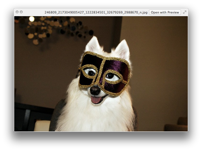
In Snow Leopard, the Quicklook window would retain the size and shape it initially took based on the size and shape of the first selected item; but now the window resizes dynamically based on each selection, more accurately reflecting the size and shape of each selected item. If you modify the Quicklook window, however, it will retain the custom size and shape no matter what you select. The best of both worlds!

Quicklook is also smart about displaying .webloc files, fetching and showing the actual web page referenced by the file. Nice!
Quicklook also works in Spotlight now; hovering over an item in Spotlight's menubar dropdown will display a small preview.

Quicklook also, oddly enough, seems to be a better media player than QuickTime Player. I was able to view a transport stream MPEG with a .TS extension just fine in Quicklook. But QuickTime Player, for some reason, hung when attempting to view this file; QuickTime Player Pro 7 simply refused to play the file at all.
But my favorite thing about the new Quicklook is that it remains active even when you switch to a different application. In the past, switching to a different app make the Quicklook window disappear, and switching back to the Finder made it reappear. It was conceptually confusing and it made comparing something in Quicklook to something in another application very frustrating. now it behaves properly. I'm very happy about this.
Overall, Quicklook is one of my top happy surprises in Lion. It's a feature that I've always loved, and now it's much improved in ways that make it even more useful.
TextEdit
I use TextEdit all the time, especially for writing blog posts like this one, so I can't help but commenting on a few of the things I've noticed about the venerable and essential app's Lion incarnation. TextEdit is, admittedly, largely unchanged, but there are some minor points worth noting.
Some of TextEdit's previously buried formatting options have now been moved into the toolbar, but the toolbar itself is now miniscule. I mean, it's really tiny. And there seems to be no way to enlarge it. Sure, I can live with it, but I really kind of hate it. It's hard to see and hard to hit with a mouse cursor, particularly as we begin to use less accurate input devices like trackpads. It's also incongruous; I don't see this change anywhere but in TextEdit.

Also, where is fullscreen mode for TextEdit. There's fullscreen for iTunes and Safari but not TextEdit? TextEdit is the one app I usually want to really focus in, and there are all sorts of text editors out there with a "concentration mode" that blocks out all other apps, so I know there's an audience for this sort of thing in TextEdit. Seems like a natural place to showcase this Lion feature, but it's just not there. Very disappointing!
Mail
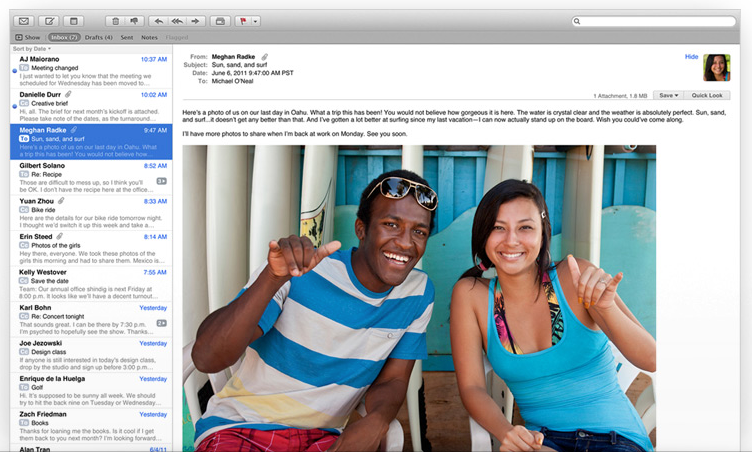
Mail in Lion gets a major facelift. Now with a horizontal orientation, Mail displays the message in a pane to the right of the message list, taking greater advantage of the horizontal nature of computer screens. The mailbox sidebar is now hidden by default, again emphasizing content over administration. And the message list now displays message previews a-la-iOS and Gmail.

As in the past, I won't use the message pane. I appreciate the smarter use of screen real estate, but using it it precludes two things I need to do all the time: deleting spam emails without opening them; and opening multiple emails. But the inline message previews are wonderful. This is something that both Gmail and iOS have had over Mail.app for some time, and which have become a major limitation in Mail.app. Good to finally see this arrive.
Mail is one of those app that doesn't make sense to me in fullscreen mode, but it does feature the capablility. Perhaps most significantly, Mail in fullscreen mode prevents you from looking at more than one email at a time, which is something I often need to do.
The new thread viewing capabilities are very nicely implemented, and to some extent mitigate my need to view multiple emails at once.
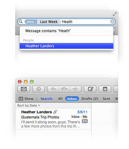
Searching is also much better and full featured in Mail. I haven't used it much, but so far I like the interface and increased functionality.

Overall, the changes in Mail are welcome and well done, though I still prefer Gmail (in the browser) for its ability to Undo sending emails, among other features.
Launchpad
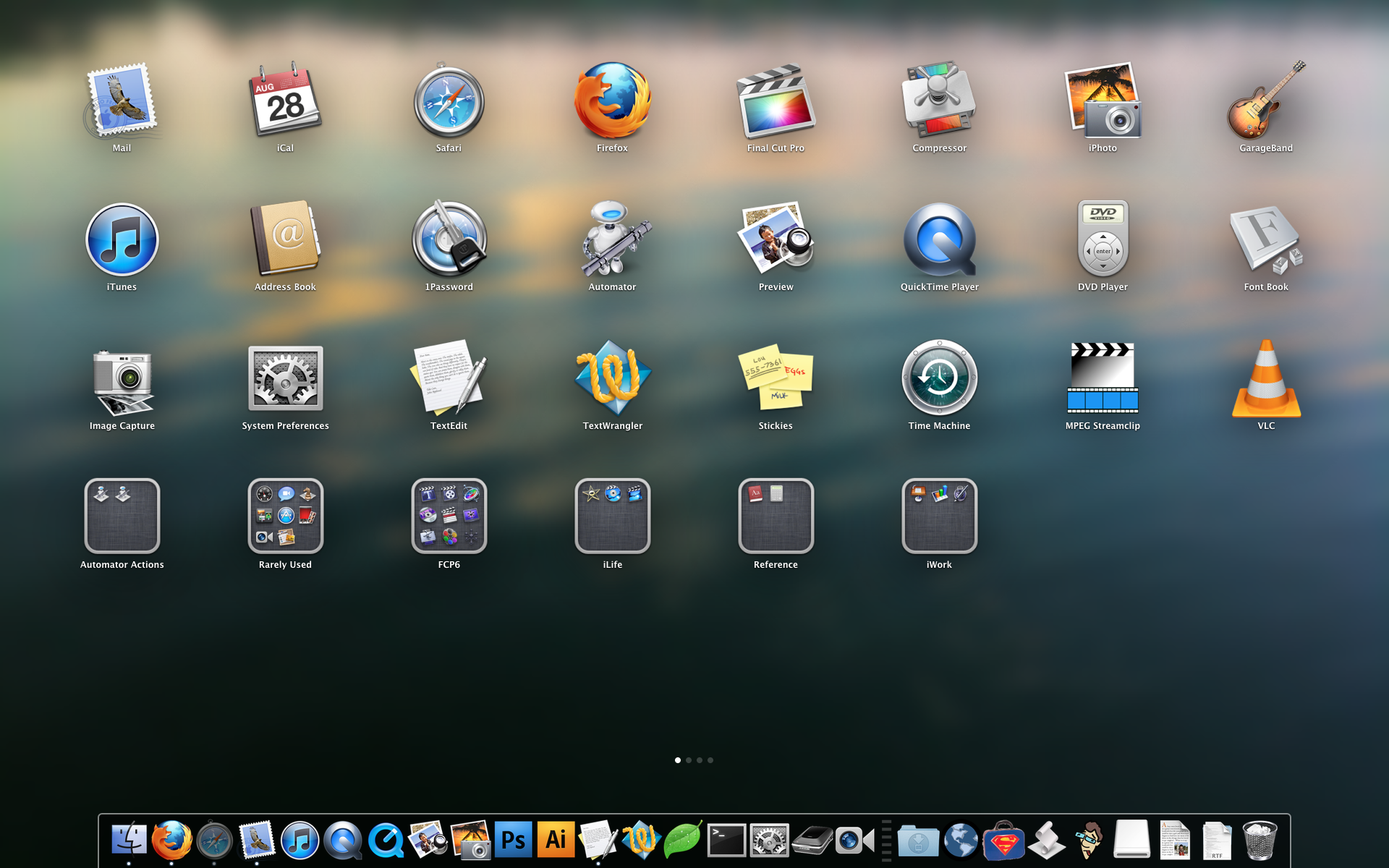
Launchpad is a great idea gone pretty badly awry. Borrowing heavily from iOS in terms of appearance, it's actually closer in concept to the way we used the Apple Menu back in OS 9 when it was configurable. Remember that? We used to put folders full of application aliases for quick, easy access. Launchpad is the same basic idea, but with very limited setup capabilities and an interface that takes up your entire screen.
There are lots of problems with Launchpad. The overarching one is that customization is entirely too limited at this time.

Launchpad populates its interface with every application on your system. This is the right idea in theory, but if you've got a lot of apps on your system, Launchpad becomes very full of useless items. And unfortunately the only way to customize this is by opening Launchpad and moving things around in the same way you move things on an iPhone or iPad, by clicking and dragging them. But there is no multiple-select in Launchpad, so you must arrange you apps one-at-a-time. And arranging things this way is just as clumsy on the Mac as it is in iOS. Dragging an item to a spot that is occupied by another app causes all the other apps to change positions, making targeting very challenging to even seasoned users. And if you hit an item and linger too long, Launchpad will try to create a folder for the group, just like in iOS. it reminds me of many of the pitfalls of the Dock, but it's a thousand times worse, because it's much easier to trigger the wrong behavior, and because you may be dealing with a huge number of items scattered across multiple screens. It's disaster.
Deleting items from Launchpad is also extremely limited and confusing. You can click-and-hold on an item and this will start the jiggling behavior familiar to iOS users. But only some of the items in Lauchpad feature the X icon that indicates that they are removable. Why are only some items removable? Turns out that apps in your ~/Applications folder can be removed from Launchpad, but others can't. Launchpad is clearly made for novice users who are confused by the Applications folder, but no novice will understand what's going on here.
Also, the items in Launchpad are needlessly large, and there is no way to customize this at all.
Launchpad's conceit is a noble one: create an easy way for novice users to find and access applications. But, because there is no easy way to manage a large collection of applications, Launchpad is really only appropriate for the most basic of user with the smallest of application collections. And even those users, without better tools for managing the interface, will likely outgrow Launchpad in short order.
Launchpad takes everything that's limiting and frustrating in an iOS interface and ports it wholesale to the Mac OS. It's an affront to everything decent and good in interfaces. There is the potential for good here, but it is deeply buried within a frustrating and confounding interface.
Mission Control
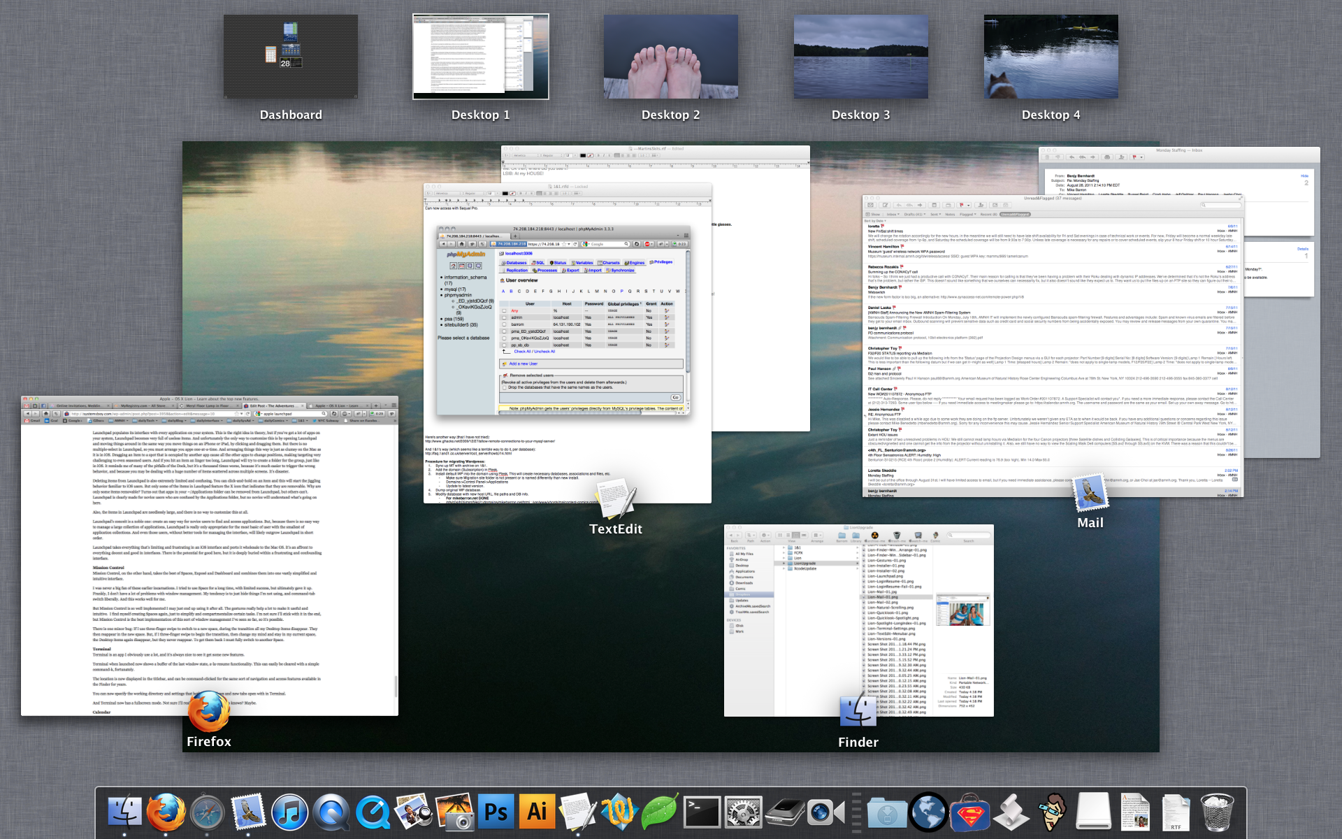
Mission Control, on the other hand, takes the best of Spaces, Exposé and Dashboard and combines them into one vastly simplified and intuitive interface.
I was never a big fan of these earlier incarnations. I tried to use Spaces for a long time, with limited success, but ultimately gave it up. Frankly, I don't have a lot of problems with window management. My tendency is to just hide things I'm not using, and command-tab switch liberally. And this works well for me.

But Mission Control is so well implemented I may just end up using it after all. The gestures really help a lot to make it useful and intuitive. I find myself creating Spaces again, just to simplify and compartmentalize certain tasks. I'm not sure I'll stick with it in the end, but Mission Control is the best implementation of this sort of window management I've seen so far, so it's possible.
There is one minor bug: If I use three-finger swipe to switch to a new space, during the transition all my Desktop items disappear. They then reappear in the new space. But, if I three-finger swipe to begin the transition, then change my mind and stay in my current space, the Desktop items again disappear, but they never reappear. To get them back I must fully switch to another Space.
Terminal
Terminal is an app I obviously use a lot, and it's always nice to see it get some new features.
Terminal when launched now shows a buffer of the last window state, a-la-resume functionality. This can easily be cleared with a simple command-k.
The location is now displayed in the titlebar, and can be command-clicked for the same sort of navigation and access features that have been available in the Finder for years.

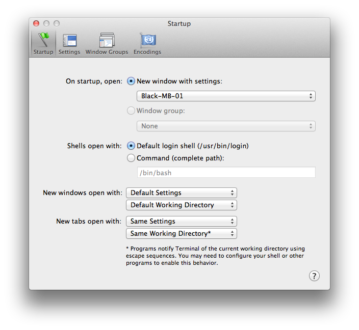
You can now specify the working directory and settings that both new windows and new tabs open with in Terminal.

And Terminal now has a fullscreen mode. Not sure I'll really ever use this, but who knows? Maybe.
iCal
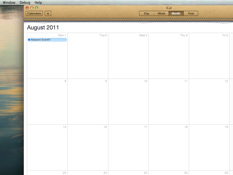
Great God almighty, what did they do to iCal. Man, is it ugly!

Other than the new appearance, it seems pretty much identical to the old iCal. I even still get a cascade of error messages as it attempts to load my Google Calendar delegates.
I think the tagline for the new version should be: iCal: Same Crappy Behavior; Brand New Shitty Interface!
Address Book
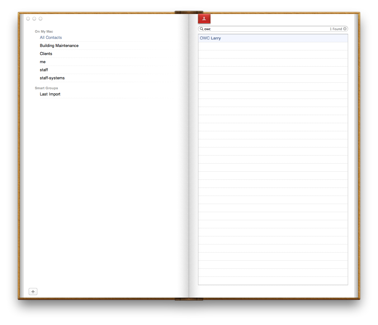
Address Book's interface has been similarly redesigned to look like an actual, physical address book, for some reason. I personally don't like the look. It's contrary to the focus of the Lion Finder, a focus on content. The focus in Address Book and Calendar seem to be on cuteness to the detriment of both content and usability. The graphics distract from the content, and in the case of Address Book, functionality has been compromised.

To wit: where are the Groups? There are no Groups shown by default. Yes, you can see them by choosing Groups from the View menu. But you can't see contact info from this view. And as soon as you double-click a contact to view it you are taken out of Group view via a ridiculous and completely superfluous animated page turn. The old Address Book was simple and showed you everything — Groups, Contacts and Contact details — in a single, unified window. The new Address Book attempts to follow the behavior of a physical address book to such a great extent that it actually nearly defeats the purpose of having a digital address book. All the advantages that can be reaped from a digital interface are now eschewed in favor of a physical analog. And for what purpose? One can only guess.
This seems like a huge step backwards for interface design, and one that is largely in contradiction with the direction seen in other parts of Lion. It's a real shame.
There is one good thing about the new Address Book: I can finally search by nickname. Now was that so hard?
Conclusion
So there you have it. There's lots of good and some bad in Lion. Overall I'm pretty pleased, but I agree with a lot of the punditry that this is a transitional release. Transitional to what remains to be seen. But it seems clear to me that Apple has thrown a lot of stuff into this release, much of it simply to see what sticks. My sense is that a lot of the innovation in Lion is still not yet fully baked and that Apple is both aware of this and okay with it. But this is how change happens. You try stuff; you keep what works and throw out what doesn't.
There's a surprising amount that works in Lion. In particular, many of the resume features as well as the new versioning paradigms, while still in need of some refinement, will be huge boons to productivity, and will likely reshape in no small way how we expect computers to work. That is, more simply and sensibly, and in ways that reduce our workload rather than add to it.
I also really like the focus on simplicity and reduction of visual clutter to emphasize user content. As people continue to create and house ever larger stores of data, as they continue to do more and more on their computers, as they continue to create more and more documents, finding better ways to focus on content will be essential.


