I'm working on a fairly lengthy post about my Lion impressions. Meantime, here's a funny I like from Malcontent Comics.
Firefox Icon Tweak
The first release candidate for Firefox 3.5 came out yesterday, and with it a slightly different application icon.
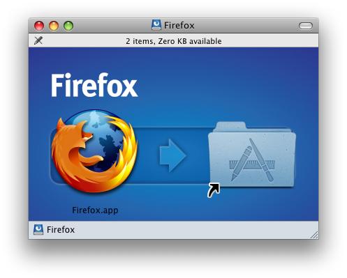
The old icon looked like this:
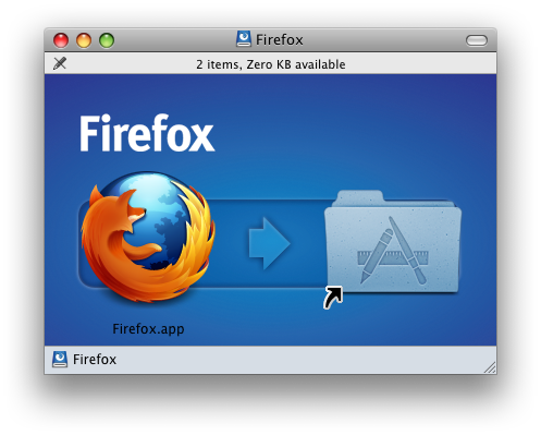
And here's the new icon:
Personally, I think it looks swell. It's a big enough change to be noticeable, but subtle enough to retain the brand identity and not be visually jarring. Just a wee bit fierier along its bottom edge, It even looks good in my Dock:
I've just downloaded RC 1, but I've been using the betas for some time now. I've had really no problems to speak of and have enjoyed the speed increases and new functionality. This minor icon change is a good representation of the sort of attention to detail you're starting to see a lot of in Firefox. While they still haven't addressed my biggest complaint, I can certainly say I recommend this latest version of Firefox.
UPDATE:
I've just downloaded this for another computer and it appears they've pulled the new icon. Today's release is still being called "RC1," but it now sports a "3.5b4" version number. Too bad. I hope they bring back the new icon in a later release. I like it.
UPDATE 2:
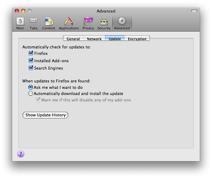
Actually, what seems to be going on is that the update that gets downloaded from the RC1 web page is different from the one that gets downloaded via Firefox's Update preference pane.
This was not the case the other day. The version on the web page is now 3.5b4 (Beta 4), as it now states in the fine print. But download that and Firefox will still prompt you to download a newer version (which prompt, oddly, links back to the confused download web page). The newer version that Firefox downloads has the updated icon. I'm not sure why they pulled this newer version from the web page. That's mighty strange. But, for the record, what's currently on the web page is not the release candidate. It is beta 4. You've been warned.
UPDATE 3:
Today the web page links to the new RC2, which does have the new icon. Wow! That was fast!
ScreenFlow and Opacity Redux
I recently wrote some criticism of a couple very promising new applications: ScreenFlow and Opacity. Both these apps came out at roughly the same time, and each was of particular interest to me. Each also had some pretty glaring bugs.
One of the great things about being a member of the Mac Community is that it actually is a community. Loosely, It's a group of people with similar interests and ideas about the computing experience. And Mac software developers — perhaps more than anyone — feel keenly this bond. At least the good ones do.
So, in true Mac Community fashion, shortly after my initial reviews (like, the next day) I got comments from the developers of ScreenFlow and Opacity. And those comments basically said, "Hey, I addressed the bugs you mentioned, and have released an update to my software. Check it out!"
I have checked it out. And it is good.
Unfortunately, I don't have time to do a complete review of these products. And I'm sure that someone more qualified will beat me to it in any case. But I did want to mention a few things about each.
ScreenFlow
ScreenFlow is a revolutionary approach to screen capturing and screen-based presentation. It is a complete environment for creating computer-screen-based presentations, in fact, letting you capture both your computer screen, its audio, and the video and audio from an external camera all at the same time. ScreenFlow then drops you into a very elegant editing mode that allows you to do all sorts of tricks specifically designed for screencasts (the Callout Actions are particularly nice).
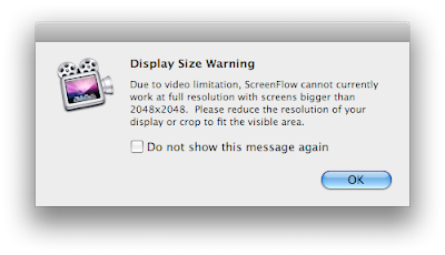
I had a few problems with the 1.0 version, but I'm happy to report that the latest update, v. 1.0.1, fixes them all. I've been playing around with it a lot, and I can't say I've really had any problems at all, at least on my home machine. My work machine sports a 30" monitor, however, and ScreenFlow has problems with its native resolutions. The good news is, it says so:
The bad news is that this alert comes up after you've captured your too-big screen. Still, it's absolutely crucial information, and this alert is better than the nothing we had in version 1.0. I'll take it.
Otherwise, ScreenFlow has been a complete joy to use, and I do anticipate buying it for our lab at some point, probably in the summer. I've even showed it to my boss, who was duly impressed.
If you're looking for such a beast, ScreenFlow makes all the others I've tried pale in comparison.
Opacity
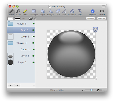
Opacity is a graphics app dedicated to creating, editing and outputting screen graphics — for the web, applications or desktop icons. As an occasional icon creator I can tell you, something like this has been a long time coming. In the past I've used a combination of Illustrator, Photoshop and the IconBuilder plug-in for Photoshop to create icons. Opacity costs only slightly more than IconBuilder, and it doesn't require Photoshop. In fact, it doesn't require anything. It, like ScreenFlow, is a dedicated environment for doing one thing. Unified, task-based apps like this are all the rage right now, and I for one think it's great.
Opacity is more personally interesting to me than it is something we'd need for the lab. It's also something I need more time to explore. ScreenFlow is almost instantly intelligible. But Opacity will require a bit more investigation on my part before I decide whether or not I need it. Since many of my icons are hand drawn with a Wacom, I'll need to investigate the level to which this will be possible in Opacity.
But there are two things I want to point out about Opacity. One, I like the idea of it very much, and I think it's actually fairly novel on the Mac. I'm sure professional icon designers are loving that this exists and that it might actually turn out to be good. Two, it seems to be a very well-though out application. I think icon design is actually a much more complex task than screencast recording. But Opacity strikes a really good balance between the complexity of the task and a clean, elegant UI. It might not be right for me in the end, but if you design computer graphics of any kind, you should certainly take Opacity for a spin.
Oh, and one other thing about Opacity I'd like to mention: Its latest version (1.0.1) resolves every issue I mentioned in my initial article.
So, my thanks to the creators of these fine applications. Not only have they made what look like a couple of really neat apps, but they've handled initial criticism with the aplomb worthy of a Mac Developer.
Great work, guys!
UPDATE:
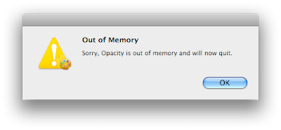
Testing of Opacity continues, and not without issue. The program is a good deal more solid than it was in version 1.0, but, for the record, attempting to import very large Illustrator documents causes the "Out of memory" alert to rear its ugly head once again. This alert will cause the application to quit. And, unfortunately, the default behavior of Opacity is to open the previous document on launch. If that document happens to be a large Illustrator file that causes the alert and subsequent quit of the program, you will be unable to successfully launch Opacity without moving the offending file. Bummer.
Also of note, Opacity is not currently pressure-sensitive when used with a Wacom tablet, which may be a bit of a problem for some — myself included — though perhaps not a deal-breaker. I'm certainly not averse to creating line-art in pressure-sensitive programs (like Illustrator) and importing them into an app like Opacity if it beats my previous workflow. But obviously this won't work if the Illustrator file essentially kills Opacity.
In any case, like I said, this is all for the record. I still feel Opacity has great potential. That's why I'm testing it so rigorously.
Opacity: Another Crash-Happy 1.0 App
It's 1.0 release week, here at TASB, apparently. It also appears to be crash week.
Another useful-looking app has caught my attention: Opacity. It's a graphics editor designed especially for doing one of my favorite things: icon creation.
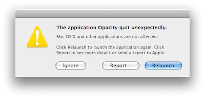
Opacity, like ScreenFlow, looks like a really nice application built for doing one specific thing. Which makes it really good at doing that specific thing. And Opacity appears as though it will, someday, be quite good at icon creation. In fact, it looks to be the best icon-specific graphics editor I've seen thus far. But — and this seems to be a theme here lately — it crashes constantly.
I mean, like, unusably. Like during the tutorial. Not good. The saving grace here is that it at least autosaves a copy of your document. But when an icon editor, working on a single-layer, 512x512 pixel vector image, tells you it's out of memory (I have 5 GBs of RAM for crap's sake) when you're trying to save your file, you know there are some serious problems with the app. Am I right people? Seriously, who's with me here?
'Nuff said, I think.
Opacity looks like it might be a really good application for icon creation — maybe the way to go. It's got some great tools for preview and output, and the price is right — it's about ten bucks more than Icon Builder, but is completely self-contained and doesn't require Photoshop. But it's far too unreliable for serious use at this point.
It's too bad that developers are releasing such buggy stuff. It leaves a really bad first impression, and makes me not want to rush out and purchase the product, no matter how hot it might look. I hope I get over that first impression before something else better comes along, or simply steals my attention.
In the meantime, as with ScreenFlow, I'll try to remember to check back for Opacity's 1.0.1 release.
What I Was Talking About
When Adobe went all periodic table on our asses with their icons, I wrote a little article about it, just like a lot of people did. At the end of that article I suggested that Adobe start thinking about actual icons — visual symbols — for their applications that could be recognized at a glance, rather than using letters or letter combinations in the place of icons.
I think the best approach Adobe could take — both from a conceptual and a practical standpoint — would be to actually create memorable, iconic symbols for each of their applications. Thus far they have not done so, and choosing instead to represent their apps with plain two-letter text identifiers just seems a little cheap, lazy and ineffectual. Why doesn't Photoshop have such a memorable symbol associated with its product line after all these years? Or Illustrator? By now they really should. Maybe it's time to start working on these.
It looks like that's what they've started doing, at least in the case of Photoshop (Warning! Annoying Flash content ahead), which now has its own icon. Unfortunately, the icon itself ain't all that great. It's kind of confusing, not all that attractive and seems totally disconnected to the idea of Photoshop. It looks like a combination of a metallic speech bubble and the 1970s PBS logo. And I'm not the only one who thinks so.
Still, it's a step in the right direction, and I'm glad to see it. And I have to say, I kind of like the typography. Not that I'm any sort of expert in any of this.


