ScreenFlow

Holy poo! ScreenFlow is one of the nicest, most polished, yet useful applications I've seen a really long time.

On the surface, Vara Software's ScreenFlow appears to be just another in a series of applications designed to capture your computer screen to a Quicktime movie as you work. Typically such captures are then used for demonstration purposes for new products, or workflows, or videocasts, or what-have-you. But ScreenFlow is much more than just another screen capturing app. ScreenFlow is really an entire environment for creating and finishing computer demonstration videos.

And it's gorgeous!

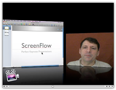
The most obvious thing that sets ScreenFlow apart from its competitors is the fact that, along with the computer screen, it can capture iSight (or DV camera) video and audio at the same time. By default it sticks this video in a reduced-size window in the lower right hand corner, though, as you'll discover, this can easily be changed. That's because ScreenFlow, in addition to being a screen capturing application is also a presentation editor.


ScreenFlow: Capture Screen and Camera
(click image for larger view)

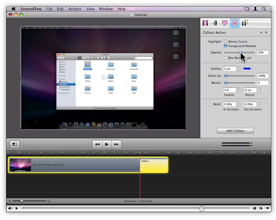
Once you've captured your computer screen actions and your iSight video, ScreenFlow presents you with an editing interface. Here you can perform all sorts of actions, including zooms, pans and something called "Callout Actions," which allow you to highlight specific windows as well as the mouse cursor. Vara has a nice demo of this feature (in a video, of course, which by the way, is where I pulled these screen shots from) on their site. But the application is so smart and well thought out, that if you've ever used a screencast app, you'll find the learning curve incredibly gentle.


ScreenFlow: Edit Your Presentation
(click image for larger view)

I do want to point out that this is a 1.0 release, and I have experienced numerous bugs. On my work computer (a Quad Intel box with copious amounts of RAM), the application completely crashes my machine. Force quit will not rectify the crash; a hard reboot is required. On my home system (an 8-core Intel with 2 GBs of RAM) ScreenFlow functions well enough, but there are still problems. The iSight registers video and audio in the setup screen, but no audio gets captured for some reason. Also, when exporting my final product to DV-NTSC, I was presented with a set of options, one of which was "Letterbox Content." Though I checked it, ScreenFlow did not honor the "Letterbox Content" option, and my movie came out squished. In fact, I exported the same movie without the box checked and there was no difference between the two movies. Clearly this function is broken. Clearly, ScreenFlow has some kinks to work out.

Still, once the problems are solved — and I sincerely hope that happens soon — ScreenFlow is poised to be the application of choice for regular producers of screen-based videos. And beyond. I admit, I don't do a lot of screen-based capturing, but I'm starting to wonder if the reason is because there haven't been any great apps out there for doing it. ScreenFlow is one of those apps that gives you ideas. It instantly makes you want to use it and then you start thinking of ways to do so. Being in education, this has been pretty easy for me to do. Something tells me I'll be buying and using ScreenFlow in the very near future.

UPDATE:
Version 1.0.1 has just been released, and it seems to fix at least some of the problems mentioned above, in particular the iSight audio problem. Expect a re-review sometime in the near future.

Leopard Installer Certificates

If you've been using Software Update (like I have, up 'til the other day), you've probably missed one of the new features of Leopard: Installer Certificates. Major updates from Apple now come with certificates of authenticity.

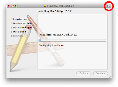
So, for instance, download the standalone Mac OS X 10.5.2 installer and launch the package in the Installer application, and you'll notice a small, new certificate badge in the upper right hand corner of the installer window.


Apple Installer: Certificate Badge
(click image for larger view)

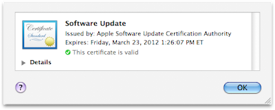
Click the badge and you can take a look at the certificate that's attached to the installer, replete with details about said certificate under the "Details" disclosure triangle.


Apple Installer: Certificate Details
(click image for larger view)

It's another preemptive step in the right direction, security-wise. Always nice to see.

iPhone Browser Cache

I love my iPhone. It is increasingly important to me for getting things done. I use it for everything: appointments, reminders, fact-checking, contacts, text, entertainment and, of course, as a telephone. It's boosted my productivity immensely, yet made my life easier and better in so many ways. I'm not sure how many products I can say that about.

Nevertheless, I have one persistent gripe when it comes to the iPhone, one thing that just pisses me off and confounds me every time I encounter it: Mobile Safari's cache is simply too small, to the point where it almost seems pointless to have cache at all. Case in point: I open a web page. It gets cached. I open a new window, and a new page in that new window. It too gets cached. Unfortunately, this new cache invariably wipes out the previously cached page, so that when I navigate back to the other window, the first page has to reload. And, just for the record, these are mostly text-based blogs, sometimes with a picture or two. It doesn't always go down this way, but more often than not it does. This defeats the usefulness of both cache and the multi-page interface available in the browser. I'm not sure what the point is.

I'm sure the browser cache equation rides a fine line between usefulness and unnecessary disc overuse. But for anyone who uses the Edge network on any kind of regular basis, I think they've got that balance wrong. And I can't help wondering why they don't give us a setting — just like in any other desktop browser — for cache size, within a sensible range, of course. Or, if not that, simply make the default a bit larger. The current one is pointlessly small.

UPDATE:
Fixed!

What's So Funny 'Bout Peace, Love and WYSIWYG HTML Editing?

I'm not sure why, but the concept of the WYSIWYG HTML editor has really taken a beating. The most recent comment I've heard comes from Shawn Blanc's review of MarsEdit, an offline blog editing product. Shawn says that:

"In all my experience with WYSIWYG editors I have found them a clumsy enemy of fine web typography."

This, apparently, is the major rationale for what seems to be the prevailing notion in the web development community that WYSIWYG HTML editors are an inherently bad idea. The logic seems to go something like: every time I edit my web page in a WYSIWYG editor, the experience is a bad one, therefore the concept of WYSIWYG HTML editors is flawed from the get-go; real designers only ever edit raw HTML. (Though I might point out that I have yet to see or read of a single example of a WYSIWYG editor creating terrible HTML code in a very long time, at least when it comes to fairly simple HTML pages, which most blog pages are. But I'm getting ahead of myself.)

Comments like the following also make it sound like if I'm not editing raw text, I'm just a big pansy-ass wuss:

"I suspect most of you are at least a bit HTML savvy and prefer the use of monospace type and a HTML editor anyway. But for those who are getting weak in the knees at the thought of having to type your own HTML relax."

Now, I'm not a web developer by any stretch of the imagination, but my experience with WYSIWYG editors — even web-based ones — has been largely positive. And, though I'm fairly comfortable looking at HTML code (and actually enjoy looking at other types of code), I never, ever want to edit it if I can at all avoid it. It's a completely unnecessary distraction from what I'm here to do: write. I'd much rather work on something that more closely resembles the finished product and not have it cluttered up with code. It's not that I'm scared of the code, it's that I'm annoyed by it.

For my personal web pages I have always used Dreamweaver. And while the user experience offered by that app is not always the most intuitive or Mac-like, it's always far preferable to me than using a text editor. For my blog pages — which are all formatted exactly the same way as per the Blogger style sheets I've set up — I use the Blogger-supplied online WYSIWYG editor. As much as I like the idea of working on my blog offline, I do not use MarsEdit or any other such client. And the reason is because of their lack of WYSIWYG.

Blogger's HTML Editor: All I Really Need

(click image for larger view)

John Gruber also supports the use of MarsEdit and its ilk:

"My best argument for using MarsEdit (or any desktop weblog editor) instead of a web-based interface is that it’s like using a desktop email client instead of webmail."

That's a great argument, except that it's a bit flawed: A desktop email client adds features and ease-of-use to the email experience. MarsEdit, on the other hand, removes a major feature that, for me anyway, greatly hinders ease-of use. It's far less aggravating to me to use a web-based WYSIWYG editor than it is to use a desktop-based code editor. To follow Gruber's analogy, using MarsEdit is like using a desktop mail client that only shows you the code in which your email is written. MarsEdit hinders ease-of-use by making me look at code when I really don't need to. All I need are some very simple markup commands and basic text editing. I really can't see any reason not to use WYSIWYG, particularly when it comes to editing blogs.

But this is not to completely disparage MarsEdit. That's not my intention at all. It sounds like a great product, really, and MarsEdit's author, Daniel Jalkut even acknowledges the need for WYSIWYG in his product and is planning it for a future release. Awesome. I may even buy and use MarsEdit when that day comes.

My point is that the WYSIWYG HTML editor is a great idea that someone needs to get on and do right. I believe its time has come. Over the past few years I've watched a series of HTML editors hit the market. The latest are either completely template-based — like Apple's iWeb, which lacks any ability to examine the code when it's necessary to do so, which is a big problem — or completely code-based — like, well, all the others. In between is a gaping chasm. The giant WYSIWYG hole. CSS editors, too, seem to be plagued by this lack of WYSIWYG. So I always find myself using Dreamweaver in the end, for lack of a better replacement. I suspect I'm not alone.

Again, I can't help wondering if there's a faulty rationale at work here. Do software authors think that, because their WYSIWYG editor experiences have been bad ones, the basic idea is also bad? Or entirely too difficult to build? Or unprofitable? Because I think that, in the same way that beautiful, affordable image editors are springing up to challenge Adobe's dominance with Photoshop, WYSIWYG HTML editors could have great appeal. I've been marginally on the lookout for one for years, and I write web pages only occasionally. And the best I've found, frankly, is Dreamweaver, which is good but not great, and very expensive.

Or is it possible that it's just machismo? (God, I hope not. Is there anything worse than macho geeks?) It is possible that developers think that WYSIWYG just isn't cool? That real web developers would scoff at such a product? Seriously, why is it that Coda, an absolutely beautiful app that does, like, everything under the sun, lacks the basic WYSIWYG found in all web-based editors? (Yes, I would totally buy Coda if it had WYSIWYG. Without a doubt.)

Guys, all I can say is, you're missing a big opportunity here.

MacFUSE Follow-Up

I recently wondered aloud about the benefits of MacFUSE-supplied ssh access in a web development environment. A reader asked for a follow-up in the comments to that post, so I thought I'd just do a quickie today.

After writing the article, I tried out MacFUSE and the sshfs extension to that bundle. This combo facilitates the mounting of ssh-enabled computers directly on the Mac OS Desktop via a bundled GUI app, foregoing the need for an FTP client application. It was our hope that this would provide a more intuitive and user-friendly experience for our web developers. Unfortunately, in my experience there were bugs: the ssh filesystems often hung or had trouble mounting, often requiring a logout or restart to get things back to normal. (Mind you, this was over a month ago, in Mac OS X 10.4.something-or-other and God-knows-what version of MacFUSE and sshfs.) Also, from a user-simplification standpoint I felt that adding yet another application to the mix (the sshfs GUI app for mounting shares) didn't really do all that much to simplify things. In fact, in some ways, it complicated matters as it is not standard practice anywhere as yet.

That said, I really like the idea of mounting any sort of network share in the Finder. It's what's done in every aspect of our filesharing lives except web development, for some reason (that reason mainly being that Apple, inexplicably, still has not implemented this capability into the Finder.) As I mentioned in the original article, there are styles of development that take place outside the lab that are inherently different from what can happen inside a lab. The use of MAMP, for instance, is not friendly to a shared, multi-user environment, but is perfectly suited to a lone user on a single computer. So, again, I wonder aloud, do we provide a different way of working inside the lab than outside? A completely different workflow?

Ultimately, my answer will mostly be yes, I think. We provide it. We provide it right alongside the sorts of workflows that are common in the industry today. We provide both. We show students. We show teachers. And hopefully, someday, down the line, this will become the standard way of developing for the web. Until then we leave the old ways in place; they are not mutually exclusive.

My concern with MacFUSE and sshfs right now is stability. Because the product requires kernel extensions, and because I saw bugs in my limited testing, I am reluctant to put this on our machines. I can, however, use NFS from within our lab to provide a testing ground for the same sort of behavior that MacFUSE provides (i.e. ssh servers on the Desktop). And this will actually fit in nicely with the way we mount other shares in the lab as well (more nicely than the sshfs GUI, in particular). I will most likely implement this over the summer, however, as there's not enough time in the semester for it to really have much impact. Also, things will probably change a bit with the arrival of Leopard to the lab, and I don't see much point in making folks learn it twice.

Again, external development can be handled differently. So I may recommend, for advanced users, the use of MacFUSE outside the lab if they really end up digging the Desktop web development experience.

That's my take at this point on MacFUSE and web development. Hope it's useful to someone.