iPad Pro Screen Dimensions

My next computer purchase will be an iPad Pro. I'll use it mostly for drawing. I love my iPad Air 9.7", but for drawing the 12.9" feels like a much better fit. Obviously that's because it's bigger, and it can use the Apple Pencil. But the size is not just bigger, it's also much closer to the size of paper, at least the sort of paper I typically use for drawing. This makes it feel much more natural as a drawing tool, which I confirmed with an in-person test at an Apple Store.

The paper size I usually use for drawing is 9"x12". The body of the iPad Pro 12.9 measures 8.69"x12.04". This is very close to my paper size. The screen, measured diagonally, is 12.9". But finding the actual screen dimensions — in inches — has been nigh impossible, so I thought I'd note it here and save future Googlers the hassle of figuring it out.

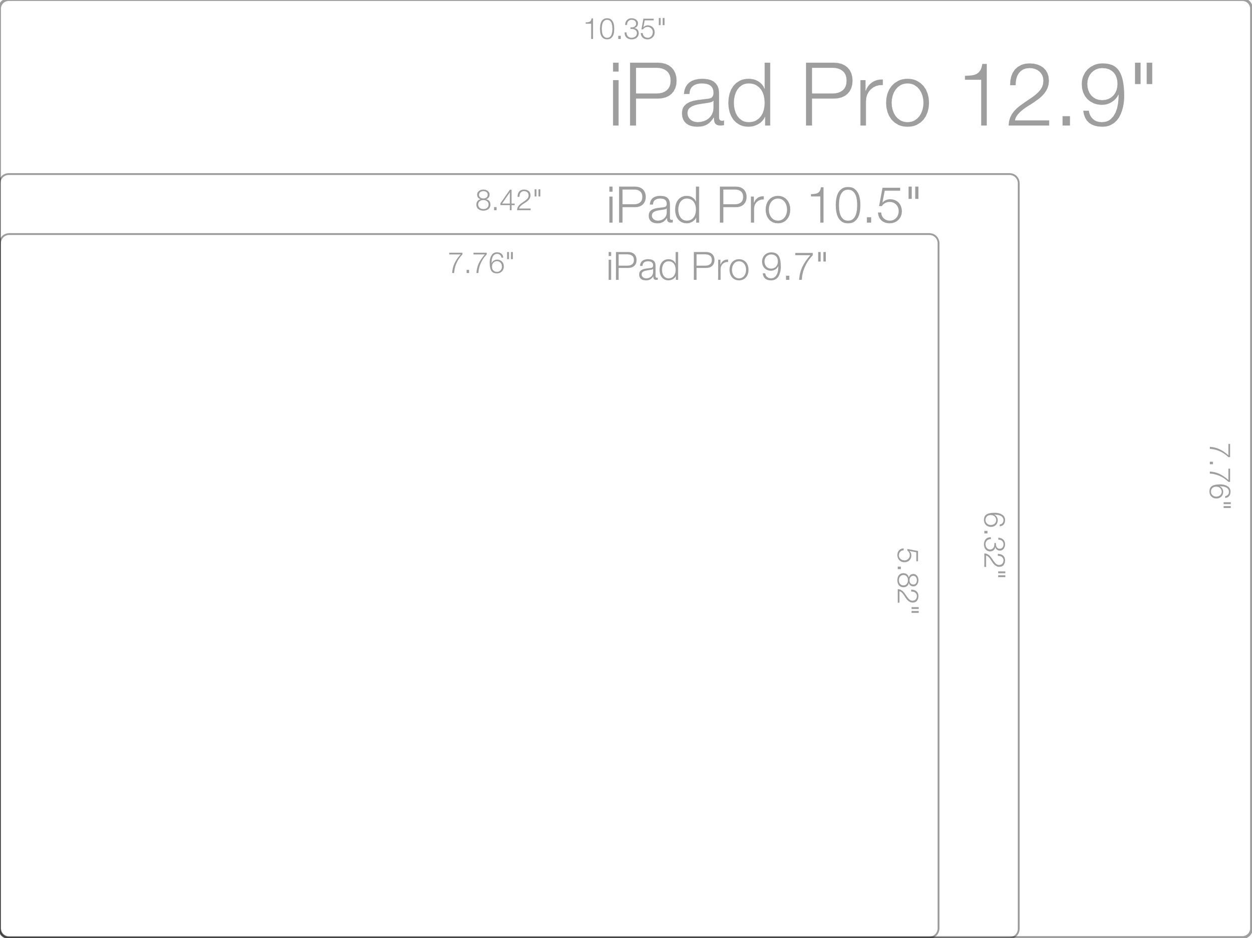
And so: The screen width and height of the iPad Pro 12.9's screen is 7.76"x10.35".

Also, for reference, the iPad Pro 9.7 screen dimensions: 5.82"x7.76".

UPDATE:
The screen size of the new iPad Pro 10.5 is: 6.32"x8.42".

Here's a diagram for visual reference as well. As you can see, the 10.5" iPad Pro is not squarely in between the 9.7" and 12.9" screen sizes, but rather is much closer in size to the model it replaces, the 9.7". This being the case, I still plan to buy the 12.9" model for it's significant increase in screen real estate.

iPad Pro Relative Screen Sizes

iPad Pro Relative Screen Sizes

That's What I was Thinking

A few links from the Department of OMG! I Was Thinking Exactly the Same Thing!!!

Khoi Vinh is not so enamored with the aesthetics of the latest iPhones:

The iPhone 5’s lines are sophisticated and modern; each bevel or corner or detail seems unique, well considered and essential. I still marvel at its beauty when I hold it in my hands.
By contrast, the iPhone 6’s form seems uninspired, harkening back to the dated-looking forms of the original iPhone, and barely managing to distinguish itself from the countless other phones that have since aped that look.

I couldn't agree more. When rumor sites were publishing these images I thought, "These can't possibly be the finished designs." But they were. Sorry, but those antennae are, if not downright ugly, certainly sub-par for an Apple product.

Allen Pike is not happy with the lack of clarity in shift key activation in iOS 7 and above:

When the shift key is on, it blends in with the letter keys. When it’s off, it blends in with the function keys. Neither state sticks out enough to read as active, especially in a split second.

This has been driving me up a wall as well, and I'm relived to find I'm not alone. To my way of thinking, the shift key activation appearance is backwards. And I find it almost impossible to learn a backwards thing, but even more so when it's placed within — and reinforced by — a field of not-backwards things. Such is the current state of the iOS shift key, and it is maddening. Pike's solution, though, is inspired.

Russel Ivanovic is displeased with the rapid pace of Apple OS releases at the expense of stability and reliability:

I just wish that Apple would slow down their breakneck pace and spend the time required to build stable software that their hardware so desperately needs. The yearly release cycles of OS X, iOS, iPhone & iPad are resulting in too many things seeing the light of day that aren’t finished yet. Perhaps the world wouldn’t let them, perhaps the expectations are now too high, but I’d kill for Snow iOS 8 and Snow Yosemite next year. I’m fairly confident I’m not alone in that feeling.

Don't get me wrong, I like iOS 8. But since upgrading, apps crash with alarming regularity. Even FileMaker Go 13, which I'm now using all the time, and which, for my purposes, requires a login at each launch, and which is owned by Apple, crashes with hair-pullingly annoying frequency. I, too, long for the days of Snow Leopard, a release whose focus was on efficiency and stability. It was quite possibly the most rock-solid OS release I've ever used. And it was glorious. 

Even Gruber's bugged by this unreliability:

(Just today: My iPhone 6 rebooted after I changed the home screen wallpaper. Tapped a new image in the wallpaper settings, and poof, it rebooted. Worse, it never stopped rebooting. Endless reboot cycle. Now I’m doing a full restore with iTunes. After changing my wallpaper to a different image.)

Which makes it an almost mainstream gripe.


Robot Names

Why are robot names, by and large, so bad? It seems like it wouldn't be that hard to come up with some cool ones, or at least some not awful ones. Instead we get names that are downright embarrassing to say out loud. They sound pseudo-futuristic and ridiculous, or like something out of a bad fantasy novel. Here are some examples.

Horrible Robot Names

256px-HAL9000.svg.png

There have been, to my memory, only two decent, usable robot names.

Cool Robot Names

  • Computer (the  LCARS system from Star Trek, but they always just called it "Computer")
  • HAL

Seriously, those last two are the only ones I wouldn't feel idiotic addressing directly, with words issuing forth from my mouth, in a public setting. The rest? Feh! "Okay, Glass?" Really?

If we're to start using voice activated assistants and robots in our daily lives, I think we need to do a better job of making the process more natural and less awkward. You'd think the naming of the thing would be the first and easiest place to start. Apparently not.


New Hotness: Late 2013 MBPr

I have received my 15" MacBook Pro with Retina Display. This is my first new computer in over four years. Normally I get one about every three, but this time around I decided to wait a while and see how things went. They did not go well.

Basically, my old, beloved 2009 17" MacBook Pro has been dying a slow death over the last year as I've awaited the new hardware with increasing impatience. As of the other day it was freezing every few hours. And that's when not in use.  To complicate matters, I even had a hard drive in it die a month or two ago. Enough, I say!

So when Apple finally announced the latest 15" MBPr, I... Hesitated...

To be honest, my enthusiasm for getting new computers has lessened as I've gotten older. These days, I think of setting up new hardware as something I do for work, not on my free time. It doesn't help that the hardware has largely stabilized in terms of form factor: today's MacBook Pros look pretty much just like they did four years ago. And spending this rather large chunk of cash is never easy either. But what's a systemsboy to do? I needed a new machine. Bad. 

So I bit the bullet. I got, essentially, the top of the line, but with the second-fastest processor. So:  

Screen Shot 2013-11-06 at 6.43.08 PM.png

I also upgraded the storage to 1TB. (Hint: the storage is really the pricey upgrade, so if you plan on upgrading the storage you're better off just getting the higher-end machine with the dedicated graphics and faster processor for only a little extra green.) The upgrade made this a build-to-order system, so I had to order online and wait for it to ship from China.

I was very pleased when my machine arrived three days earlier than Apple's best estimate.  This put it in my hands at the end of a long weekend rather than mid-week, which was awesome.

But the biggest surprise was how much I've ended up loving this machine so far. Yes, it looks mostly the same. But in almost every respect it is far superior to my old machine. While it may look similar, it feels vastly better to use.  

For one, it doesn't crash every few hours. It's amazing how quickly you can get used to this sort of thing and start to just think of it as the norm. But when it goes away, man is it nice.

It's also much, much faster. With a newer processor featuring more cores, speedy flash storage, a faster graphics card and 16GBs of RAM this thing really feels fast. Everything just happens instantaneously, and copying the vast store of files from my backups has been as quick as I've ever seen it. When you wait four years, you really feel the speed improvements, and it's very nice.

This new machine is lighter too. Much lighter, in fact. I pick it up one-handed all the time and compared to my old 17" it feels like nothing.  This wasn't something I really thought would make such a difference, but the overall effect is that I use — and want to use — the computer more, because doing so is much less physically burdensome.

The battery lasts a really long time too — about 6 hours for my own personal general use case. Gone are the days of sitting tethered to my power cord. Now I go power free most of the time, which also makes the thing much nicer to use. 

There are even little things I've noticed that really add up: this machine doesn't get as hot as easily as my old one, and the fans are quiet during normal use; the sharp edges along the sides — which I noted when I wrote up my 17" machine — have been softened ever so slightly, and the finger notch for opening the display is also softer and shallower. These subtle things are instantly noticeable, though, because they're so much a part of how the machine feels all the time as you use it. These little improvements make a huge difference! 

Finally, the screen. I was worried the retina display would be something of a mixed blessing. I'm quite used to the screen real estate of the 17", and I must admit I missed it a bit at first. But the retina display is strikingly good. Because of its greater pixel density, I'm able to scale the resolution to increase the screen real estate and show more content without making things hard to read. And it just looks gorgeous. Also, it's quite bright and the glare problem of older models seems to be largely solved: I haven't noticed glare once after using it all around the house.

So I have to say, now that I have it, I'm pretty excited about my new MacBook Pro. Waiting the extra year to upgrade has made the new machine seem like a huge leap, and in a way I'm glad I waited. Then again, I suffered for this, so we'll see what happens in three years.  


Super Initial Impressions

Normally on Keynote Day I'm right there, but today was an exception. I have a perfectly nerdy excuse: SAN Installation. So I missed all of toady's Apple announcements. I've only skimmed the info on the new products, but I wanted to get down my very initial impressions.  

 Mac OS X Mavericks

The new  version of Mac OS X was announced today. The name is a little corny, but I have to admit it's catchy and it's already growing on me. Time will tell. 

Yes. I am excited about Finder Tabs.

Yes. I am excited about Finder Tabs.

Feature-wise, I audibly called out, "Finally!" multiple times while skimming the list. Don't get me wrong, I'm pleased as punch about a number of the new features — tags, tabs, books for Christ's sake, yes! — but really, what took you so long? Some of this stuff is great, but a little obvious and a bit of a reach. Makes it looks like Apple might be short on new ideas.

iOS 7

When Microsoft released its mobile OS a few years back I really liked the look of it: flat, simple, classy and downright minimalist. It was a terrific contrast to Apple's bouncy translucent eye candy. 

But now iOS 7 is taking a similar approach, and while the new look holds a certain appeal, I can't help feeling they borrowed the idea from Microsoft. I also worry they may have taken things a bit too far, with control screens that look more like software prototypes than actual working apps.

Does this button do anything?

Does this button do anything?

Again, though, time will tell, and reading about a product is by no means the same as using it. 

MacBook Air 

Each iteration brings the Air one step closer to a product I can use. This release is no different, with solid — though hardly surprising — gains in performance.

The real story here, though, is the battery life. A very competent computer with battery life that rivals the iPad? Very cool!  

Mac Pro 

Most of today's announcements were hardly earth-shattering. But the Mac Pro is just that

When I first opened the page I said to myself, "Why is there a picture of a giant lens? Where's the computer?" Slowly it dawned on me: That is the computer. 

Is that the barrel of a gun? No, it's a Mac Pro.

Is that the barrel of a gun? No, it's a Mac Pro.

From an industrial design standpoint, the new Mac Pro is a wonder. It's the sexiest thing Apple's released since the iPhone. It's straight up beautiful. But perhaps more important is the fact that it's geared towards professional computer users. Here you have an extremely beautiful, thoughtful, exciting product in a category most people had written off. Apple hasn't done something this exciting in this space for perhaps a decade. And I didn't think they ever would again. 

The new Mac Pro may prove me wrong.

I have yet to even look at the specs or talk to my pro user friends. But if the new Mac Pro is only a symbol, it could just be the sort of symbol pros need to take Apple seriously again. It's the first sign we've seen of Apple making something that at least looks amazing specifically for pros since Final Cut Pro X. We all know how that turned out. Or do we? 

Apple's stance on the pro market has been unclear over the past few years. The Mac Pro makes it a bit clearer. It remains to be seen what this machine's really all about. Does it have what it takes to win over pros? But it's heartening to see Apple making a real effort. Though only time will tell if it's enough. 

Either way, I can't wait to read all about it. Which is what I'll be doing for the rest of the night.

Happy Keynote, everyone!