Post to Instagram from a Mac

Instagram recently announced support for photo uploads via its mobile website. But the desktop version of the site still doesn't offer a way to upload images from a Mac.

Screenshot 2017-05-09 12.05.12.png


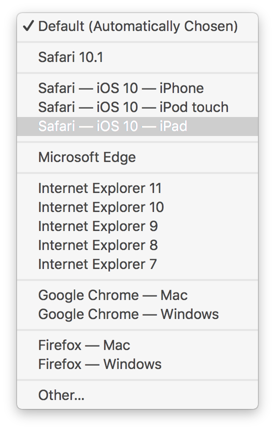
I tried changing the user agent in Safari to "Safari — iOS 10 — iPad" and doing so does in fact enable photo uploads from the desktop. And the interface looks nice too!

Instagram-iPadInterface-On-Desktop.jpg

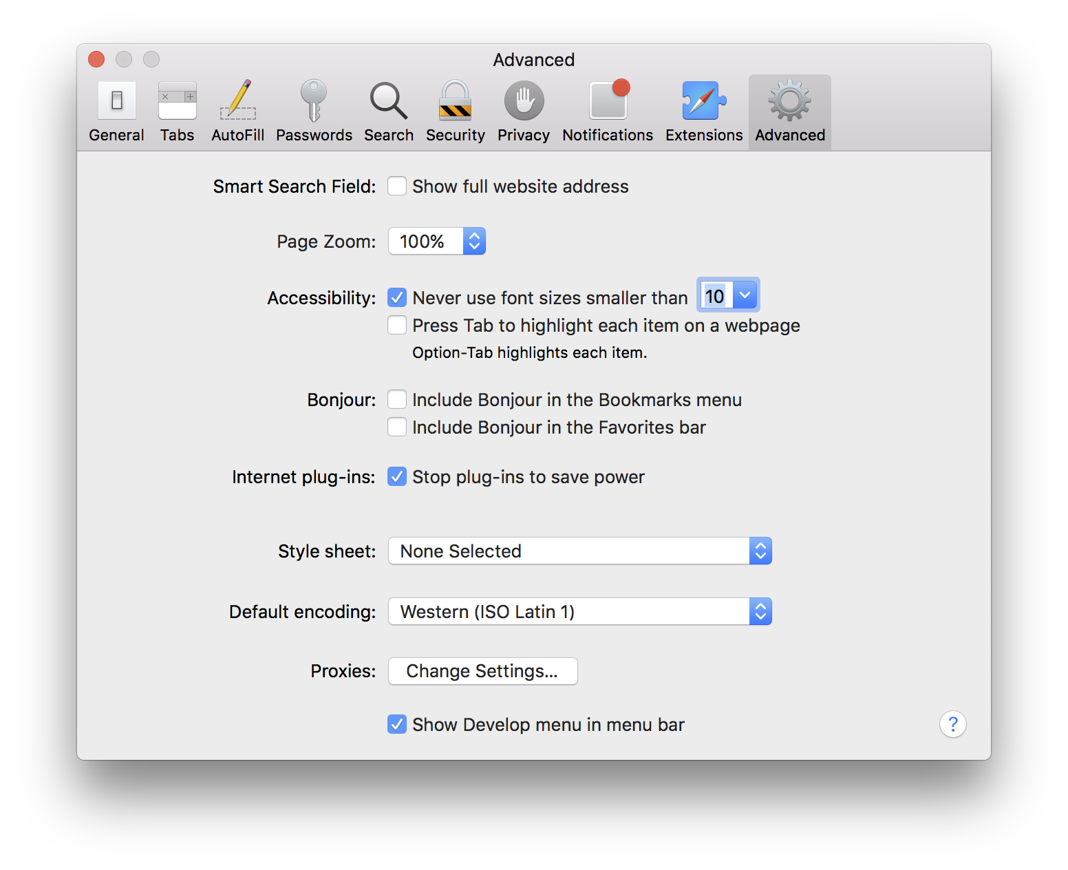
To enable the ability to change Safari's user agent you'll need to go to the Advanced Preferences pane and check "Show Develop menu in menu bar."

Robot Names

Why are robot names, by and large, so bad? It seems like it wouldn't be that hard to come up with some cool ones, or at least some not awful ones. Instead we get names that are downright embarrassing to say out loud. They sound pseudo-futuristic and ridiculous, or like something out of a bad fantasy novel. Here are some examples.

Horrible Robot Names

256px-HAL9000.svg.png

There have been, to my memory, only two decent, usable robot names.

Cool Robot Names

  • Computer (the  LCARS system from Star Trek, but they always just called it "Computer")
  • HAL

Seriously, those last two are the only ones I wouldn't feel idiotic addressing directly, with words issuing forth from my mouth, in a public setting. The rest? Feh! "Okay, Glass?" Really?

If we're to start using voice activated assistants and robots in our daily lives, I think we need to do a better job of making the process more natural and less awkward. You'd think the naming of the thing would be the first and easiest place to start. Apparently not.


Super Initial Impressions

Normally on Keynote Day I'm right there, but today was an exception. I have a perfectly nerdy excuse: SAN Installation. So I missed all of toady's Apple announcements. I've only skimmed the info on the new products, but I wanted to get down my very initial impressions.  

 Mac OS X Mavericks

The new  version of Mac OS X was announced today. The name is a little corny, but I have to admit it's catchy and it's already growing on me. Time will tell. 

Yes. I am excited about Finder Tabs.

Yes. I am excited about Finder Tabs.

Feature-wise, I audibly called out, "Finally!" multiple times while skimming the list. Don't get me wrong, I'm pleased as punch about a number of the new features — tags, tabs, books for Christ's sake, yes! — but really, what took you so long? Some of this stuff is great, but a little obvious and a bit of a reach. Makes it looks like Apple might be short on new ideas.

iOS 7

When Microsoft released its mobile OS a few years back I really liked the look of it: flat, simple, classy and downright minimalist. It was a terrific contrast to Apple's bouncy translucent eye candy. 

But now iOS 7 is taking a similar approach, and while the new look holds a certain appeal, I can't help feeling they borrowed the idea from Microsoft. I also worry they may have taken things a bit too far, with control screens that look more like software prototypes than actual working apps.

Does this button do anything?

Does this button do anything?

Again, though, time will tell, and reading about a product is by no means the same as using it. 

MacBook Air 

Each iteration brings the Air one step closer to a product I can use. This release is no different, with solid — though hardly surprising — gains in performance.

The real story here, though, is the battery life. A very competent computer with battery life that rivals the iPad? Very cool!  

Mac Pro 

Most of today's announcements were hardly earth-shattering. But the Mac Pro is just that

When I first opened the page I said to myself, "Why is there a picture of a giant lens? Where's the computer?" Slowly it dawned on me: That is the computer. 

Is that the barrel of a gun? No, it's a Mac Pro.

Is that the barrel of a gun? No, it's a Mac Pro.

From an industrial design standpoint, the new Mac Pro is a wonder. It's the sexiest thing Apple's released since the iPhone. It's straight up beautiful. But perhaps more important is the fact that it's geared towards professional computer users. Here you have an extremely beautiful, thoughtful, exciting product in a category most people had written off. Apple hasn't done something this exciting in this space for perhaps a decade. And I didn't think they ever would again. 

The new Mac Pro may prove me wrong.

I have yet to even look at the specs or talk to my pro user friends. But if the new Mac Pro is only a symbol, it could just be the sort of symbol pros need to take Apple seriously again. It's the first sign we've seen of Apple making something that at least looks amazing specifically for pros since Final Cut Pro X. We all know how that turned out. Or do we? 

Apple's stance on the pro market has been unclear over the past few years. The Mac Pro makes it a bit clearer. It remains to be seen what this machine's really all about. Does it have what it takes to win over pros? But it's heartening to see Apple making a real effort. Though only time will tell if it's enough. 

Either way, I can't wait to read all about it. Which is what I'll be doing for the rest of the night.

Happy Keynote, everyone! 


More Thoughts On Feedback

It occurs to me, as I think more about the problem of interface feedback, and as I ponder the things in computing that drive me bonkers, that the problem of feedback — when to let a user know that something has happened or that something is happening — seems to be one that's getting worse. I complained about it a lot in my criticisms of The Mac App Store, but it bothers me throughout a whole host of applications.

The browser, for instance: I often find myself clicking a link to a slow website — or maybe there's some other network hiccup — and nothing happens. Or at least that's how it seems. There actually is a subtle indication that I've successfully clicked, and it comes in the form of a pinwheel or a progress dial in the loading tab — what we used to call the Throbber back in the Netscape days — that tells me that, yes, I clicked and now the page is loading. But these subtle indicators are often lost on new users, or less tech-savvy ones. And, to be quite honest, they're often lost on me as well.

Links are small, and with the inaccuracies that tend to accompany touchpad use, I miss them a lot. This is especially true on pages like Facebook which often load new content just before you click said link, causing your link to shift position, thus causing you to miss it through no fault of your own and in a way that you might be completely unaware of. So it's important to know simply that you clicked. That you nailed it.

Clicking in one spot and then having to look in a completely different spot to see if I successfully clicked is not only inefficient, it's really annoying. It totally breaks my flow and it also doesn't make much sense except within the historical context of the Netscape-style Throbber. Why not make the progress indicator closer to the link you just clicked? Or cover the page with some sort of translucent graphic? Or use some sort of Heads Up Display?

The Finder is guilty too. The throbber for searches performed in a Finder window is a small radial line throbber in the status bar in the lower right corner of the window. By default, in Lion, the status bar is hidden, thus the throbber, too, is hidden by default. But even when visible, it's nowhere near the search bubble, nor is it anywhere near where the search results begin to appear. Unless you know that the throbber is there — and I certainly missed it for a long time — you'll likely be oblivious to its existence.

But, you say, search results appear so instantaneously, there's no need for a throbber. Well, sure, except when they don't. Say you're searching a network volume, for instance. This type of search is much slower since it doesn't rely on the local Spotlight database to perform the search, so results can take some time to appear. Also, without a throbber, how do you know when Spotlight has finished searching, particularly on a large volume with lots of results? Feedback, my friends. Feedback.

This should be the rule — and maybe it already is somewhere, but if it isn't it should be. If I click on something I should get immediate feedback that tells me simply that I successfully clicked, that I hit my target, and it should be obvioulsy apparent. Details beyond this, like what's happening now that I've interacted with my computer, should also be evident. But it seems like lately we're really falling down on the, "Hey, you clicked something," front. And it's been bugging me. A lot. Because in computerland, clicking on something and receiving no feedback whatsoever has always meant one thing and one thing only: it's broken.

Browser developers, OS programmers, you want to rethink an interface? You want to make a better mousetrap? Start there. Start with feedback. It's quite basic, but feedback is so very important to the computing experience. And while I wouldn't say it's completely broken, it, like everything in life, can always get better.

Long live the Throbber!

UPDATE: One reader has decided to begin recording every instance of radial throbbers he can find. Check 'em out at Samuel Henry's Space!

Automation and Feedback

One of my overarching problems with Lion, I'm slowly realizing, is that it's trying to do too much for me. Don't get me wrong, I think this is, in many ways, a good direction. I've long wondered why I had to save every document revision by hand. Isn't this a job a computer would be way better at than a human?

Indeed.

But the problem with the computer doing too much for me is really an implementation problem, and in the end it boils down to one main issue: communication. I don't mind the computer doing things for me, but I need to know about it.

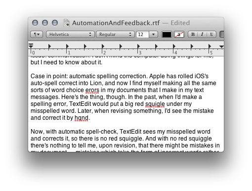
Case in point: automatic spelling correction. Apple has rolled iOS's auto-spell correct into Lion, and now I find myself making all the same sorts of word choice errors in my documents that I make in my text messages. Here's the thing, though. In the past, when I'd make a spelling error, TextEdit would put a big red squiggle under my misspelled word. Later, when revising something, I'd easily spot the mistake and correct it by hand.

Now, with automatic spell-correct, TextEdit sees my misspelled word and corrects it, so there is no red squiggle. And with no red squiggle there's nothing to tell me, upon revision, that there might be mistakes in my document — mistakes which take the form of incorrect words rather than misspellings, but mistakes nonetheless — mistakes made by the computer.

While I generally like auto spell-correct, I think it would be much improved with some sort of notification system. Perhaps a subtle highlight, or a blue squiggle, under every word that was corrected by the system. That way, when you go to revise your document, you can see where the computer has intervened and perhaps made an unfortunate word choice.

Extend that idea to Versions and I think I'd have a lot less to complain about with the versioning system as well.

Overall, I think there are some good ideas here in Lion. But there's definitely room for improvement.