Ass-Fucked by Flash and Java

I'm in a rotten mood lately. It's my time of year. Sorry for all the ranting and swearing. Keep your kids away for the next couple of weeks.

Right, then.

I've always been baffled by the use of the "Start" page or "Enter" page at the front of some websites. I mean, really, what's the point of these things? If I didn't want to start or enter the site, I wouldn't have gone there in the first place. And, technically, I've already "entered" the site simply by navigating to it. So, I've always asked myself, why the extra step?


The Enter Page: Get Ready to Take One in the Heiny
(click image for larger view)

Today I think I figured out the answer. The Enter page signals something subtle but immensely important: You are about to be fucked up the ass. When you click the Enter button, a series of things is about to happen. First, a new window will pop up. This new window will be of a size, position and aspect ratio of the site author's choosing, i.e. not of your choosing and probably as gigantic as possible. The URL bar, bookmark bar, tab bar and anything else you might rely on for browsing the web will be disabled. And this new, probably gigantic window will most likely be populated with... nothing, at least for the first few seconds, save for a "progress" bar (really, is this progress?), which is a sure sign that, yes, you've just been anally reamed. Congratulations.


Flash Progress Bar: How's Your Tookas Feeling Now?
(click image for larger view)

Eventually, the Flash will load and you'll be browsing the site in no time, and, like some sort of alien abduction, you'll have absolutely no memory of this violation. Next time you see that Enter button, you'll go right ahead and click it like nothing ever happened. And then later you'll scratch your head and wonder where all the rectal bleeding is coming from.

So this post is a warning to all you forgetful folks out there. If you see a Start or Enter page for a site, just remember: It's a trap! Don't click it! No good can come of it.

Someday you'll thank me.

Smart Folders Suck Ass

Rarely have I seen an interface or feature as useless or just downright broken as Smart Folders in the Mac OS X 10.4 Finder. Thought they might be handy, so I tried to make one. Here's what happened.

My goal was to create a Smart Folder that contained all my Final Cut Pro project files from the past year. In the Finder I clicked "command-f" to perform a search. A new window opened with some default search criteria pre-filled. I set the search location to "Home" and then set the "Kind" to "Others..." Next, I attempted to set up my "Kind" criteria to search for Final Cut Pro project files. Clicking the little arrow next to the text entry field brings up a list of document types. The list would seem to be rather exhaustive. It's huge. But the bad thing is that it seems to continually update, so as you begin to scroll through the list, it keeps jumping back to the top as the list is updated. Type-ahead find is also enabled, but again, even using type-ahead the list still jumps to the top. Too much typing and you'll get the beachball. All this makes the list of document types nearly unusable, or at least unreadable. Unless you know the exact name of the document type you're looking for, you'll be lucky to find it in this horribly broken drop-down. Fortunately I was able to correctly guess that the document type I was looking for was called "Final Cut Pro Project File." After typing this in, I got a list of all the FCP files in my home account. Okay. Great. Halfway to my goal, I saved the Smart Folder to the "Saved Searches" location and added it to my Sidebar (there are only three possible save locations for Smart Folders, by the way: Saved Searches, Desktop and Home).
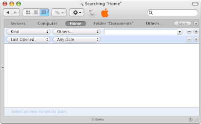

My New Smart Folder: Let the Ass-Sucking Begin
(click image for larger view)

So, I had a Smart Folder that listed all my FCP files, but I wanted to narrow this a bit to include only those FCP files from the last year. No problem, right? I opened my Smart Folder and clicked the Edit button. Again I was presented with search criteria at the top of my window. For my second set of criteria I selected "Created Within Last 1 Years." At this point the Finder beachballed for about twenty seconds, then restarted. Fortunately — and I use the term loosely — when it came back to life it had actually preserved my Smart Folder and I was able to save it.

So, finally, after much effort, I had my Smart Folder of all FCP documents in my home account, created in the last year. Neat-O! I decided to see what I could do with this list. So I opened up my Smart Folder, and started poking around. The first thing I noticed was that the list was ordered alphabetically. There appeared no obvious way to reorder the list. It was just a flat list of files, and a long one at that. It didn't even show labels.
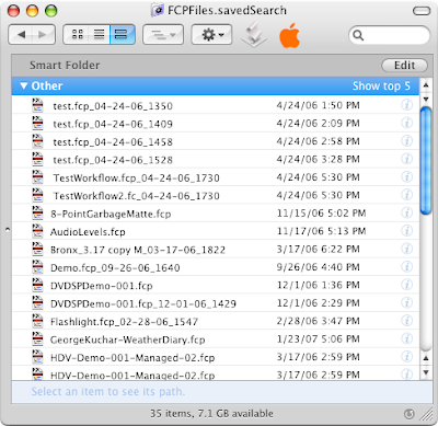

The Default Smart Folder View: Utterly Useless
(click image for larger view)

Fortunately, as it happens, switching to List view in the Finder window yielded a more useful view of my data, but it took me a bit of time to even realize I could do this.

The View Switch: Good Thing I Remembered This
(click image for larger view)

It's a little confusing that the default view in a Smart Folder is really quite limited in its usefulness. Why do they use the Spotlight view for this? The standard list view is just as user-friendly and a thousand times more useful. It's hard to believe this is an Apple-designed interface.
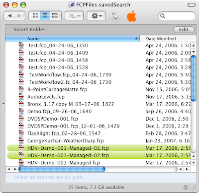

List View: Finally Something Vaguely Useful
(click image for larger view)

In the end, I'm not sure how useful my Smart Folder will be. Honestly, I've rarely found myself wishing I had this sort of functionality, and the confounding and oftentimes irritating user experience that is Smart Folder configuration doesn't really leave me with much desire to come up with a use for it. Nor does it instill much confidence that this view of my data is accurate. If Smart Folders can cause the Finder to crash, can I really trust them to accurately perform their searches?

Smart Folders are a neat idea. But I really think they're just one more area where Spotlight needs a ton of work before they can really be of much use. I recently read a description of Smart Folders as "underused." Yeah, well, maybe that's less because no one knows about them and more because they just plain ol' suck ass.

The Coolest Mistake

The new ModBook, from Axiotron and OWC, finally realizes a dream long held by Mac lovers: the tablet Mac. But seeing this Franken-computer in action only makes me realize that it's a product that's doomed to failure.

As cool as the idea of a tablet computer seems — and make no mistake, these ModBooks do look pretty cool — all I can think about when I see them demoed is how incredibly inconvenient they'd be to use for most regular work — for most anything I use my laptop for. What do I use my laptop for? Email, billing, troubleshooting, surfing, writing. Almost everything I generally do on my laptop requires text input, for which a WACOM is poorly suited. What do I not do on my laptop? Draw! Let's face it, the WACOM is a drawing tool, and I just don't think most people use a laptop for drawing. And I don't think they want to either.


The ModBook: Best Bad Idea Ever
(click image for larger view)

Graphics people tend to use desktop systems as their main rigs. There are a lot of reasons for this: they need a faster computer; they need a larger viewing surface; and, perhaps most importantly, they just don't want to draw or design on-the-go. Ever try to draw something in your sketchbook in the car? Or on the train? On a plane? It sucks. Drawing is not a portable activity.

So, the scenario goes, you buy this ModBook, and not only do you have to draw on this small screen, on this underpowered machine, but you also have to handwrite your emails, your terminal scripts, and your blog entries. The ModBook cripples both the functionality of a portable computer and that of a drawing tablet. It flies in the face of both these products' very reason for being. And it costs a bundle to boot.

I'm not sure what the intended market is for these machines. But I can say with almost 100% certainty that they will fail, because I don't think that market is very large, if it exists at all. The ModBook adds either a layer of complexity or a lack of functionality to everything you might want to use a tablet or a laptop for in the first place. I predict that graphics users will find it underwhelming, and regular users will find it frustrating. Who does that leave? Um... People with a lot of expendable income for electronic toys they'll never seriously use. A novelty market at best.

It's almost too bad the ModBook was released alongside the iPhone. The iPhone shows us real and good reasons to use a touch-screen interface on a portable device, and some really brilliant and innovative ways to implement this. It totally shows the ModBook up. Compare the two, and the ModBook comes up looking like a product without a purpose.

Apple was right when they said that no one would want a tablet computer. Seeing the ModBook only drives the point home. With a vengeance.

Why did we want that again? I forget.

Yes, I Want One

That's all I really have to say about it. I totally, unreservedly want an Apple iPhone. It will most likely replace my aging 867MhZ PowerBook. And my cellphone. And my wireless provider. And my iPod. And my portable hard drive. And... And...

Yeah, I want one.


The Apple iPhone: Completely Exceeded My Expectations
(click image for larger view)

Build It Ugly

Anecdotal evidence suggests that the perception that Macintosh computers are more expensive than comparably equipped computers from other manufacturers persists to this day, despite the fact that this has not been true for several years now. Steven Frank recently wrote:

"Despite recent dramatic price drops across Apple's line, I still hear from beloved but uninformed relatives that Macs are "too expensive". It's a stigma that they seem unable to shake, even with raw numbers in your face demonstrating that the Mac is equal to or cheaper than a similarly equipped Dell."

Most Mac users — and non-Mac users in the know — can tell you that Macs, for what they offer, are very reasonably priced. Yet the stigma remains.

I believe the reason for this is that Macs just look damn nice. People take one look at a Mac and just instantly assume that it must be expensive, because no computer — hell, no product — could look that good and cost the same as something less beautiful.

If Apple is ever going to shake the perception that their computers cost more, they're going to have to build them uglier. Actually, I think they should come out with a whole new budget product line. Encase everything in cheap, shiny, silver plastic — you know, that chromed shit that just looks and feels awful and flimsy. This should cover 90% of the machine. Some flashy lights and extra, useless buttons would be a good touch too. Latches and ports should also feel cheap and sport gaudy colors. Display hinges on portables should be stiff and unyielding. Maybe the Mac OS X interface should uglied-up a bit too. The display itself should, of course, be ultra-glossy.

Call it the UglyMac.


The UglyMac (Mock-Up): Same Price as a Pretty Mac, but Uglier
(click image for larger view)

Of course, the price points for this budget line would be pretty much the same, because Macs are already sold at an average market cost. But the perception that they cost more would almost certainly dissolve. Finally.

There you go. Problem solved.