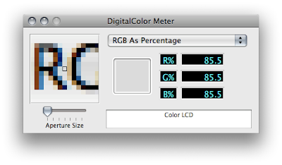
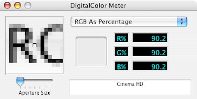
It's not a difference you'd probably ever really notice, but Leopard's standard menus now use color to create the dark gray text you see throughout the interface (though not in the menubar).
I'm not sure the reason for the change — perhaps to add a warmth and a softness to the text.

Leopard's Menu Text: Now in Full Color
(click image for larger view)
UPDATE:
John Gruber has the answer over at Daring Fireball, actually. Turns out this is nothing new and not a difference between Leopard and Tiger. What you're seeing here, generally, is the difference between standard and sub-pixel anti-aliasing, two techniques for anti-aliasing text. What you're seeing, specific to my two computers, is the difference between the "Standard" and "Light" Font smoothing style settings in the Appearance Preferences. "Standard," as you might guess, uses standard anti-aliasing — i.e. shades of gray — to anti-alias text, whereas any of the other settings use sub-pixel anti-aliasing, which uses color to achieve the same effect. Turns out I've always preferred standard, even on LCDs. Weird.
More details here.

