There's been no shortage of commentary on Leopard's 3D Dock, mostly because it's just ugly as Hell. But that's fixable.
There's been almost as much bitching about two other new visual changes in Leopard. The first is the menubar, which is now translucent. I'm ambivalent about this one. On the one hand, I understand that, from a usability standpoint, it's a bad idea. It's now slightly harder to read a primary interface element under certain conditions, those conditions being, in particular, the use of busy Desktop pictures and/or patterns. The default Desktop picture for Leopard, in fact, is an image of outer space whose star field can directly compete for visual attention with text in the menubar. My argument to this, however, is that busy, distracting, high-contrast Desktop pictures are a far greater hindrance to usability than slightly-harder-to-read menubar text, and if you're really bothered by the menubar changes, you should probably switch to a nice, solid or muted Desktop background and remove all distractions from your life once and for all. That's what I do and, so, while the I understand that translucent menubar is not the best idea for usability's sake, it really just doesn't bother me in the least. Actually, I kind of like the muted, lower-contrast lack of in-your-face-ness of the new menubar.
The other big gripe has been about pulldown menu transparency. No. Seriously. David Pogue of the New York frickin' Times for Pete's sake:
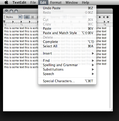
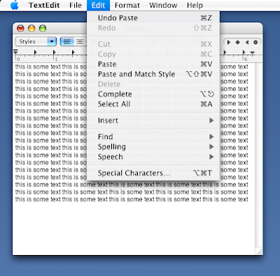
The most serious misstep in Leopard is its new see-through menus. When the menu commands — Save As, Page Preview, whatever — are superimposed on the text of whatever document is behind them, they’re much harder to read. Often, Apple’s snazzy graphics are justifiable because they make the Mac more fun to use. In this case, though, nothing is gained, and much is lost.
This one I don't get. Pulldown menus have been transparent in Mac OS X for a long time. (Oh, wait. I mean forever!) The difference between how Tiger deals with them and how Leopard does is extremely subtle.
And Leopard does away with the pinstripes, which to my mind is a huge usability gain. At worst we break even here.

Leopard Pulldown Transparency: A "Serious Misstep." Really?
(click image for larger view)
UPDATE:
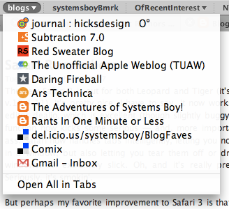
Oddly, Firefox's group bookmark pulldowns exhibit the old-style, non-blurred menu transparency, minus the pinstripes of course. I can't find another application that does this. Weird.


