I recently complained about the the Lion Finder's iOS-style toolbar buttons, which look like the sort of slider-style switches found on iPhones and iPads. This metaphor works great on those touch interfaces, but to my thinking isn't so well suited to the mouse-driven desktop OS.
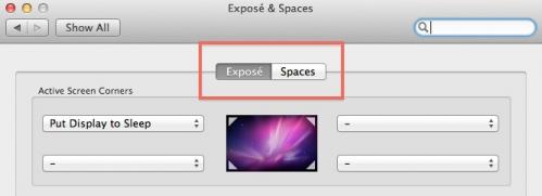
Well, it looks like someone at Apple has agreed, at least where such buttons are used for Preferences sub-panes:
I much prefer the standard sub-pane buttons for an OS in which clicking — rather than gesture — is how interaction will occur. It just makes sense.
I'm glad to see this reversion. It may be small and subtle, but this is a change for the better.
And I love that Apple still thinks so hard about these things.


