The founding article for this blog — indeed, the very reason for TASB's existence — was a little post called "Tiger Beefs" in which I ranted for a few thousand words about everything I disliked about Tiger. It's been over two years since that faithful first post, and Apple has just released the follow-up to Tiger, Mac OS X 10.5, codenamed Leopard. Please note the absence of the word "beef" from today's title. So far, I have to say, I'm quite pleased — and certainly not deeply irritated — by this latest OS iteration.
Right off the bat I want to point you to the best and most thorough review of Leopard. Every time a new cat is born, John Siracusa not only reviews many of the new features, but goes deep into the depths of the OS to tell us geeks what's really changed and what it means for the future of the platform. It should be required reading for anyone seriously interested in Mac OS X changes.
Also, I want to point you to Apple's infamous list of new features. It's pretty comprehensive for the surface features, and even touches on some of the things I'll deal with here. And speaking of, my particular perspective on Leopard will be less about productivity features (though there will be some of that, to be sure) and more about Leopard from an administration and maintenance standpoint. So, let's get started!
Time Machine
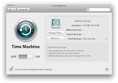
The most highly touted new feature in Leopard — and rightly so — is Time Machine, which automatically makes backups of your data to any external hard drive (or even, I'm told, partition). The whole idea behind Time Machine is that it's so simple, and requires so little thought, that anyone can — and, more importantly, will — use it. It's backups for the masses. And while Time Machine is really made for the end-user, the fact that such a beast now exists as part of the OS is a huge boon to SysAdmins.

Time Machine: Drop-Dead Simple
(click image for larger view)
I maintain a backup system for all staff members in my department. Anyone who's ever had to deal with such a system knows what a pain it is to implement and maintain. In the old days, we used to back up to tape using Retrospect. But as data storage became increasingly large, and tape increasingly expensive, the system grew unwieldy. An unwieldy system, as you surely know, is not reliable. A few years ago (in fact, with the introduction of Mac OS X, come to think of it) we moved to the free, scriptable, and very reliable rsync (we use the RsyncX version). This allows us to back up over the network to a large RAID drive. But still, the scripts require occasional maintenance, staff must be sure to leave their computers on. There are numerous points of failure. And most inconvenient of all, if a staff member does lose data, they have to come to me to retrieve it, which is inconvenient for both them and me.
Time Machine removes that last step from the equation. Time Machine puts the end-user in control, not just of their current data, but of their backups as well. Now, if a staff member accidentally throws away a file, or makes changes they don't like to a document, or whatever, they simply activate Time Machine and roll back. No freak-outs. No calls to the SysAdmin. No worries. Time Machine is frickin' beautiful.
I will continue to make backups to the RAID with rsync for the foreseeable future. It doesn't hurt to have an extra backup, and, Hell, the system's already in place. But I've also bought all staff a firewire drive specifically for Time Machine as well.

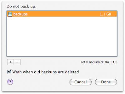
Time Machine: Limited Options
(click image for larger view)
One thing to note about Time Machine: It is geared towards the idea of backing up everything. Like in Spotlight, you can add exclusions to Time Machine, but the default is to back up all your data. A fellow SysAdmin complained that he needed the ability to select what would be backed up, not what wouldn't, if this were to be useful in a production environment. Yes, my friend, but this is not made for production. It's made for people. So the default is, back up everything. What could be simpler?
The Finder
I won't spend too much time on the Finder. In a nutshell, I'm mostly happy, though I'm a bit peeved that the first thing I felt the need to do was hack that ugly-ass Dock.

The Dock: Ugly-Ass
(click image for larger view)
Seriously. Ouch. I can see liking it on first glance. I mean it is shiny. I know people like shiny. But damn is it intrusive, and not the least bit of an increase in functionality. Yikes! What were they thinking?

The Dock: Now That's Purdy
(click image for larger view)
There are a few awesome new touches in the Finder, though. Quick Look is probably my favorite. Hitting the spacebar to view a preview of a document is a great productivity boon. Students in the art department where I work will love it for presentations as well. It's beautiful, useful and extremely well-implemented. I only wish it were more key-command-able. (Or maybe we'll discover that it is.)

The Finder: Quick Look
(click image for larger view)
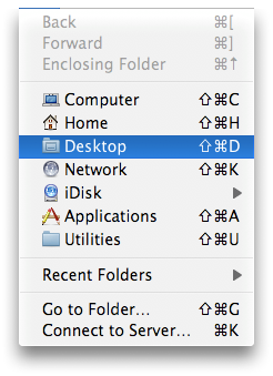
Speaking of key-commands, the Desktop now has a presence and key-command in the "Go" menu (it's command-shift-d). Sweet!

Go Menu: Go Desktop!
(click image for larger view)
Also, a long-standing (read: never solved) problem with Tiger's inspector, wherein the inspector would not properly update file ownerships, has been fixed.
I also rather like the look of the new Finder. I'm pleased as punch that there's finally a window standard, and that it's not brushed metal. While I'd probably prefer a lighter shade of gray, and apps in the background to be darker rather than switching to a lighter shade (dark recedes; light comes forward, at least that's what they always told us in art school), the current iteration is really quite nice. The Sidebar is also, in my opinion, more efficient than it once was. And Cover Flow in the Finder might even prove useful at some point.
Other nice touches:
- Clicking on a file name only highlights the file's name, not its extension, thus making file renaming a lot quicker and easier.

- Drop shadows are larger and darker and generally more dramatic, making windows easier to discern.
- Drop shadows are also now included in screen captures of individual windows.
- File sharing, which is now possible on a per-folder basis (hooray!), can be activated and configured right from the Inspector.
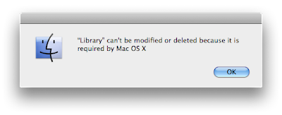
One oddity: the Finder seems to be a bit more fascistic about what you can and can't do with your data. In fact, it disallows trashing key folders in your home account. I was unable to trash, or even rename my Library folder from the Finder. This might be great for the home user. But it could slightly complicate troubleshooting from an admin standpoint. Not a big deal, but I'm not crazy about the trend towards over-management of user data. It's fine for Time Machine. Not so sure about the Finder.

Finder: Data Nazis?
(click image for larger view)
Still, that's a lot of good and very little bad. Overall, the Finder's a big win for me.
Disk Utility
Probably the best thing about Leopard is that there is so much good stuff for SysAdmins. Each OS upgrade has brought us a couple goodies, but Leopard is chock full of them, and the goodies are so... Uh... Good...
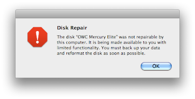
First off, Leopard now handles broken disks more gracefully. Attach a damaged external firewire drive, for instance, and if it's mountable, Leopard will mount it and allow you to copy any data that might be salvageable. This actually happened to me in the beta days, and Leopard provided successful, albeit partial, disk recovery where Tiger simply refused to even mount the damaged drive. That's a pretty sweet improvement that no one but SysAdmins are likely to see. Kudos to Apple's Disk Utility team for that one!

Disk Utility: Plays Well with Broken Disks
(click image for larger view)
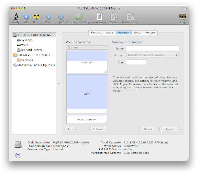
Another huge advancement in Disk Utility is the ability to re-partition a drive without wiping it, within limits, of course. Actually, it might be more accurate to say that Disk Utility allows partitioning — or splitting — of partitions. Let's say you have two partitions. But you want to turn that into three. In Tiger and before you had to erase the entire drive and repartition. In Leopard, you can cut one of your two partitions in half (or quarters, or whatever). Leopard will even indicate the free portion of the disk and cut it at the right point. It's pretty damn cool, and something I've been wanting for a long time. For forever, really. I've already used it in the beta, and it seems to work great. Cool!

Disk Utility: Splitting Partitions
(click image for larger view)
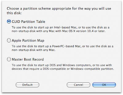
The one caveat to this dynamic partitioning is that the disk must be formatted using the GUID partition map, which Apple has adopted for the move to Intel. It's GUID that makes all this possible. The old style Apple partition map won't allow non-destructive partitioning.

Disk Utility: GUID is the Wave of the Future
(click image for larger view)
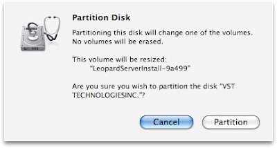
The final touch in Disk Utility — and actually, this appears to be true through much of the new OS — is that the wording of dialog boxes and information panels has been made much clearer. This should do a lot to make scary disk operations a bit less scary.

Disk Utility: Clearer Language
(click image for larger view)
Directory Utility
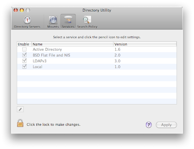
The application formerly known as Directory Access gets some love in Leopard too. Now called Directory Utility, the application does more with less. It's simple, four-tab interface still allows the configuration of services, but there's just a lot less to configure. The only services left now are Active Directory, BSD Flat File and NIS, LDAPv3, and Local. Gone are the services that were never really configurable in the first place, save for turning them on and off.

Directory Utility: Do More with Less
(click image for larger view)
But Directory Utility allows for the configuration of Directory Servers now in a separate panel, and this is where you'll most likely set up your Open Directory server (though the option still exists in the list of services as it always did). Setup is super simple: check the type, and enter the name. That's it!
Directory Utility now also has a panel for configuring NFS mounts. This is also really easy to use. Simply type the path to your NFS server, and type in the mount point. Directory Utility will verify that the server is functioning and then, when you hit apply, it will mount it. Neat-O!
NetInfo (RIP)
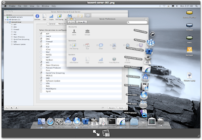
NFS mounts were once handled in an obscure admin utility called NetInfo Manager. NetInfo Manager is now dead. Leopard has moved all of its arcane functionality into other more GUI-friendly apps. Directory Utility handles NFS mounts. The Finder and Sharing Prefs handle per-folder file sharing (which was once the domain of a little app called SharePoints, which configured properties in NetInfo). And home account location can now be configured by using the Accounts Preference Pane and control-clicking the account in question, then choosing "Advanced" and selecting the appropriate options. It's true, I can't think of too many more reasons to go to NetInfo Manager.
But wait... How do I activate root?
AutoFS
autofs is the new automounter daemon in Leopard, and boy is it cool. I've watched with envy for years as my Linux counterparts dynamically mounted NFS shares — or folders within NFS shares — as they get called by the OS. I realize that autofs does a great deal of good for hangs caused by network dependencies, but what I'm most excited about is the dynamic nature of autofs. Prior to Leopard we used automount, which I simply could never coax into doing what autofs does out of the box. With automount, we basically just hard-mounted our NFS server at /home at every boot. With autofs, however, we can specify a wildcard in our map file. What that allows us to do is to never keep the entire NFS server mounted, ever, ever. Instead, when the needed share is requested, autofs mounts the portion of it that was requested.
Perhaps an example is in order. Currently, our NFS server gets mounted in its entirety at /home on every client in the lab. This happens using an arcane Startup Item that contains a truly Byzantine script that I made. It's horrible. Not only does it require this crazy-ass script, it only happens at boot or when automount is specifically restarted. It also requires (for reasons I can't recall) a series of symlinks to land in the /home folder properly. And, worst of all, it keeps the entire home account server mounted over the network on every client all the time. Yuck!
By contrast, autofs requires no such Startup Item. You simply edit one tiny text file (/etc/auto_home, if you're interested) and you're done. Not only are you done, though, but the entire process is now dynamic. No reboot required. In fact nothing happens. The home account server doesn't mount... Until it's called! That's right. No home account server is mounted until joe_user comes and logs in. When that happens, autofs springs to life and mounts the user's home account. And here's the other thing: it only mounts the user's home account, not every folder on the share. This is a huge savings in terms of network overhead. It's also much easier for me to maintain and manage. For me, a working autofs is a huge, huge deal, and it's the thing I'm most pleased about. SysAdmins doing any kind of NFS home account mounting will totally understand where I'm coming from here, I'm sure. This is fantastic. My job just got easier, and my network and Mac systems just got a helluva lot more efficient. Awesome!
Other Notables
There's a whole other list of new features that should make SysAdmins and even regular folk pretty happy. Here are my faves, in no particular order:
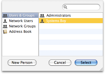
- Preferences and applications (i.e. Sharing, etc.) that can be applied to specific users now list network users and groups.

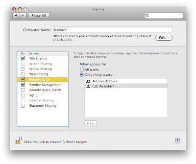
- Login, remote login (SSH), and file sharing are all now configurable on a per-user/group basis.

- The firewall is now configurable on a per-application basis.
- There is now a built-in guest account that gets deleted at logout.
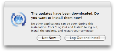
- Software Update now logs you out for certain updates where your presence might cause problems.
- Software Update now remembers what it's downloaded and will use that if you postpone an update, rather than having to re-download it.
- iCal event entry doesn't suck as bad now, and is reminiscent of Google's method of contextual calendar entry.
- Dictionary now includes Wikipedia and can easily toggle the three views (dictionary, thesaurus and encyclopedia) or view them all at the same time.
- Spotlight works well now, like it always should have.
- Spaces might actually be useful as well!
- Screen Sharing! For free! Cool!
So, that pretty much covers my initial impressions of Leopard. We'll be holding off on installing it in the lab until I can run the majority of major applications (currently, AfterEffects is listed as not working, and that's a deal breaker). Until then, I will run it on my test machine.
And happily. Leopard has been extremely stable and reliable so far, and I must admit I really rather like it. I was never a big fan of Tiger, actually. I found everything "cool" about it to be buggy or annoying. Spotlight sucked, Dashboard was stupid, and there were all manner of problems, and few features to recommend it over Panther, at least not from a SysAdmin standpoint. Leopard, on the other hand, is completely the opposite. There are tons of new, useful features for both users and admins alike. So far, I'm very happy with this release.
Nice job, Apple people!
