Twitter: No, I Fully Admit, I Don't Get It

The buzz around Twitter is, frankly, reaching a pitched and utterly annoying frenzy. Some of the latest stuff I've read, though, has inspired me to add my voice to the throngs. Yes, that would be you people.

Now let me start by saying I don't use Twitter. I don't even have an account. And this leads me to my first beef about Twitter: the barrier to entry. "Come on!" you say, "All you need is an email address and a password." Yes, This is true. But in a world where a user such as myself already has about 80 trillion user accounts, and about 20 trillion of those are in now-defunct, out-of-style, unused social networks, one starts to think a bit more carefully about signing up for anything at all anymore. I mean, Jesus, I still get email from Friendster. Fucking Friendster! And don't even get me started on the whole online dating thing. Suffice to say, I've been doing this for a while now, and I've gotten gun-shy.

Twitter

But the other, bigger, more hidden barrier to entry — the one no one talks about much when they talk about Twitter — is the fact that to Twitter "properly" takes a certain kind of work. It's not like starting a blog; you can't just start Tweeting in a vacuum and hope to get anywhere. No, Twitter requires effort and strategy. Effort in the following of other Twitter users and, eventually, strategy in being followed by other Twitterers. It's not that I mind work — I certainly do my fair share of it — but the goal of Twitter work seems to be following and/or being followed. And I've never been much of a pack animal.

A friend of mine, who has also been reading about, but so far refrained from joining, Twitter, recently remarked (in a Facebook status update, no less):

"I've been reading about this for the past couple days and it seems to me what Twitter does is take educated and mobile people who would form a kind of elite regardless of the technology of the day, and offers them another way to seperate [sic] themselves from the masses while at the same time allowing them to assert that they are in fact very well-connected."

This describes a feeling I've had for some time about Twitter, but have been unable to put into words. Twitter has an air of exclusivity that I find off-putting. Defensive article titles like, "Twitter Quitters Just Don't Get It" don't do much to ameliorate that feeling. And so, something that at it's heart is perfectly benign, and potentially even useful or entertaining — an extremely micro micro-blogging platform with a small per-post character limit — has become something that fosters a certain sense of resentment from those of us who choose not to partake of its offerings. If there's been a Twitter backlash, it's probably largely due to the defensive posture of its users. And I believe it's partly this posture that my friend is talking about.

Facebook

It seems to me that the other part of my friend's argument — and the other part of my hesitance at signing up — is context. Like I said, I'm kinda burnt out on the whole social networking thing. But I recently joined Facebook just the same, and I've stuck around. And the reason I can stomach Facebook is context. When you sign up for Facebook you immediately have a context, and that context is your friends. What better context could there be? Everyone wants to stay connected with friends, and Facebook handles this better than any social network I've used so far. I think Twitter's lack of context, while certainly being part of its charm, is another barrier to entry for many. For the technologically savvy (which I consider myself to be), and for those inclined to experiment with social networks in general (which I no longer consider myself to be so much), the lack of context is far less vexing. And those seem to be just the sorts of people using Twitter — the elite my friend is referring to. They seem to have figured out a way to make Twitter genuinely useful. For them. But by outward appearances, Twitter's context seems to be less about staying connected and more about appearing clever amongst a group of peers.

Tweetie: A Twitter Client

To those elite Twitter lovers though, I say bully for you. You get on that Twitter client-of-the-day (I must admit, some of the client apps look beautiful enough to make me want to join purely from an interest in interface design) and you tweet your little hearts out. I bear no grudge against this. I just personally have no desire to be any more connected than I already am. I don't see how Twitter will be useful or enjoyable for me. I don't get Twitter, and I'm pretty sure I just don't really want to.

And bully for me too. 'Cause guess what? I don't get Flickr either. Or MySpace. Or feed readers. In fact, there's a whole lot of stuff I don't get.

And all the snide little articles in the world aren't going to change my mind.

Allow Me to (Re)Introduce Myself

My name is Systems Boy. Hi there.

We have a new look today. It's based on a WordPress theme called Blue by Sean McPherson of Brambling Design. I've taken some liberties with Blue, enlarging some of the fonts, changing some colors and widening the post area. But the basic look remains the same: clean, simple, but still kinda fun. I really like it.

I've foregone the traditional Systems Boy logo this time out. I love it, but it can be a pain to deal with and many themes don't easily allow for banner images. Plus, I like the idea of preserving the simplicity of the Blue theme and sticking to designing mainly with text.

systemsboy

As so often seems to happen (by which I mean twice), today's new look coincides loosely with the anniversary of the blog, which is May 29th. This year TASB turns four. Wow. Four years. I never thought I'd be doing this for so long. And still liking it no less.

Today's makeover was also at least partly inspired by fellow systems blogger Jay Young, with whom I share very similar tastes in themes. Seems every time I go to use one he's already grabbed it, forcing me to go my own way.

Anyway, thanks to everyone who stops by. Your visits are always appreciated.

Enjoy the new look.

Design vs. Data Redux or: Apple and Tandy

I got a number of great comments on the recent post on Design vs. Data. But my favorite by far was on the subjectivity of design and aesthetics:

"The way things look is important, but the way things look is also *subjective*. Terribly so. I have a Macbook Pro and I think it looks like something Tandy would have come up with in 1979. Really, that whole slightly rounded silver design is TRS-80 style."

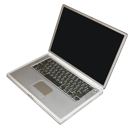
It's true that a comparison can easily be drawn between, say, my beloved titanium PowerBook:

Titanium PowerBook

And the TRS-80:

Tandy TRS-80

It's also true that which design you prefer is a very personal thing.

But I think my point was less that Google's apps look crappy, and more that the crappy (in my view) look of their apps (among other things) makes me think that they don't regard design highly, and that if they did hold design in higher regard they could innovate even more than they already have, and make even better products. I assume Google is a company always on the lookout for ways to improve. I'm arguing that a stronger focus on design is one direction that might lead to better products.

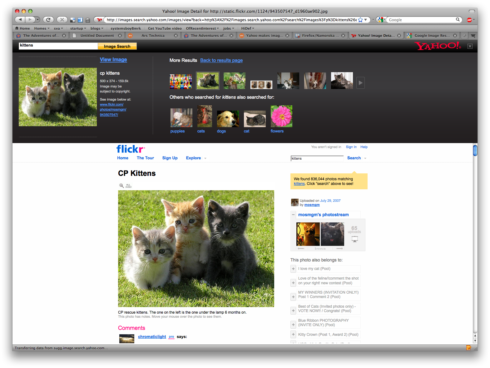
Today I was struck by an article over at Ars Technica about Yahoo's new image search preview page. Typically in search engines, clicking on an image in a list of image search results brings up a page that has a frame at the top that contains the image, a link to it and some info about it, and the page that actually contains the image in another frame beneath it. Yahoo has decided to make that upper frame actually useful by granting it some new capabilities, namely, a preview of the next search results and a group of related searches. What's instantly notable is how beautiful the search result frame looks:

Yahoo's Image Search Results

Clearly, Yahoo is paying attention to design, and I would argue that it's this attention that has yielded not just better looks (again, to my eye), but greater functionality. The upper frame is visually distinct from the referring page through the use of color. The use of imagery, layout and color and font choices clearly delineate both what the upper frame is and what it does. Contrast this with Google's search result page:

Google's Image Search Results

It seems clear to me that Google has not given a great deal of thought to the design of their frame, especially when seen next to Yahoo's version. Google's result frame is both less appealing and less distinctive. It is not readily apparent why the frame exists or what function it provides. Nor does it provide much function at all. I maintain that even if Google were to implement the sort of functionality that Yahoo has incorporated into their search result frame, were they to continue to ignore design to the extent that they have their result frame would be significantly less usable than Yahoo's. I also can't help wondering if Google's lack of design sense may even prevent them from coming up with ideas like the ones present in Yahoo's version of the search result frame, though on this I can only speculate.

So, not to beat a dead horse here, but I did want to reiterate what I was trying to say in Design vs. Data, and point to a rather striking example of it. I think Yahoo's search result frame is just swell, and I would guess that it's at least partially the result of a design sensibility.

Alarms: The Downside to Calendar Syncing

I'm thrilled to have all my calendars centrally located and synced after all these years, I really am. But there is one minor downside: email alarms.

To explain: let's say I have a calendar called "Birthdays" (which, in fact, I do). That calendar lives on a server (Google's, to be precise), and all my computers read and pull birthday information from it. Great. Just as it should be.

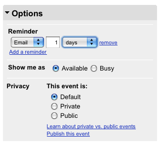
Now let's say my mom's birthday is coming, and I don't want to forget about it. So I add an alarm (or, what Google calls a "reminder") for the date — an email that will get sent 24 hours before Mom's big day. Now, a day before Mom's big day, Google's server will see the calendar alarm and send me an email reminding me of the upcoming big day. Awesome. Very handy!

gcal-reminder

Unfortunately, Google's server is not the only computer that's aware of the alarms.

As I said, all my other personal computers (or, "PCs," as their sometimes called) are aware of my Google calendars. I use iCal on my laptop, for instance, to subscribe to my Google-hosted Birthdays calendar. I do this on my work computer as well. And on my home tower. Each time one of these systems loads the Birthdays calendar it also loads the alarms. And, as one might (or might not!) expect, it acts on them. So each system that loads my Google calendars also sends out any alarms that have been set up. That means that I get no fewer than four emails reminding me of Mom's big day. And in my case, I send out two emails per birthday — a heads-up one day before, and then one on the day of the event. Do the math. That's a lot of emails.

Well, at least there's no danger of forgetting, I guess.

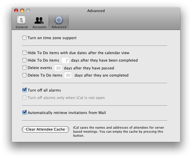
The good news is, there does seem to be a cure, though it might not work for everyone. iCal has two preferences that apply to this problem under its Advanced preference pane. They are: "Turn off all alarms" and "Turn off alarms only when iCal not open." The former will cause iCal to ignore all alarms. This is great if all your calendars are online (which mine are, luckily). But if you still have some local calendars with alarms, those alarms will not get sent. In that case, the latter may be a better choice as it will only stop alarms being sent when iCal is closed; open iCal and you should get your local alarms.

iCal Advanced Preferences

This could still be a problem for folks with a bigger mix of local and server-based calendars who really rely on local alarms, and in some ways it forces you to choose between one approach or the other. Ideally, iCal would offer a third option, something like "Disregard server-based alarms." But I'd say for the vast majority of users there's a solution here.

On a side note, this problem has been bugging me for a while. I discovered the fix during the writing of this article, and I'm pretty glad about it. It's just one more advantage to having your own blog. Shweet!

UPDATE:

Reader augmentedfourth posts in the comments an option I'd totally forgotten about, namely that alarms for individual subscribed calendars can be disabled locally as well. Simply locate the calendar in the sidebar, select it and choose "Get Info" from the file menu (or hit command-i). In the dropdown you'll see an option to disable alarms for that calendar.  Click it, and there you go.

Coda and Espresso

I've been tasked with building my first ever, real live web application. And I'm loving it. It's a classic but fairly simple HTML/CSS/PHP/MySQL deal. Perfect for learning the sort of basic web programming that I've been wanting to learn for quite a while, and just the kind of puzzle that gets me excited. In the course of its development I have, understandably, become interested in refining my workflow. And so, one-window site editing applications like Panic's Coda have been on my radar.
Coda

Actually, even without a web project, Coda's been on my radar as an interesting application design for some time, so this project was a good opportunity to give it a real spin. But when I initially tried Coda I dismissed it. I'm not entirely sure why. It could be that I hadn't gotten far enough along in my process to really understand how it works. Or maybe it was all just too much; maybe I was overwhelmed by the sheer scope of the app. It does a lot.

I'd eventually settled on editing my site over the network using Transmit (also by Panic) as my FTP client (I had to forego Yummy FTP for this as it's much slower editing over the network for some reason), TextWrangler as my HTML/CSS/PHP editor and Firefox and Safari as my preview browsers. (I'm using Sequel Pro to manage my databases, FWIW, and it's been terrific.) I've actually been pretty happy with this combo. It's lean and mean, mostly free, and fast and easy to use. But it's clumsy and requires that I keep all these different apps open. Apps that can eat up a lot of RAM and processor cycles and slow things down in general. It also requires switching contexts as you switch from one app to the other, which can also bog down the process somewhat.

With the recent release of Espresso, a new one-window, do-it-all website editor from MacRabbit, the makers of the beautiful CSSEdit, I decided to revisit the realm of one-window website editors, hoping that a comparison between Espresso and Coda might help me better understand the utility of these types of apps. So I sat down with my site and began a side-by-side comparison, taking note of the things I loved and hated in each. What follows are my random notes and observations.

Espresso:

  • Love the sidebar/tab bar, particularly the Workspace

    The sidebar contains the site — the hierarchy of files you're working on — as well as a "Workspace" of frequently accessed documents. Very handy!

  • Like the Project concept

    This is sort of the main conceit of these apps: each site is a "Project" and can be fully accessed from a single Project window.

  • Hate that servers are per-project and can't be reused

    Every time I set up a Project I have to enter the server information, even if another project is using the same server. There are no server bookmarks of any kind.

  • Hate that there's no way to see the file path of a given file

    While Espresso's contextual menu does contain "Reveal in Finder," and there is a beautiful icon that tells you if a file is on a server, there's no obvious way to quickly determine the path of any given file. I don't know about you, but I have lots of files called "index.html" on my server, and I need to know which is which. The only way I can see to do this is to command-click on the document icon in the title bar. Inconvenient!
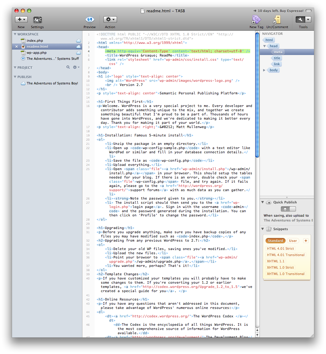
    Espresso's Main Window: Workspace, Editor and Navigator

  • Love the Live Preview

    Espresso's "Live Preview" is pretty much a browser window that will update as you make changes to any given page. It can be open in its own window alongside your site editor or in a workspace inside the main window. Crucial, in my opinion, for any kind of one-window site editor, and a pretty nice implementation.

  • Hate that you can't see HTML DOM structure in Live Preview

    I'm really getting into DOM inspectors, those things that let you rollover the sections of a page and see what part of the code they live in. I can get one of these for Firefox. I miss having one in Espresso.

  • Love style sheet overrides

    Style sheet overrides are really cool. Setting a style sheet override allows you to see what a page will look like using a different style sheet. I'm not sure how much I'd use it, but I can see where it would be immensely handy.

  • Love snippets

    The Snippets window is a place where you can drop frequently used code for later use. Love this, and Espresso's implementation is beautiful.

  • Love the Navigator

    Unique to Espresso is its "Navigator" on the right side of its main window. The Navigator lets you highlight whole blocks of code. Say you want to highlight the meta code on an HTML page. Just select the whole thing with one click using the Navigator. Nice!

  • Love code folding

    Code folding allows you to hide away code that you're not actively working on in a page. Got a long PHP script in your page, but you only want to look at the HTML? No problem. Just activate code folding for the relevant chunk and the PHP will roll up into a bubble on the page. This is great for coding big, complicated pages.

  • Love that there are key-commands for indenting, outdenting and commenting

    This is common, I know, but after having it in TextWrangler I don't think I could live without it.

  • Not sure why Settings is called "Settings" when it only contains server settings

    Perhaps more will go here some day, but right now it's only server settings. Why not call it "Server Settings?" Or "Servers?"

  • Hate, hate, HATE the fact that there is no color palette

    I guess I'll just have to memorize all those hex codes. Um... Seriously... I can't find one anywhere. This is a problem.

  • Dislike that the only way to drill down in folders is to use disclosure triangles

    Not sure why this is. Double-clicking a folder in the sidebar doesn't drop you into that folder. In fact, it doesn't do anything but sound an error alert. Weird. This should behave as much like the Finder as possible. Anything else is just confusing.

  • Dislike that Live Preview is not auto-updated when working remotely

    If I'm working on local files, the Live Preview window gets updated on every save. But if the file I'm working on lives on my server, Live Preview's not so live anymore. I'll have to refresh the window to see the change. At that point I may as well have a browser window open.

Espresso Overall:

For the most part I like Espresso. It's beautiful to look at and incorporates some novel and extremely cool features. But it lacks certain basic functionality that some might consider crucial. The lack of a color palette, in particular, seems like a major oversight to me.

Coda:

  • LOVE the CSS editor; brilliant!

    Coda's visual CSS editor reminds me, ironically, of CSSEdit, which is made by MacRabbit, the company that makes Espresso. I can only think that MacRabbit omitted the visual CSS editor from Espresso to keep from cannibalizing sales of CSSEdit. Too bad. 'Cause the one in Coda is really nice, and doesn't require having an extra app open.

  • Love the Local/Remote views

    Coda keeps both local and remote views of your site in separate tabs in the sidebar. I prefer this to Espresso, which keeps local files in the sidebar and remote files in the main work area of the window.

    Coda Main Window: File hierarchy on the left, code up top and a live preview wiht DOM inspection below. Now that's what I call one-window editing!

  • Love the contextual menus and the ability to edit in other editors

    Coda's contextual menus contain all sorts of useful stuff.

  • Love that there are key-commands for indenting, outdenting and commenting

    Again, standard, I know, but this is a deal-breaker.

  • LOVE the DOM hierarchy inspector

    In Coda's preview window you can turn on a DOM inspector that shows exactly which page elements are which.

  • Love the tab rollovers that show the file path (though sometimes they disappear too slowly or not at all)

    Rolling over the tab for any given page will show you a heads-up of its location. This is great. Occasionally the heads-up stays on, for some reason, even after I've rolled away. But I like this implementation a lot. It tells me just what I need to know. No more, no less.

    Coda: File Path Heads-Up

  • HATE that you can't view a preview side-by-side with the code; that blows

    Actually, not only can you have the preview in another window, you can also have it in another pane in the same window, and that pane will auto-update when changes are made (even remotely). Which brings us to...

  • LOVE split pane

    Coda has a feature called Split-Pane that allows you to split a window into multiple sections and put whatever you want in each section. Typically I keep the editor open in the top pane and a preview open in the bottom pane. Very cool! I just wish you could set a preference to always open windows this way.

  • Love clips (like snippets)

    Clips are Coda's version of Snippets, a storage area for blocks of frequently used code.

  • OMG! LOVE the CSS editor!

    Did I mention the CSS editor? Yeah, this thing is awesome. And guess what? It even contains a color palette. You know, for getting colors.
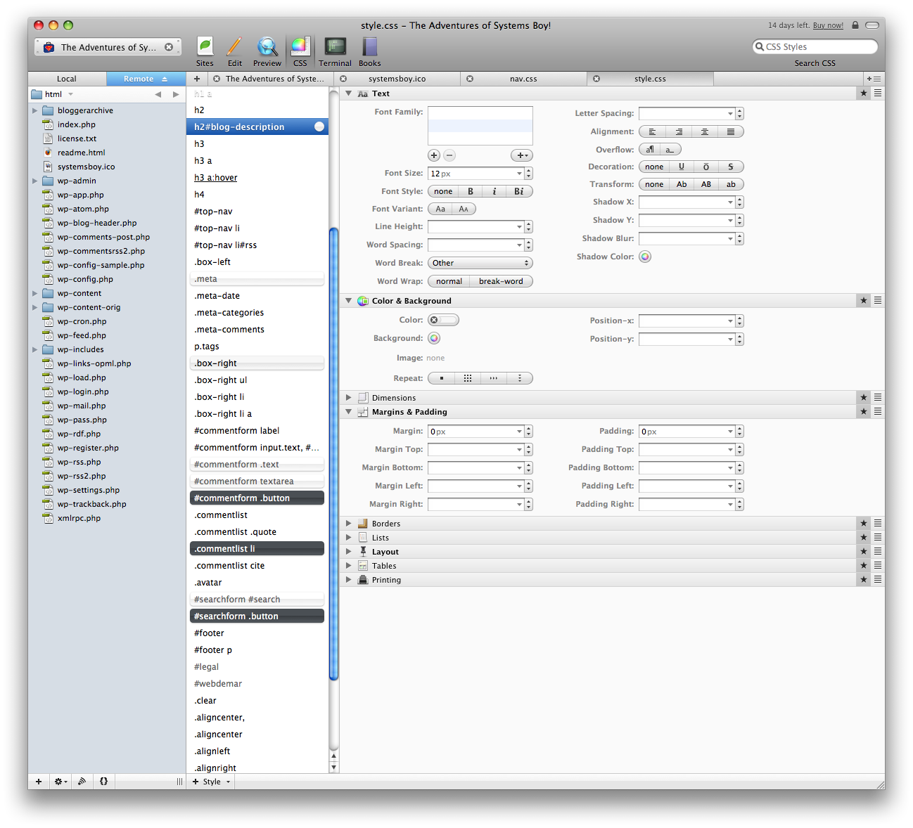
    Coda: Fantastic Visual CSS Editing

  • Love the "Highlight matching brackets" feature in scripts

    Arrow-key over a bracket in your code and Coda will highlight the corresponding open/close bracket with a super cool circular sonar effect.

  • Love that Coda saves the application state

    Coda remembers what you were working on and where you were in the site's file hierarchy even after closing the app. This is great as I easily forget what I was working on from day to day.

  • HATE that there is no global list of servers

    Coda, too, lacks server bookmarks. How is it that the maker of one of the most popular FTP clients — which certainly does have server bookmarks — doesn't include this obvious convenience in their web editing application?

  • Like that you can access a terminal when needed

    Having a terminal window available is nice. Not exactly a necessity, but quite useful. My favorite touch here is that Coda cds into the site directory you define when you set up your project.

  • Books are a great idea as well, making Coda true one-window site design

    I have to admit I'm finding the PHP manual here immensely helpful. I only wonder why they excluded a MySQL manual. Were there licensing problems, perhaps? Kinda sucks to have to go to the web to look up MySQL calls. But, Coda, see how you've spoiled me!

  • Multiple tab styles take some getting used to

    Coda's beautiful, and packs so much into such a small space, and I'm not sure how you'd avoid this. But there are tabs for freaking everything: Sites in the sidebar get one kind of tab, pages get another, and there there are tabs for mode (Sites, Edit, Preview, CSS, Terminal and Books). I'm used to it now (it didn't take long) but I did find it confusing at first. (I remember reading something by the Panic folks about this, so I think it's something they're aware of and working on. Ah, yes. Here we go. And here's the initial criticism, which is far more informed than my own, though I think the basic problem we're talking about is the same.)

Coda Overall:

Coda is an amazing app, loaded with great advanced features as well as all the basic stuff you'd expect from an app like this. In fact I have very few complaints about this app. It both looks and works beautifully and is as revolutionary as everyone's been saying.

Conclusion:

I have to admit, I was not convinced — and was even a bit confused — by Coda initially. But once I had a real, meaty site to work on, the usefulness of Coda began to become evident. I was also convinced of its usefulness, oddly enough, by trying its competitor, Espresso. Don't get me wrong, Espresso is a wonderful application, and I have no doubt that it will soon give its older sibling a run for her money. But right now nearly every complaint I have about Espresso is answered by Coda with competence and style. Espresso is beautiful and simple and has useful features that really shine, but Coda is the clear winner when it comes to sheer number of features (which I think is what I originally found daunting). And while I really like the Workspace concept and the Navigator, Coda's fantastic CSS editor and better preview integration trump them by a long shot. Coda wins on basics as well, providing essentials like a color palette and allowing you to look at the filesystem more naturally as well as giving better information about the location of the file you're looking at.

There's a bit of a learning curve with this type of app, and Coda's is probably a bit steeper than Espresso's. I'm already grappling with learning HTML, CSS, PHP and MySQL, so I may  not be quite ready to jump into — or pay for — this type of environment. I have yet to decide if I'll actually buy one of these apps, but it's looking like, right now, if I do, it'll have to be Coda.

UPDATE:

Reader EchoD writes to mention that additional books can be added to Coda using the little plus sign doohicky at the bottom of the Books mode window, thus addressing one of my minor Coda complaints.

coda-add-books

EchoD also notes a link with instructions on how to customize your books. Pretty cool!