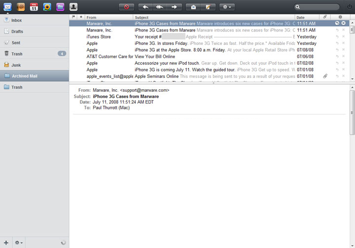
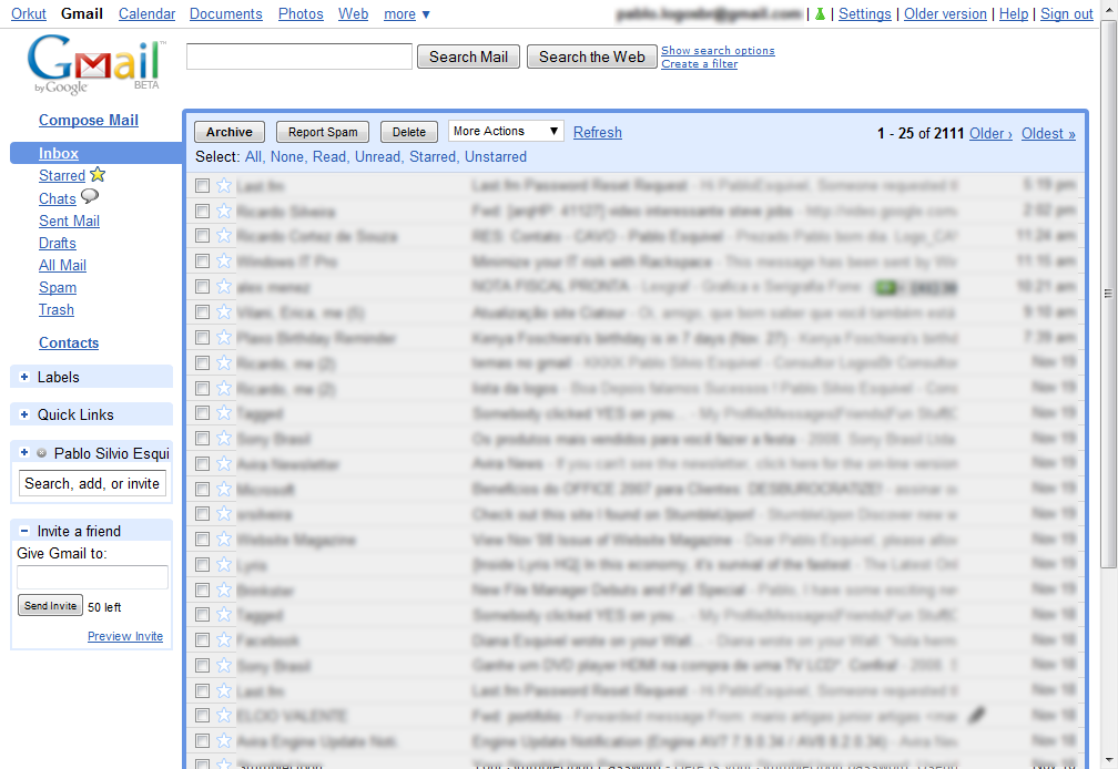
There's a fascinating discussion that ties nicely into into my recent post on workflows, that's recently picked up since Doug Bowman decided to leave Google. Mr. Bowman is a designer, and has had some issues regarding Google's priorities. The general takeaway from all this has been that Google places engineers' data and statistics above the aesthetic sensibilities of the designer.
While I don't work at Google, and I certainly don't know the actual priority Google places on design, I've certainly had my gripes about their products in the past. And the main gripe therein generally revolves around design. Google's applications — particularly their web apps such as Gmail — do function wonderfully. Gmail, in fact, works in ways that I've begun to find superior to desktop apps, even ones designed by Apple. The problem is, Google's apps look like ass.
Yes, I have switched almost entirely to Gmail. Why? Because, frankly, it works better for me. It scales beautifully and offers features that no other client does without me ever having to manage it locally. Why, then, am I just making this move now, after years of doing it the Desktop way? Well, partly because Google's apps look like ass. And if it's email we're talking about, that's an ass I have to look at all frickin' day long.
I should say, Gmail has gotten appreciably better over time. But it still lacks anything even remotely resembling the charm of an Apple-designed desktop application. Or even the panache of many websites, Apple's MobileMe among them.
I understand the approach they're taking — blue links, black text, efficiency and clarity. And that's great. But — and I hate that I'm even saying this — it's so very Web 1.0. Seriously. It's time to get over it.
I don't advocate Gmail aping Apple's mail clients by any means. But I do wish they'd pay a bit more attention to design. Or, if they are paying attention to design, do it better. The comparison here is stark. Google's mail app looks like it came out of 1997. Which, in fact, it did. How is it that the best, most amazing mail client you can get for free looks like Windows 2000? It's sad. Big, clunky, grayscale buttons; gray lists of black text; a blue border around the conversations list? This could look better, guys. I'm sure of it.
But why does all this matter? Well, I'm of an opinion, frankly, that the way things look is a part of your environment, and ugly things contribute to an ugly environment. And that ultimately hurts usability. I think that if Google were to make attempts to improve the design of Gmail — and I'm not just talking about themes here — they would discover numerous ways to improve the usability along the way. And that would make users happy. And that's good for everyone.
Apple is, in fact, a great example of the triumph of design in usability as well as corporate success. Their computers since the clear-plastic, fruit-flavored iMacs have made everyone else look antiquated and backwards. This has thrust their image ahead of their competitors and has ultimately gained them marketshare.
I've said it before, and I'll say it again. The way things look is important. It speaks volumes. Google's been immensely successful, and deservedly so. They make great stuff. But if they want to be even more successful they should really start taking design seriously. It's a niche they're leaving wide open for companies who do.


