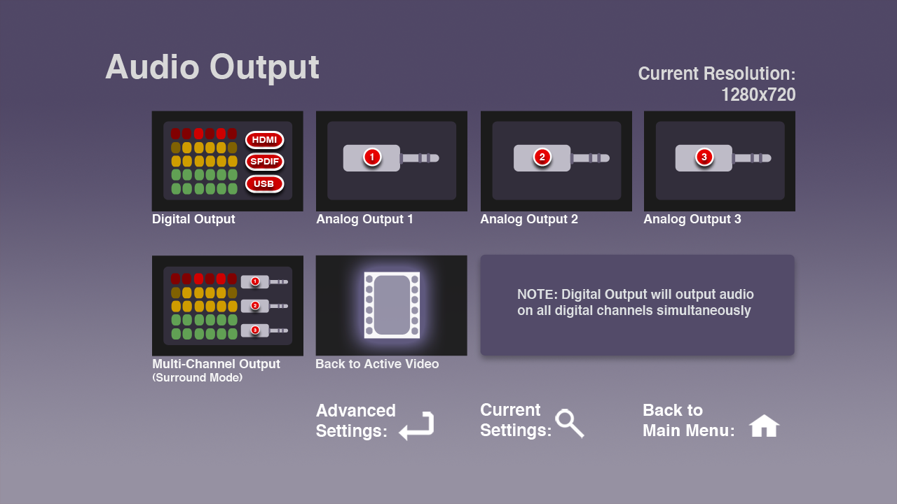
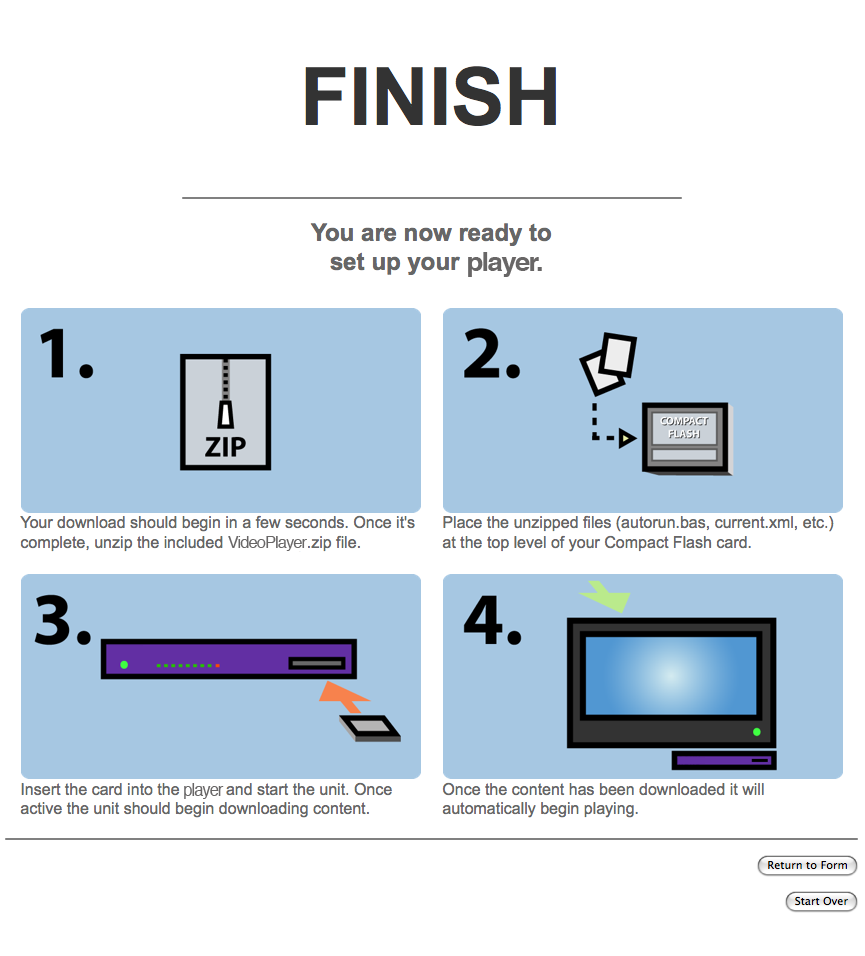
I've long described my professional self as someone who designs workflows. And as I design more of these workflows, I find myself more and more creating — and obsessing over — the interfaces to them. I have no formal training in the field of interface design, but I find it fascinating and I'm definitely an admirer of great workflow and interface design. Over the course of the last few months, in which I've been focused almost entirely on workflows and their interfaces, I've made some observations. These are certainly not earth-shattering revelations, and real interface designers will probably have codified these in some formal way a long time ago. But for me this is all very new, and so I wanted to get down in writing some of my early impressions of the process.
What's a Workflow?
Before I start, let me talk about what I mean when I say "workflow" as the notion goes a bit beyond just interface design. Generally, when I'm designing a workflow, I'm designing the process by which a user will complete a complex task. A workflow often involves a number of steps using a variety of tools, from the web to a remote control to shell scripts. Often I am directly responsible for the design of each of these workflow components, their guts as well as their surfaces; sometimes I find myself working on only one facet of them. But that, in a nutshell, is generally how I think of this concept I'm calling the workflow: a series of steps and tools used for completing a large, complex task.
So, on to some observations.
Keep It Simple
First of all, the simpler and easier you can make a workflow, the better. This is always the case, though simple can be a bit of a relative term. Sometimes you can make something so simple that it fails to meet the user's needs (yes, this has happened to me). Which brings us to my next observation.
Know Your Goals
The first, and often most difficult, but certainly most important aspect of designing a good workflow and the interface to it is knowing exactly what you want to accomplish with the workflow. It is essential to figure this out as early on in the process and as accurately as possible, though some amount of discovery can be a part of the early design process. That said, you really want to nail it down as soon as you can.
Know Your Users and Your Tools
You also need to quickly determine who will use the workflow — and by who I mean, what is the userbase and what is their particular skill set — as well as the context for the workflow, and the most appropriate tools for both the job of creating the workflow and accessing it.
Looks Are Important
The way things look and sound is paramount. These communicate everything about the workflow, from how it works to a certain mood. It's weird to think of a workflow having a mood, but it really helps to set a tone. If your workflow is for novice users, for instance, creating a mood that is not intimidating can help a great deal with discoverability. This can be achieved through choice of graphics as well as the use of language. These things are important.
Simplicity Is Hard
While simplicity is always the goal (not one unnecessary click, I always say!) it is also deceptively difficult to achieve. Generally the tools for creating workflows are extremely complex; boiling those tools down to something simple is the challenge of the designer.
Get Out of Your Shell
Testing on real people — preferably the people that will be using the workflow — as often as possible, or near milestones in the project, is crucial. As the designer you tend to lose a great of objectivity when it comes to the project, and the more you can try to see things through the eyes of your end-user the better. There is no better way to do this than to let them use use the workflow. You'll instantly see where your design breaks down, where it succeeds and where it fails. It will test all your assumptions about your workflow and about the way people interact with it. Watch closely and take notes!
This is also a great way to get to know your user (or at least more about them), if you don't already.
Make It Look Easy
Lastly, and perhaps somewhat frustratingly, if (when!) you are successful in making something that is simple and elegant and still functional, people will not understand how difficult that balance was to achieve and will think that your workflow sprang forth from the ether, fully formed. They will think it is native; they will think "it couldn't have been hard." They will say things like, "how hard could it be to add such and such a feature?"
While sometimes maddening, you should take it as a sign that you've done something right.


