The latest Firefox 4 beta is really nice. I particularly like the minor refinements to the tabs.
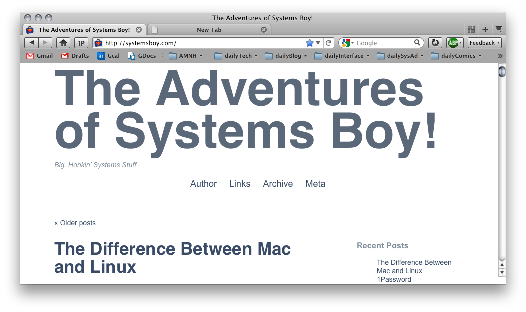
The tabs in 4.0b7 look pretty much like Firefox 3.6's tabs:
 The tops are rounded; the bottoms, where the tab connects to the page, are square; the color of a background tab is nearly the same as the overall window frame.
In 4.0b8, however, style and functionality have been added:
 Notice here that the connection between the active tab and the page is rounded. Also, the gradient is stronger and overall there is more contrast. All of this makes the active tab stand out more from the other tabs, and the tabs generally stand out more from the whole of the window.
It's a minor thing, to be sure, but I really dig it. And, hey, it's the little stuff that really makes the difference.
