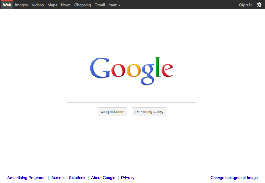
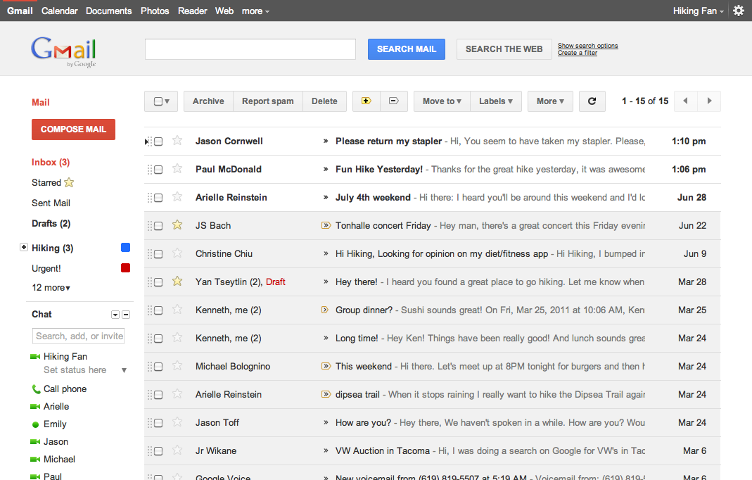
Google has recently been rolling out redesigns of their flagship products, Gmail, Google Calendar, Google Maps, and, of course, Search. I have to say, I'm both pleased to see it and impressed with the results.
I've argued several times now that, as great as Google's products are, they could be made even better if Google were to begin to concentrate even just a tiny fraction of its mighty will on the issue of design. And the new Google pages are distinctly better — nicer to look at and easier to use — than ever.
Mail and Calendar are most improved, but then perhaps they were the most in need of help. Both are now lighter and more spacious; colors have been muted, borders softened and emphasis placed in all the right spots. Both are easier to look at, and easier to read or just skim. Visually parsing the new interfaces for particular nuggets of information in the sea of crap that is my calendar and email is just plain easier.
The new interfaces look really nice too, at least to my eye, and that makes me want to look at them more, makes checking mail more of a pleasure, less of a chore.
By the way, if you want to see the new Gmail interface, you'll need to apply one of the themes built special for the purpose. Just hit the Gear icon in the upper right, go to Settings and then Themes and select either "Preview" or "Preview (Dense)".
I'm not a designer. I don't know precisely how design works nor how to do it. But I am and admirer of good design, and I can certainly appreciate when it makes the tools we use work better.
It's great to see Google embrace design in the manner.


