Another Reason to Use Firefox

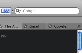
Firefox bests Safari in the management of huge numbers of tabs in how it allows access to the spillover. That is, in Safari, once you've opened around 20 or so tabs (the actual number varies depending on the size of your browser window) tabs spill over into an invisible no-man's-land beyond the browser window, and a double-arrow icon appears indicating that fact:

Safari Tab Spillover Arrows

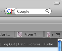
Firefox exhibits similar behavior:

Firefox: Tab Spillover

Accessing those hidden tabs in Safari can only be done by clicking that double-arrow and selecting them from a list.

Safari: Tab Spillover Access

Those no-man's-land tabs never come up in the tab strip, though. If you want to, for instance, drag one of them to a different position (like, say, out of no-man's-land), the only way to do so is to increase the window size or decrease the number of tabs. Sucktastic!

But in Firefox, there exists a similar looking arrow doohickey, but said arrow actually scrolls the tabs right there in the tab strip.

Firefox Spillover Access: Nice!

Access to the actual, draggable tabs can be had through this convention, despite their position beyond the visibility threshold. What's more, hover over the tab strip and your mouse's scroll wheel will also scroll the tabs. Nice!

This is another reason why, despite certain bugaboos, Firefox remains my browser of choice.

Firefox 3 and Download Warnings on Quit

This is one of those "what were they thinking" moments. Actually, I think I might know. The fine folks over at Mozilla have been tackling the huge job of streamlining their excellent Firefox browser. One of the best tactics for streamlining anything — be it a workflow, an infrastructure or, indeed, an application — is to simplify through reduction or removal. Apple is famous for this sort of reductionism. The iPod is the classic example: where every other player has offered more and more features, Apple has consistently removed features in favor of a simpler and easier (and better) user experience. My theory is that the Firefox kids have taken a page from Apple's book. Their hugely full-featured — but, yes, often cluttered — Firefox is a lot cleaner in version 3 than in previous iterations. And for the most part I applaud this. But there is at least one option, I'd argue, they should have never removed: the alert that warns you of in-progress downloads on quit.

There seems to be at least one argument that goes, "Since Firefox now automatically resumes downloads, the warning is no longer necessary. The next time you launch Firefox it will resume the download." If this is the thinking, then I can see why they removed the feature. Indeed, Firefox no longer asks you if you want to save your open windows and tabs if you've set it to reopen all previous windows and tabs on launch, and that's really smart. It's a clever way to remove feedback when it's conditionally no longer necessary. The problem with the logic regarding the download alert is that it assumes that the reason for the alert was that you might lose or have to restart the download if you interrupted it, and now, because of the presence of resumability, that's no longer a problem.

In actual fact, however, that is not the only purpose for the alert. To my mind, the main reason that alert exists is to tell the user that he is about to do something he may not want or mean to do: he may be about to unintentionally kill a a process that's running in the background, a process he's forgotten about. He may be about to kill a download. An alert for such a thing is hardly redundant, certainly acceptable, and in most cases probably desirable.
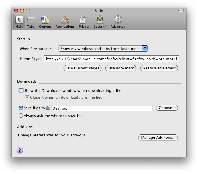
Firefox Download Options: Leaner, Meaner, but Not Better

As if this weren't bad enough, this lack of alerts is compounded by three other facts. The first is that, quite simply, this behavior is a drastic and unexpected change, not only from most other browsers, but from previous versions of Firefox itself. It certainly took me by surprise once I realized why my downloads weren't completing. The second is that, if you've selected the option to keep the download window hidden (which I have, and which I really like, mind you) the visual cues that something is downloading are extremely subtle and easy to miss, making quitting the browser during a download a far simpler and more common occurrence.

Firefox 3: Subtle Download Cues

And the last — and perhaps most practically serious — is that downloads often don't resume after the browser is relaunched. Sure, Firefox is very good about attempting to resume the download, but sometimes your download link is temporary or dynamic, and on reload it fails. This has already happened to me a few times.

Now everyone knows I'm a sucker for simplification. I've certainly done my fair share of it, and I know it's not easy. I also know that you can go too far, and I think the removal of this alert is a prime example. Because this alert is necessary. Without it data loss can, in effect, occur. It's like the dialog that asks you to save open, unsaved documents when you close an application. It's almost that crucial. Would you remove such a dialog from your application?

Firefox 3 devs need to put back that alert.

Command-Tilde in Photoshop

When Adobe released the Photoshop CS3 Beta, I was pretty pleased with it. But I did have one big beef:

"My one big beef is that there still seems to be no key command to switch between open documents. Almost every other application on the Mac nowadays uses “command-`” to switch between open docs. Yet Photoshop CS3 still not only fails to adhere to this standard, but apparently lacks the ability to switch between open docs with the keyboard at all. This seems like a strange oversight for such a significant interface overhaul. I also wish Adobe would use standard Apple key-commands for things like hiding the app (”command-h” on the Mac, generally) but at least the ability exists to do this from the keyboard, and it’s configurable."

While I did later discover that Photoshop did in fact have a key command for document switching, I still found it bothersome that it varied from the system default, all in the name of backwards compatibility. A Photoshop developer chimed in with the following:

"Photoshop since the first OS X version has supported using Ctrl-Tab to switch amongst open documents. This is because Cmd-~ has since Photoshop 1.0 meant “show all channels of the current layer” a command ingrained in a great many fingers of a great many pro Photoshop users..."

To which I responded:

"...I do think there’s a certain logic to changing PS key commands to match the ones in the OS though. It seems to me that by choosing to stick with your original key commands to help legacy users, you’re actually doing a disservice to everyone: legacy users, instead of having to relearn one or two new key commands now have to use a different one in PS than they do in virtually every other application on their computer. Frankly, they’ve already relearned Command-H (and others) by using it in all the other apps, and in the OS. Including these key command in PS won’t significantly impair legacy users, and it will greatly speed the adoption of PS by new users who are already familiar with the Mac OS and its attendant apps. Giving us the ability to customize these key commands helps a lot, but I would still argue that the defaults should match those of the OS. Let legacy users customize things how they want. OR, have a key-command preset for legacy users that uses old PS key-commands, and a standard one that uses those of the OS for users who prefer that. That would be the best of both worlds!..."

Well, I never thought I'd see the day, but it's finally happened. Command-tilde is now the default method for switching between open documents in Photoshop CS4. And John Nack is even happy about it (via Daring Fireball).

It's a brave new world.

Firefox URL Bar for Mac Users

The fact that John Gruber is trying and writing about the latest Firefox betas — which, by the way, I am frickin' loving — is a testament to how good this release will be. Though he's not switching for a variety of reasons, his review is still quite complimentary.

Most of Gruber's Firefox complaints either don't bother me or don't affect me, but there is one that has always bugged the crap out of me: a single-click in the URL field of the browser highlights the entire URL. This is almost never what I want to do. If I want to highlight the entire URL, I'll just hit Command-L and be done with it. If I'm clicking in the URL field it's because I mean to edit that thing, and I want my click to place the cursor right where I clicked, damnit. Despite Firefox 3's attempt — and, I should mention, general success — to integrate better with your platform of choice, it gets it wrong here.

Fortunately, Gruber's posted a link to a dude who has the skinny on the fix. Here it is in my own words, if you don't feel like following the links:

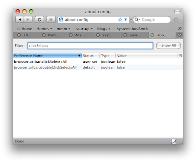
  • Type "about:config" in the URL field
  • Filter by "clickSelectsAll"
  • Change the "browser.urlbar.clickSelectsAll" to "true" (just double-click it)


Firefox 3 Beta 5: Fix the URL Bar
(click image for larger view)

From now on clicking in the URL bar in Firefox will behave as it does in Safari: single-click places the cursor; double-click highlights the word; triple-click highlights the whole URL.

Oh, sweet merciful heaven, that's good stuff.

Translucency

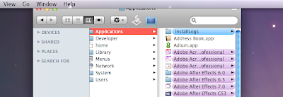
Every now and then, when I connect to a network share, the window opens with its top slightly behind the menubar. This has been happening at least since Tiger, and I half expected it to go away in Leopard. But it hasn't. What has changed in Leopard, however, is the menubar, which is allegedly translucent.


Leopard Menubar: My Window has Been Decapitated
(click image for larger view)

But, as you can see from this screen grab, when one of my windows opens behind this supposedly translucent menubar you cannot see it. It just disappears. So, one of two things is happening here: either the menubar is not actually "translucent" but simply draws a shaded strip from the top of your Desktop image and layers the menubar atop that strip; or my window is not actually going up behind the menubar but, rather, is being partially sucked up into some neither-universe where graphics as we know them cease to exist.

Either way, it sure is disconcerting.