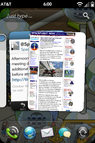
My reaction to HP's (nee Palm's) webOS is diametrically opposed to that of my reaction to Windows Phone 7. The webOS looks decidedly Smartphone 1.0, with chintzy, plasticky looking graphics and entirely too much information. I'm not sure what people find so appealing about the OS, but I can't imagine it's the look of it. To my eye it comes across like a cheap knock-off of iOS.
Windows Phone 7
First off, apologies for the incredible dearth of posts for the past 3 months (Jesus!). I should have more on that soon. Suffice to say, I'm not dead.
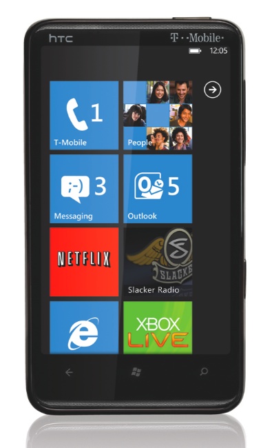
Meantime, I wanted to just point out the Ars review of Windows Phone 7, which I'm presently in the midst of skimming. And I have to say, I'm impressed. It looks very promising and it's the most attractive, forward thinking thing I've seen come out of Redmond in, well, maybe since I started using computers, which would be about 12 years.
I'm intrigued by the largely text-based visual approach, and the incredibly spartan, almost institutional iconography. In a world of imagery overload there is something very appealing to me about this look, and I'd imagine it will appeal to the business set as well. It's classy but not cutesy the way iOS can be.
It's not often (ever?) I post something positive about a Microsoft product. And I don't know if it will be successful. But I have to admit, Windows Phone 7 looks, if nothing else, interesting.
My Favorite iOS 4 Changes
Much has already been said about the high-profile features in the new iOS 4. But there are also a bunch of smaller, subtler changes that I really enjoy.
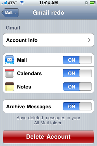
Gmail settings for mail, calendars and notes are now all integrated and accessible from one attractive page.
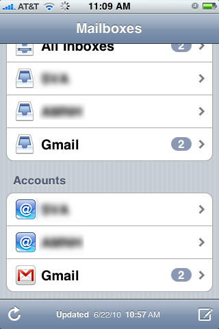
To take advantage of this change you'll have to reset your Gmail account. Afterwards you'll also get the custom Gmail icon in your Mail application…
…as well as the option to Archive instead of delete Gmail emails.
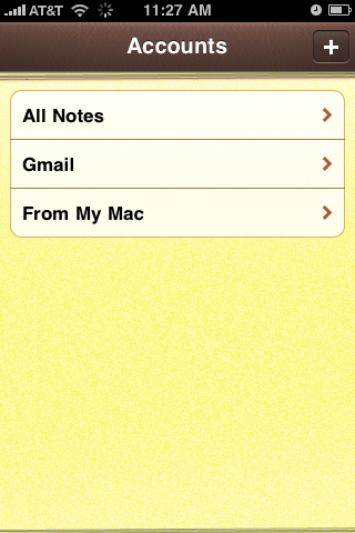
Notes
I don't know about you, but I use Notes all the time. It's terrifying to me not to have a better backup of these things than what iTunes provides. At long last, in iOS 4, we get over-the-air note syncing.
To Gmail, no less. This is sweet.
Photos
The Photos app now remembers the state it was in. This is great because I use it for, among other things, subway maps, which are broken up into several JPEGs. In previous iOSes, every time I quit the Photos app I'd have to navigate back to the Subway Maps gallery, then back to my image upon reopening the application. Photo app now remembers where it was, so now I just reopen the application and pick up where I left off. I'd guess this is a likely consequence of the new multi-tasking and fast-application-switching features of iOS 4. It's a very welcome change.
Photos also requires a re-sync after you upgrade the OS. Directly after the update my photo album was all lo-res thumbnails. But once you re-sync, the photos seem to be a bit higher resolution than they used to be, which is especially nice for my subway maps.
Task Bar
Multi-tasking is great, allowing you to fast-application switch, which makes it possible for me to draft a post like this, with text and images, much more quickly and easily than before as switching between text and photos is much, much more efficient.
Portrait lock. Finally, I can read in bed!
Lastly, here's a good article on some of the other more subtle changes in iOS 4:
http://nikf.org/post/722500438/8-subtle-changes-you-may-or-may-not-notice-in-ios-4
It's little refinements like these that often make me the happiest. It's always great to see the attention to detail that Apple gives its products.
Finally and Finally!
Two small but exciting improvements revealed today.
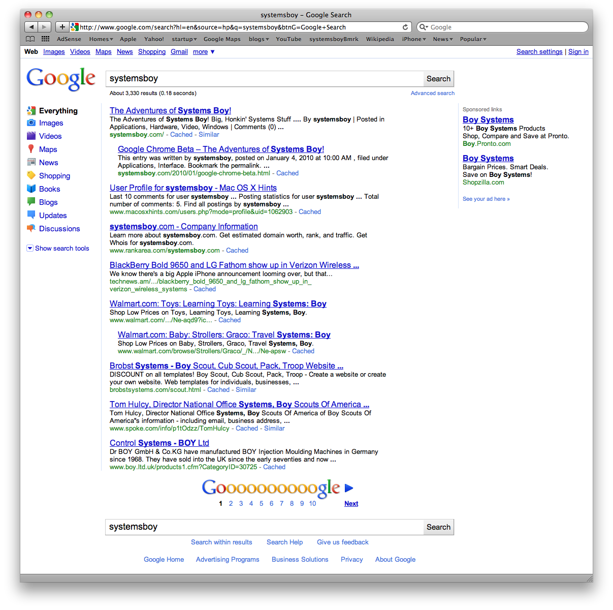
1. Google has at last made some design improvements to their search results (via Daring Fireball).
I wrote about my frustration with Google's lack of design vision some time ago. It's great to finally see them trying to improve their usability and their aesthetic at the same time.
For the record, Google's in the midst of a gradual roll out of the redesign, so you may not see the changes right away.
2. Rumor has it that the next iteration of the iPhone OS will include orientation locking. What's orientation locking, you say? It's the ability to keep the iPhone screen from switching to landscape mode.
I've lamented how the lack of this feature has been one of the major bothers of an otherwise great phone experience. I'm excited to finally have the feature on my phone.
It's definitely the little things I get excited about. But then, sometimes they're what really matter most to a fella.
Google Chrome Beta
Google's finally released a beta version of their browser for the Mac. I'm surprised at how impressive I'm finding it. Here are some initial observations:
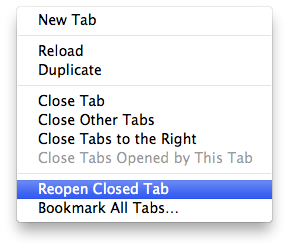
- "Reopen Closed Tab"
Google Chrome allows you to reopen the last tab you closed, which is an insanely useful feature I don't seem to be able to live without anymore, and a big reason I keep using Firefox. It's a deal-breaker.
- Saves your session
Chrome allows you to reopen your tabs and windows from the last session, just like in Firefox.
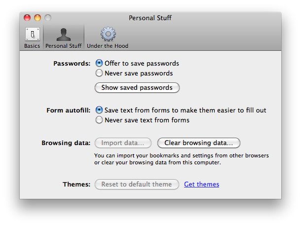
- Username memory
Another Firefox fave is that is reliably remembers my form data without having to save my passwords. Safari never does this quite right for me, but Google Chrome nails it.
- Uses the Mac OS X Keychain to store passwords
If you did want to use Chrome to store your passwords, it'll do so using Mac OS X's native Keychain mechanism, which I greatly prefer to Firefox's app-based mechanism.
- Nice looking, native looking appearance
I like the way Google Chrome looks, and it uses the same rendering engine as Safari, so it tends to render pages better than Firefox.
- URL completion based on text inside the string (a la Firefox's "Awesome Bar")
Chrome has the ability to suggest a URL even when you type in a part of the URL that occurs in its middle. I use this every day to get to my Wordpress admin page by simply typing "wp" in Firefox.
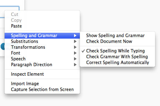
- Uses the native Mac OS X spellchecker
Chrome, like Safari, uses the native spellchecker, making it better integrated with the OS than Firefox.
- No Snow Leopard Text Substitutions
Snow Leopard brought with it Text Substitutions — handy for filling in usernames and password, and something I was really looking forward to using. But non-Cocoa applications must be written to take advantage of them. Safari has them; Firefox does not. Nor does Chrome. Bummer.
- Text entry doesn't take key commands (bold, ital.) like it does in FF
Firefox still wins at text entry, particularly when composing my blog posts. Firefox allows for Mac OS X key-commands for bolding (command-b) and italicizing (command-i) text. Chrome, like Safari, currently lacks this functionality. A minor nit, sure, but something I always note as an area in which Firefox is more native in behavior than Safari.
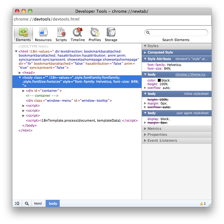
- Nice looking developer tools
Chrome's developer tools look to be on par with Safari's. To get something comparable in Firefox you need to install Firefly. I prefer the native tools if I can get 'em.
- When opening a new tab via a link in the current tab, the new tab opens directly to the right of the current tab
Oddly, this behavior mimics what I've seen on the iPhone. I don't really like it there, and I'm pretty sure I won't like it in Chrome either.
- You can hold shift while opening/closing a new tab to watch the animation in slow motion
On a purely gee-whiz note, Chrome lets you watch tab animations in slow motion by initiating them while holding the shift key, just like the Mac OS X Finder and Dock do.
- Fast! Wicked fast
Chrome seems to be about on par with Safari in terms of launch and load speeds. Which is to say, fast. Very fast.
- Cold, Cruel Irony
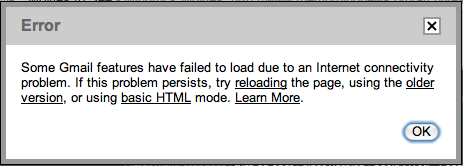
Finally, for some odd reason, the page Chrome consistently has trouble with is my Gmail. I know, I know, it's beta, but really.
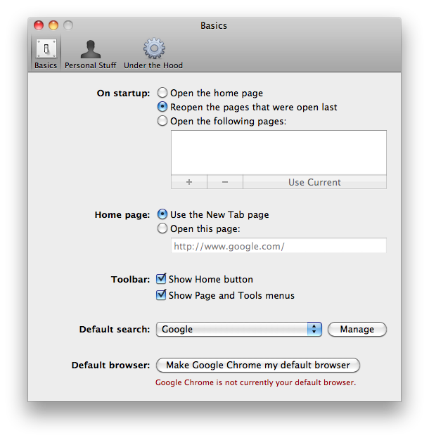
When testing out a new browser there are a handful of features I look for first. In particular, I'm addicted to Firefox's ability to save window and tab sessions at quit, to undo the closing of an individual tab directly after the fact, and to remember my usernames on login pages without having to save my passwords. It's also essential for any browser to be able to handle the plethora of web-based forms and apps I use on a regular basis, apps such as the Wordpress backend I'm using to post this article, for instance. Finally, I look for features that I miss in Firefox. These are features that are generally present in Safari, things like native look and feel, speed, and Keychain integration. I suppose my ideal browser is a combination of Firefox and Safari, so that's generally what I'm looking for when testing them out.
With its unique ability to treat each tab and window as a separate process, Google Chrome takes an innovative approach to a web browser while still employing the best features of both Safari and Firefox. Many of the things that make me staunchly stick to Firefox — saved sessions, the ability to undo a closed tab — are present, as are many of the features that make me wish I could use Safari — native good looks, speed, keychain integration. There's still a lot missing from this beta. Bookmarks in particular are half-baked, lacking the ability, for instance, to open a group of bookmarks in tabs. And after using Firefox for the past few years, there may be extensions from its vast plugin ecosystem I may find myself unable to live without. Nevertheless, once mature, Google Chrome looks to be a strong contender for my primary browser. There's a lot here to like, and this is only a beta. The Mac Google Chrome team should be very proud.

