Installing Xcode 4 From the App Store

I have to say, installing Xcode 4 from the Mac App Store was one of the worst software installation experiences I've ever had.

Thwarted Expectations

For starters, the big appeal to me of downloading and installing stuff from the App Store is that I don't have to manage it. All that management stuff is handled by the store itself. I make my purchase and the app installs correctly and in the proper spot. Not so with the Xcode install.

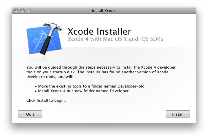
In fact, once you've clicked on the buy button in the store, had the $5 clams removed from your account and waited the half hour it takes for the 4.5 GB install to do its thing in your Dock, what you end up with is not Xcode installed on your system. No, instead what you get is an application called "Install Xcode," which is essentially just a wrapper for the old-style installer you used to get for free.

Buying from the App Store in this case doesn't seem to manage anything except Apple taking my $5 bucks, which was never a problem before because it was free. But wait, it gets worse.

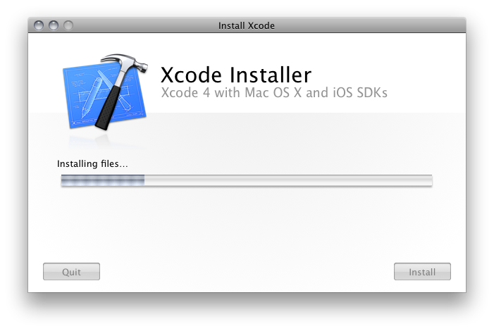
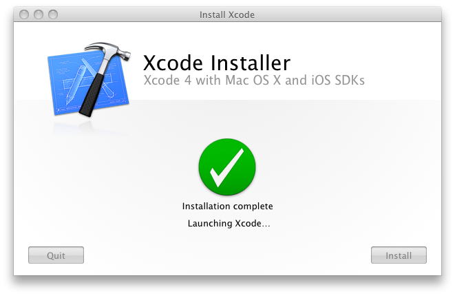
Install Xcode.app

So I run this installer app — this Install Xcode.app — and it's going okay. The inteface has the new Lion-style buttons and animations, which is at least entertaining, as well as usual stuff, license agreements and the like. Oddly, it even discovers my old install and tells me that it's going to rename it — not upgrade it, rename it — to Developer-old. No choice here, that's just what it's going to do, just so ya know.

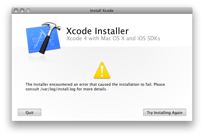
But then it fails, and not exactly gracefully. No, it fails ugly.

Um… What now? Consult /var/log huh? This is what I paid $5 bucks for? This is what you wrote an installer app for? Crappy error reporting? So you could tell me to "consult /var/log/install.log"? Not even open Console, but consult a log file in an invisible folder? Really? You think Joe Average App Store User will have any freaking idea what this means?

And isn't this just the sort of thing the App Store is supposed to prevent?

Wherefore Failure?

So I open the lo file and this is what it says:

Mar 10 15:02:38 hassium runner[557]: Administrator authorization granted.

Mar 10 15:02:39 hassium installer[541]: Will use PK session

Mar 10 15:02:39 hassium installer[541]: Starting installation:

Mar 10 15:02:39 hassium installer[541]: Configuring volume "SysApps"

Mar 10 15:02:39 hassium installer[541]: Preparing disk for local booted install.

Mar 10 15:02:39 hassium installer[541]: Free space on "SysApps": 8.51 GB (8505917440 bytes).

Mar 10 15:02:39 hassium installer[541]: Create temporary directory "/var/folders/zz/zzzivhrRnAmviuee+++++++++++/-Tmp-//Install.541PaUH12"

Mar 10 15:02:39 hassium installer[541]: IFPKInstallElement (40 packages)

Mar 10 15:02:39 hassium installer[541]: Failed install preflight: Error Domain=NSCocoaErrorDomain Code=640 UserInfo=0x103555a90 "You can’t save the file “Developer” because the volume “SysApps” is out of space."

Mar 10 15:02:39 hassium installer[541]: Install failed: The Installer encountered an error that caused the installation to fail. Contact the software manufacturer for assistance.

Yup, you guessed it. Out of disk space. Now, there's a whole list of fucked-up here, so let me just take you through it.

  1. The Xcode Installer application failed because of a lack of disk space, but somehow can't just say that.
  2. The traditional, old-style (and, ahem, free) installers will simply check disk space during preflight and tell you if you don't have enough space right there in the installer, but this custom app that I paid for cannot.
  3. Nowhere on the App Store does it say that you will need 15 GBs — yes, fifteen or more gigabytes, if you count the Install Xcode app and it's payload — of free disk space to install Xcode.
  4. The Install Xcode app itself is 4.5 GBs, which is a big part of the reason my disk is too full now for the install to complete.
  5. The traditional, old-style Xcode installer always used to offer customization options so you could preen certain Developer resources from the install to conserve space. Not everyone is an iPhone developer, for instance, and not installing the iOS SDK will actually save upwards of 8 GBs of disk space. But these options are no longer present in the custom-built Install Xcode app.

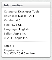
The fact is, there are at least a couple points at which this problem can and should have been detected. The most logical place would be at the app store itself — preferably before I ponied up the dough — where a simple declaration of disk space requirements would be exceptionally useful, particularly for an app and installer that together take up over 15 GBs of disk space. Instead we get this, which, if anything, seems to suggest that all you'll need is 4.24 GBs of space.

It also would be lovely if the Install Xcode app could tell me all the same useful stuff as a regular installer. But then they'd have to charge $10 bucks, and who's going to pay that for something they used to get for free.

The Fix

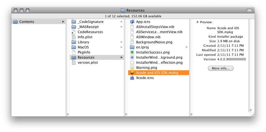
After all this I decided to see what was inside this Install Xcode app. I presumed that there would likely be a standard PKG or MPKG file that would allow me to install Xcode in the usual manner. Sure enough, that turned out to be the case.

Running that MPKG file, by the way, did, in fact, allow my to customize my install, had I wanted to go that route. (Though I would point out, it did not seem to want to upgrade my existing components as past installations of Xcode had. Take that info for what it's worth.)

Instead, however, I decided to see things through with the Install Xcode app. So I copied it to another drive partition and erased it from my /Applications folder, which freed up enough disk space to complete the full install and ran the Install Xcode app from the secondary partition (happily, the Mac App Store still recognizes that I have installed Xcode on this system).

This time, success.

Finally!

Conclusion

So that's my tale. In the case of Xcode, it seems clear to me that the only thing the App Store is really facilitating is payment, which was never an issue in the past because Xcode was blissfully free. Unfortunately, the overall experience of installing Xcode from the Mac App Store is more opaque and, if there is any sort of problem, far more difficult to fix. Given the lack of information provided by the App Store, it also seems far more likely that you will run into problems.

My conclusion: The Mac App Store is simply not well suited for complex application installs. It works great for drag-n-drop apps — self-contained applications that can simply be dropped into /Applications (or anywhere else for that matter). But for complex suites of applications, the Mac App Store doesn't simplify, it complicates. And that ain't right.

Finally, I don't mind that Apple is charging a small fee for the Dev tools. I always thought it was pretty generous that they were free in the past, and $5 is still cheap enough to grab them casually. What I don't particularly care for is paying five dollars for a singularly crappy installation experience. Those two things just don't mix well.

UPDATE:

For folks just joining us in this saga, please note that there are some additional installments dealing with the recent Xcode updates, how they're handled by App Store, and how to deal with them on space-constrained drives. Installment 2 deals with some general App Store issues I had. Installment 3 deals with the 4.0.5 update, which was the smoothest — though by no means perfect — so far.

Also, one reader points out that he was able to keep his file size down but still have success with updates by simply removing the .PKG files (found inside the .MPKG mentioned above) from  Install Xcode.app. He also points out a very cool trick that will allow you stop an in-progress update: simply option-click the INSTALL/UPGRADE button and App Store will give you the option to cancel the update. Handy!

Mac App Store: First Impressions

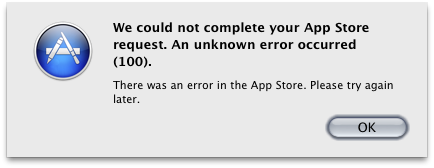
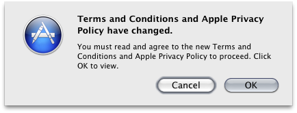
Boy, you'd think by now Apple could nail a launch, but it seems like they always have problems if it's something web-based (MobileMe, I'm looking at you). Case in point, my first attempt at a purchase in the Mac App Store:

Some nice touches, my purchased apps — even ones purchased outside the Mac App Store (contrary to what I've read on Ars) — show up as "Installed:"

And with the Mac App Store you can now buy portions of Apple's product suites — iLife and iWork — discretely, rather than only as a bundle:

Finally, I hate the iTunes shopping experience, and the Mac App Store is clearly based on it. I really hope someone comes up with a better way to shop. In the meantime, I'm just glad I don't have to actually open iTunes to shop the Mac App Store.

It's a start.

UPDATE

Ah! That's better! Looks like you can get this error to go away by just quitting the Mac App Store, opening iTunes, then reopening Mac App Store. This will let you agree to the End-User License Agreement, after which you can make purchases from the store.

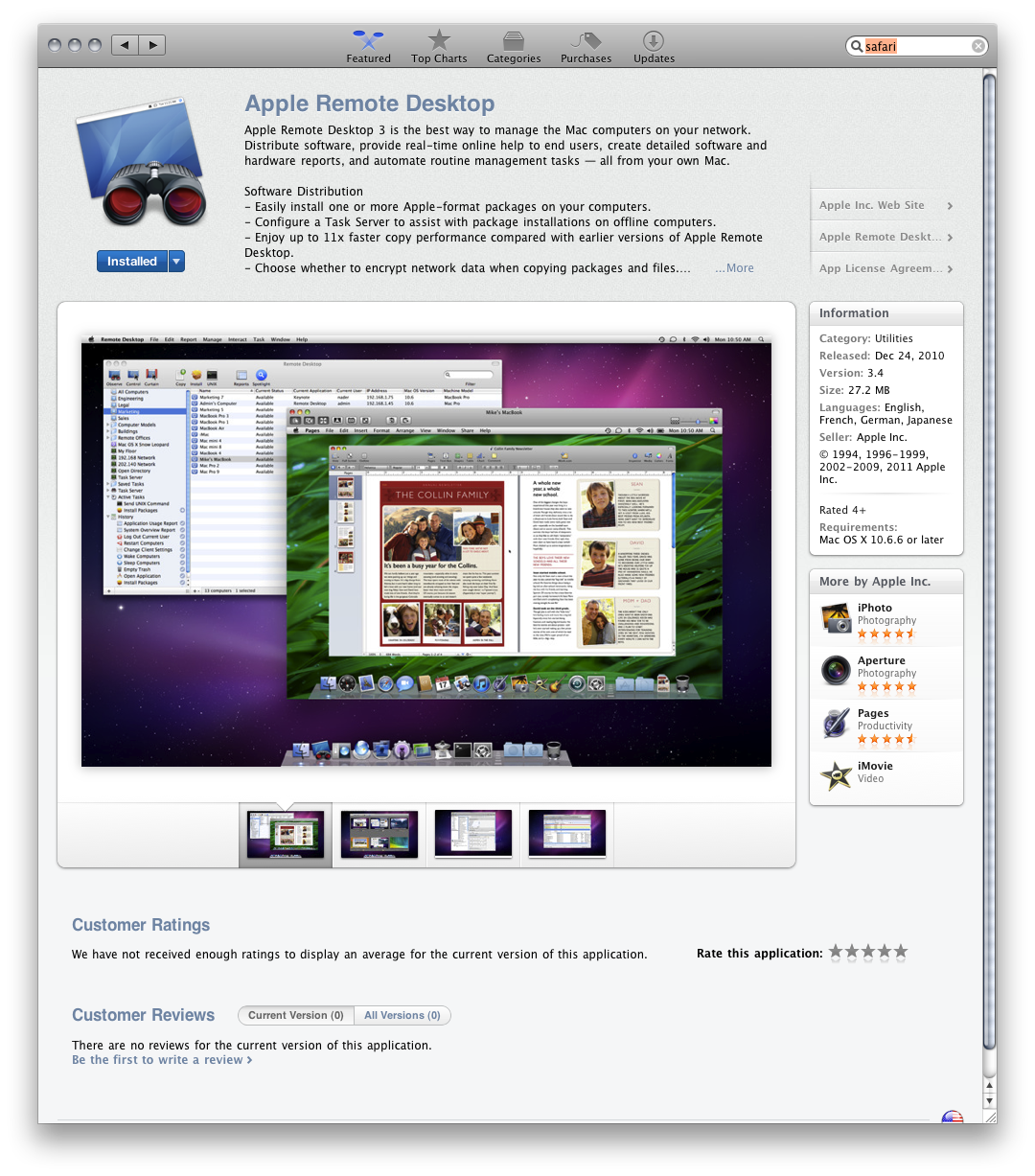
On other oddity: Remote Desktop appears on the Mac App Store. But other downloadable apps, like Safari or iTunes, do not.

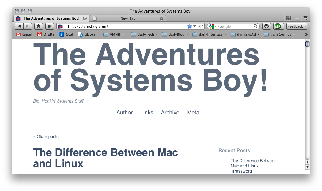
Firefox 4.0b8 Tabs

The latest Firefox 4 beta is really nice. I particularly like the minor refinements to the tabs.

The tabs in 4.0b7 look pretty much like Firefox 3.6's tabs:

The tops are rounded; the bottoms, where the tab connects to the page, are square; the color of a background tab is nearly the same as the overall window frame.

In 4.0b8, however, style and functionality have been added:

Notice here that the connection between the active tab and the page is rounded. Also, the gradient is stronger and overall there is more contrast. All of this makes the active tab stand out more from the other tabs, and the tabs generally stand out more from the whole of the window.

It's a minor thing, to be sure, but I really dig it. And, hey, it's the little stuff that really makes the difference.

Trying an iPad

My initial impression of the iPad, after reading about it and seeing it in stores, was your basic meh. There didn't seem to be much compelling about the device for a user such as myself. Let's be clear: I don't think the iPad is a bad thing, or not a "real" computer, or anything bad at all. I just don't see it being particularly useful to someone like me.

And by someone like me I should reiterate that I am, by trade, a systems administrator and that I use computers, to a large extent, to set up and maintain other computers with highly specialized or high-level functions. In my spare time I use computers to make art — video, music, and, most recently, to scan and post drawings. For much of my job an iPad is simply useless. And for many of my personal pursuits it's a non-option as well. I'm really not the intended audience for the iPad.

So when a co-worker recently purchased an iPad and was kind enough to let me test it out for a week, the question I set out to answer was: Is there anything useful I can do with the iPad?

The short answer is a qualified yes. There is a lot about the iPad to like, and there are quite a few things I don't like, but I did manage to find some areas in which the iPad shined, even for "someone like me."

The Downside

Let's start with the areas that, for me, proved disappointing. These will, of course, be based on my own usage preferences. But suffice to say there are at least a few areas where the iPad left me wanting, and some of them were quite surprising.

Performance

Much has been said about the iPad's performance. All of it positive. But frankly — and I realize I sound like a crank here, but — I just didn't see it. Maybe it was all the hype going in, or maybe it was the iOS 4.2 update I applied immediately after cracking the box, but the iPad felt to me like it performed almost exactly like my iPhone 3GS. That's right, 3GS. Not that that's particularly bad, mind you, but I was expecting to be impressed with the speed of the iPad, especially considering the fact that I'm accustomed to previous-generation hardware, and I wasn't.

In my experience, I often would touch an interface element and have to wait — sometimes for well over a second — for something to happen. For example, in iBooks, when I would touch a book in the Store section it would typically take up to five seconds to load the book info. Once it would load, if I pressed the Get Book button I'd be waiting between two and three seconds for any sort of response from the interface. Pressing a book in my library would result in a similar wait time.

What's worse is that sometimes there'd be no indication that the touch had even taken place. No dimming of the touched item, no "Loading..." message, no barber pole. You'd just wait and hope that the touch had occurred. There seemed to be some caching issues at work here, as this sort of thing seemed to get better with time spent in a given application. Nevertheless, I would hesitate to describe much of the iPad interface as zippy.

Typing

Coming from the iPhone, typing on the software keyboard felt — and largely continues to feel — awkward and difficult. Typing is so key to so many things I do that not being able to do it as easily as I can on my iPhone feels pretty crippling. I felt like I was able to learn to thumb-type much more quickly on my iPhone. But on the iPad, it's too wide to hold and thumb type on, at least with my rather dainty hands. But two-handed typing is even more difficult, and touch typing is simply impossible without some sort of tactile feedback. Without easier typing the iPad feels a lot more limited than my iPhone.

Netflix & Facebook

One thing I could see myself using the iPad for is casual movie and TV watching, and it's pretty good for that. I have to say, though, that after using the Netflix app for iPhone — which by and large I like quite a bit — I found the iPad version to be quite terrible. It's essentially no different than the web app. Unlike the iPhone app, the iPad version doesn't appear to have been optimized for the device at all. It just a slow, laggy view of the Netflix website, and I found it to be really irritating to use. The only place Netflix for iPad really shines is, of course, the watching of movies. Here, of course, the large screen makes watching stuff much nicer than it is on the iPhone.

The Facebook app, on the other hand, simply hasn't been refactored at all, which was disappointing to discover. I use my iPhone to peruse Facebook quite a bit. It's nice that iPhone apps will run on the iPad, but it really is true that they scale poorly. I was a bit surprised at how bad they look. I actually prefer the Facebook app on my iPhone to the scaled up version on iPad. The good news is that the Facebook website looks terrific, but I often prefer using the mobile app to the website; in many ways it's a better interface for browsing. So overall, while nice to have, Facebook on the iPad was disappointing.

The Physical Device

While the build quality of the iPad is, in typical Apple fashion, lovely, I found handling it to be less than optimal for many of the things I want to use it for. After watching a movie in bed for a while, I found my hands and arms getting tired. The iPad starts to feel heavy and I found myself adjusting the way I was sitting or switching hands a lot. In fact, fatigue set in when using the iPad for surfing too. And when typing or holding the iPad for extended periods, the sharp metal edges frequently dug uncomfortably into my hands and fingers. While the squared off edges do look beautiful, I can't help feeling something round would be a bit easier on the hands, and overall the iPad just felt a bit too heavy for extended use.

My co-worker also got the Apple-made iPad case. And as superb as the build quality of the iPad itself is, this case is just as crappy. Really. It's worse than I'd even surmised from the photos. Just total shit. The material is like cardboard wrapped in cheap plastic, it's flimsy, and when getting the iPad into and out of it it feels very much like it could easily break. The case also offers a way to prop the iPad up for extended viewing, but I think you'll get just as much mileage out of something homemade, and for much less money. If you're looking for a way to prop up your iPad, find a different case. One that's good. Though really, I wish there were a built-in way to do this. Maybe in iPad 2.

Finally, the iPad Dock. The dock is actually pretty nice, akin to the dock for iPhone. It makes a great and fairly stable stand for the iPad. My only gripe is that it's a bit difficult to remove the iPad from the dock without lifting the entire kit and kaboodle off the table. Still, it's a worthwhile accessory.

Activation and IDs

There were just a few other spots in the whole experience that I found perplexing. For one, can someone tell me why I need to activate this thing with a computer? This seems pretty ridiculous to me. And activation is through iTunes? But... I have iTunes on my iPad, right? Why can't I just use that? It's a shame that a computer that's perfect for people who aren't particularly interested in computers requires both a computer and a fairly tech saavy computer user to activate. I really, really don't get this. It seems contrary to the very idea of the iPad.

What's worse, I could at least see the activation process simplifying the activation of all those Apple-supplied services, but it doesn't. Despite the fact that I have to activate the iPad on my computer using my Apple ID, that ID exists in limbo on the iPad. If I launch the App Store, or iTunes, or iBooks on the iPad, I end up having to enter that same stupid Apple ID every time. Why? Can't the iPad make the assumption that you'll be using that ID for every Apple service? It would really make my life easier, and I'm an advanced user. Imagine how much better it would make my mom's life.

The Upside

In the end, I actually did manage to find a few areas in which an iPad could serve some use in my life. It took a while, but I managed.

Reading

It's been pretty obvious to me from the start that the iPad would be a great device for reading books. And it is. The form factor is that of a book, the weight is similar to a hardcover book. And if those clues weren't enough: iBooks.

I really enjoy reading books on the iPad far more than I do on my iPhone, for obvious reasons. The large, bright screen and jumbo touch areas make reading on a digital device a true pleasure. If I were going to go all digital with my book collection today, I'd do it on an iPad. And the iPad itself — along with the spatial deficiencies of a Manhattan apartment — makes a great case for doing just that. My only complaint about reading on the iPad is the weight. My arms do get tired. Fortunately, I don't tend to read for large stretches of time, so for me it's a minor point.

Pictures

I've been doing a lot of drawing lately. Particularly comics. I was very pleasantly surprised at how wonderful it's been to look at my comics on the iPad.

As the story goes, I was testing the basic Photo app functionality, and just happened to have my comics on hand to work with, so that's what I ended up using. But it turned out to be such a thrill to look at them on the iPad, flipping from page to page in the Photos app (or in Dropbox). There's a physicality to hand-drawn images that is wonderfully complimented by the physicality of the iPad. Both are about gesture and the touch of the human hand. And the iPad's display and the way it processes images is just glorious. Looking at my drawings on the iPad was the closest I got to that revelatory feeling I had when I first slid open my iPhone. It was truly magical.

General Coolness

There are a few other areas where the iPad really shines for me. And while these aren't necessarily things that will make the device useful to me, they are immensely cool, and worthy of mention. They are a showcase of the promise this device holds.

Mixed Mode Interface

The change in interface that occurs in some apps when held horizontally versus vertically is terrific. I always thought this was really smart in the ads for the iPad. But in practice it's even better. The mixed mode interface adds both delight and functionality to the basic idea that the iPad can function in either orientation. It takes advantage of this fact by offering a reason beyond personal preference to turn the device. I just find it a very thoughtful touch that could really be exploited by developers.

Battery Life

Another delight is the phenomenal battery life. I used the iPad moderately all Thanksgiving weekend (a three-day weekend for me) and when I got back to work (yes, on Sunday) the battery still read 34%, which means it probably would have lasted another day if I'd been so lucky as to be off. That's amazing battery performance, folks! I've never seen anything like it.

Maps

While it's probably not all that useful unless you have the 3G version (which I did not) the Maps application is really nice. The larger screen makes it much more usable, and the zooming implementation in that app in particular works very, very well. I'm not sure what it is, it's very subtle. But it's nice! And I found myself impressed with the Maps app.

Keyboard

Using the Bluetooth keyboard really makes the iPad much more computer-like in its usefulness. Set the iPad on the Dock and use the keyboard for typing and it's really pretty useful. I only got to do this a bit, but I can already see the potential. The keyboard and iPad combo is a powerful one.

My Stepfather

We've wanted to get my stepfather involved in computing somehow for a long time now, but he's been resistant. I think it's the learning curve. Computers tend to make people feel either really smart or really stupid, and I think my stepfather — and probably most normal people — falls into the latter camp. So I decided to show him the iPad as he's expressed some interest in getting one. With very little "training" he was able to start using the device, and I think he even enjoyed it somewhat. It's by no means a sure thing, but I think the iPad represents the best hope for people like my stepfather who want to take advantage of the basic wonders computers have to offer without feeling like an idiot. If we can accomplish this with my stepfather using an iPad it would be, in my eyes, the ultimate success of the device. Time will tell.

Conclusion

So the ultimate question is: Do I want an iPad? Or perhaps, more specifically, Can I use an iPad?

This answer's not so cut and dry, I'm afraid. There is a techno-lusty side of me that wants one just because they're neat. Any new device offers a certain allure to folks like me. But folks like me also have a huge practical side.

I've said many times now, if the iPad were $200 I'd buy one in a heartbeat. But at $500 clams, bare minimum — no keyboard, no case, no dock — I'll have to pass. For now. If I'm going to spend that kind of money, I'm going to need to be able to do a lot more with an iPad than I can right now. I'm going to need a reason for one, a killer app, a justification. And that doesn't quite exist yet.

That said, after using it for a week, while my basic suspicions were confirmed, I also came away with a greater appreciation of the device. And a much greater sense of its potential. This is already a great device for reading digital books. And it's simply a joy for perusing images. I fully expect to get one of these babies someday. Maybe it will be iPad 2, maybe iPad 3, I don't know. But they're only going to get more useful, and at some point that usefulness will reach a critical mass and I'll have to have one. What I've seen so far has proven at least that to me.

Add Icons to Services

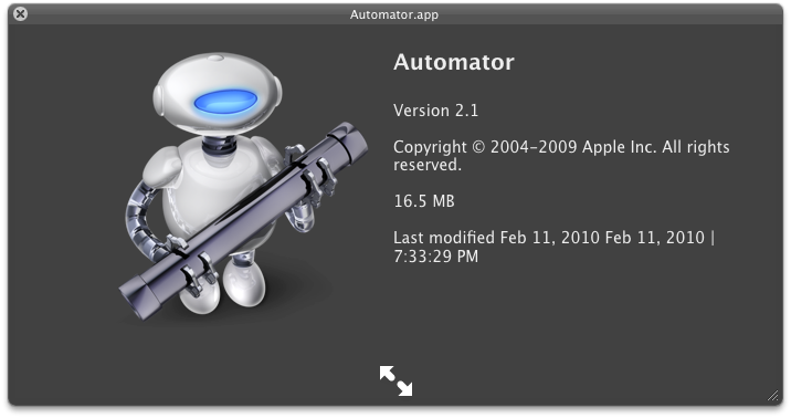
By default, Services that you create in Automator simply retain the Automator icon — the little robot with the pipe — in the Services menu.

Automator Icon

If you want to customize the look of your Services, simply give the actual services on disk (located at ~/Library/Services) a custom icon.

These icons will appear in the Services menu listing, which looks nice and provides visual hints about what the Service does.