I Don't Care Anymore

I've heard that the WACOM company's name is supposed to be pronounced "wack-em." But I don't care. I'm saying "way-com." 'Cause let's face it, you just sound stupid saying, "Hey, can I try your wack-em?" Or, "Your wack-em is huge. Much bigger than my wack-em." Or, "Wow, I just love my new, giant wack-em."

Oh yeah, and I say, "OS Ecks" as well.

Deal with it.

What Everyone's Bitching About

There's been no shortage of commentary on Leopard's 3D Dock, mostly because it's just ugly as Hell. But that's fixable.

There's been almost as much bitching about two other new visual changes in Leopard. The first is the menubar, which is now translucent. I'm ambivalent about this one. On the one hand, I understand that, from a usability standpoint, it's a bad idea. It's now slightly harder to read a primary interface element under certain conditions, those conditions being, in particular, the use of busy Desktop pictures and/or patterns. The default Desktop picture for Leopard, in fact, is an image of outer space whose star field can directly compete for visual attention with text in the menubar. My argument to this, however, is that busy, distracting, high-contrast Desktop pictures are a far greater hindrance to usability than slightly-harder-to-read menubar text, and if you're really bothered by the menubar changes, you should probably switch to a nice, solid or muted Desktop background and remove all distractions from your life once and for all. That's what I do and, so, while the I understand that translucent menubar is not the best idea for usability's sake, it really just doesn't bother me in the least. Actually, I kind of like the muted, lower-contrast lack of in-your-face-ness of the new menubar.

The other big gripe has been about pulldown menu transparency. No. Seriously. David Pogue of the New York frickin' Times for Pete's sake:

The most serious misstep in Leopard is its new see-through menus. When the menu commands — Save As, Page Preview, whatever — are superimposed on the text of whatever document is behind them, they’re much harder to read. Often, Apple’s snazzy graphics are justifiable because they make the Mac more fun to use. In this case, though, nothing is gained, and much is lost.

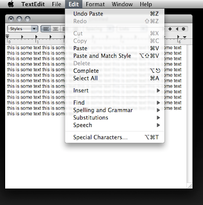
This one I don't get. Pulldown menus have been transparent in Mac OS X for a long time. (Oh, wait. I mean forever!) The difference between how Tiger deals with them and how Leopard does is extremely subtle.


Tiger Pulldown Transparency: Pinstripes! Ew!
(click image for larger view)

And Leopard does away with the pinstripes, which to my mind is a huge usability gain. At worst we break even here.


Leopard Pulldown Transparency: A "Serious Misstep." Really?
(click image for larger view)

I wonder sometimes if people are forgetting that pulldowns in Tiger were transparent. You'd think, by the level of general annoyance with this change, that they had. Honestly, people. It's really not that bad. I'm totally on board with the Dock thing (though a lot of people don't mind that even). But when it comes to the new transparencies, they just don't bother me much at all. I hardly even notice.

UPDATE:
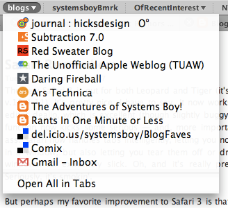
Oddly, Firefox's group bookmark pulldowns exhibit the old-style, non-blurred menu transparency, minus the pinstripes of course. I can't find another application that does this. Weird.


Firefox's Group Bookmark Pulldown: Old Skool
(click image for larger view)

Spaces Switchery

Leopard's Spaces application is pretty cool. I have to admit, I'm using it more than I expected to. Sure, it has some issues compared to older *NIX-based implementations that have been around forever. But I've never used a virtual desktop implementation until now, and all in all I like it.

I have had one little annoyance, however, and it deals with the fact that, as John Gruber puts it:

...Spaces seems designed for app partitioning, not task partitioning.

Indeed. Let's take an example: I have my browser bound to and open in Space One. I also have a Finder window open in Space Four, and the Finder is not bound to any particular Space. Currently, I am viewing my browser, and then I command-tab to the Finder. The behavior is to switch me to the Space with the open Finder window, Space Four. Cool so far. But what if I have a second Finder window open in Space One in addition to the one in Space Four. Ideally I'd like a way to switch, via the command-tab Application Switcher, either to the Finder window in Space One (the one with my browser window) or the one in Space Four (the one with the lone Finder window). Fortunately, such a thing is possible through the magic of click-and-hold.

So, if I'm in Space One and the browser is in front, and I want to switch to the Finder window in Space Four, I click command-tab, then hold the command button for a second. This takes me to the Finder in Space Four. But, if I'm in the browser in Space One and I want to switch to the Finder window in the current Space, I command-tab very rapidly and I switch to the Space One Finder window. Not bad.

Now what happens if we add a Finder window to Space Two? Well, things start to get a bit weird. A rapid command-click will still take you to the Finder window in your current Space. A click-and-hold command-tab will alternately take you to one of the other Finder windows in the other Spaces. That is, the first slow command-tab will take you to the Finder window in Space Two. Switch back to Space One and slow-command-tab again and you go to Space Four again.

Confusing? You bet it is. But at least there appears to be some thought going on as to how to manage applications with windows in multiple Spaces. Hopefully this gets refined a bit as time goes on. For now, I'll take it.

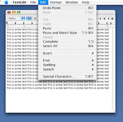
Leopard Menu Text

It's not a difference you'd probably ever really notice, but Leopard's standard menus now use color to create the dark gray text you see throughout the interface (though not in the menubar).


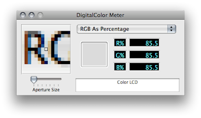
Tiger's Menu Text: Black, White and Gray
(click image for larger view)

I'm not sure the reason for the change — perhaps to add a warmth and a softness to the text.


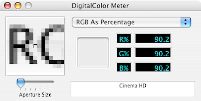
Leopard's Menu Text: Now in Full Color
(click image for larger view)
It's a subtle difference, almost imperceptible. And I'm curious what the thinking was behind this change. If anyone has any clues, I'd love to hear about them in the comments.

UPDATE:
John Gruber has the answer over at Daring Fireball, actually. Turns out this is nothing new and not a difference between Leopard and Tiger. What you're seeing here, generally, is the difference between standard and sub-pixel anti-aliasing, two techniques for anti-aliasing text. What you're seeing, specific to my two computers, is the difference between the "Standard" and "Light" Font smoothing style settings in the Appearance Preferences. "Standard," as you might guess, uses standard anti-aliasing — i.e. shades of gray — to anti-alias text, whereas any of the other settings use sub-pixel anti-aliasing, which uses color to achieve the same effect. Turns out I've always preferred standard, even on LCDs. Weird.

More details here.

The Death of NetInfo

Not sure how I missed this, but NetInfo is dead as of Leopard. And I don't just mean the NetInfo Manager application. I mean NetInfo technology. It's gone. Completely replaced by a generic set of plist files in plain ol', flat XML. The GUI functionality is found mostly where you'd expect it. Gone, too, are the command-line tools for modifying the NetInfo database. These have been replaced dscl and friends. To quote AFP548:

Since dscl can't do everything there are some new, and greatly enhanced tools to help you:
  • dsenableroot - just like it sounds. This has been on OS X for a while now, but it may be more useful now that NetInfo Manager is gone.
  • dseditgroup - also present in 10.4, but will get more usage now. Good for manipulating group memberships.
  • dscacheutil - brand new in Leopard. This tools allows you to peek into the Directory Service cache and flush it if necessary. Semi-analogous to lookupd -d.
  • dserr - a curious tool. Lives only to lookup DS error codes for you and return the text equivalent of the error. I half expected to find a quick shell script here just grepping the man page for DirectoryService.
  • dsmemberutil - now this is a command you can sink your teeth into! Allows you to check group membership and do some debugging on what groups the system thinks a user is in.

That's about as good a description as I've seen on the topic in a nutshell. Suffice to say, this is a day we've all been waiting for, or at least expecting. That it's come with such little fanfare is probably, in retrospect, not all that surprising. It just took me off guard a little.

In the end I think this will basically be a good thing. So far, things once done with NetInfo look at least a bit easier to do with the dscl and GUI equivalents. So, cool. NetInfo has finally been replaced. Of course it's been replaced with something else proprietary and weird, but it looks like it's at least a bit easier to manage. But, whatever.

So long NetInfo, we hardly knew ye!