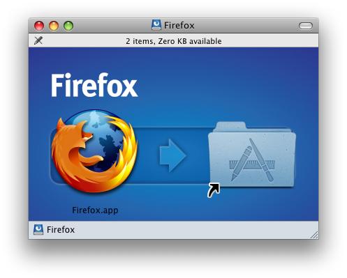
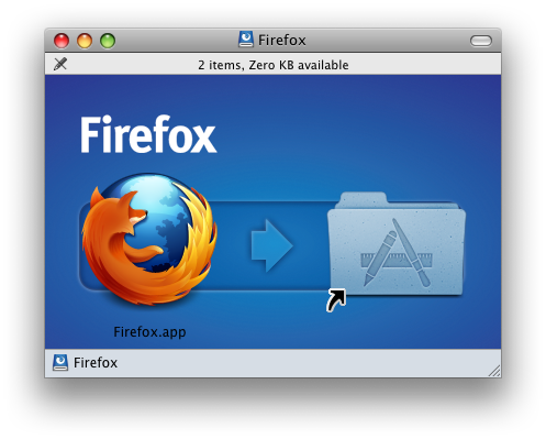
The first release candidate for Firefox 3.5 came out yesterday, and with it a slightly different application icon.
The old icon looked like this:
And here's the new icon:
Personally, I think it looks swell. It's a big enough change to be noticeable, but subtle enough to retain the brand identity and not be visually jarring. Just a wee bit fierier along its bottom edge, It even looks good in my Dock:
I've just downloaded RC 1, but I've been using the betas for some time now. I've had really no problems to speak of and have enjoyed the speed increases and new functionality. This minor icon change is a good representation of the sort of attention to detail you're starting to see a lot of in Firefox. While they still haven't addressed my biggest complaint, I can certainly say I recommend this latest version of Firefox.
UPDATE:
I've just downloaded this for another computer and it appears they've pulled the new icon. Today's release is still being called "RC1," but it now sports a "3.5b4" version number. Too bad. I hope they bring back the new icon in a later release. I like it.
UPDATE 2:
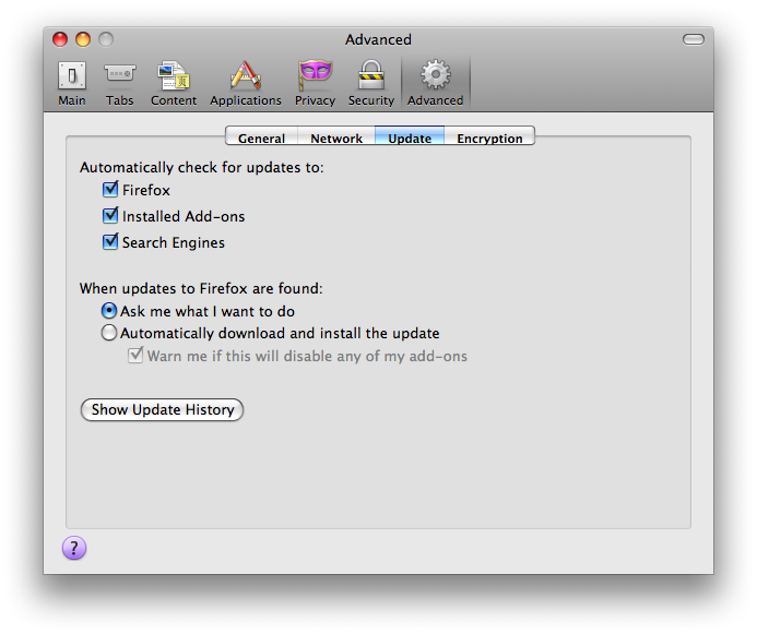
Actually, what seems to be going on is that the update that gets downloaded from the RC1 web page is different from the one that gets downloaded via Firefox's Update preference pane.
This was not the case the other day. The version on the web page is now 3.5b4 (Beta 4), as it now states in the fine print. But download that and Firefox will still prompt you to download a newer version (which prompt, oddly, links back to the confused download web page). The newer version that Firefox downloads has the updated icon. I'm not sure why they pulled this newer version from the web page. That's mighty strange. But, for the record, what's currently on the web page is not the release candidate. It is beta 4. You've been warned.
UPDATE 3:
Today the web page links to the new RC2, which does have the new icon. Wow! That was fast!


