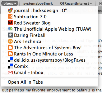
The new Safari 3 is out for both Leopard and Tiger (it's included in Mac OS X v.10.4.11). It's pretty nice, I have to say. It now works with Blogger's HTML editor dealio, which is excellent (though slightly buggy at present). The find function now kicks some serious — and, more importantly, some Firefox — ass. Safari now handles tabs intelligently, letting you not only rearrange them in a window, but also letting you tear them off or drop them into existing windows. All extremely slick. Oh, and it's really pretty and fast as Hell. Seriously, it's smokin'.
Remote Management Commands in Leopard
A while ago I wrote about the networksetup command, which provides a command-line interface to network preferences, as well as the systemsetup command, which provides command-line control over additional system-level preferences. In the past those commands were stored in the labyrinthian:
/System/Library/CoreServices/RemoteManagement/ARDAgent.app/Contents/SupportFinally Apple has put those commands in a location the shell recognizes as a command path. In Leopard they reside in the far more sensible:
/usr/sbin
Really now. Was that so hard?
What Everyone's Bitching About
There's been no shortage of commentary on Leopard's 3D Dock, mostly because it's just ugly as Hell. But that's fixable.
There's been almost as much bitching about two other new visual changes in Leopard. The first is the menubar, which is now translucent. I'm ambivalent about this one. On the one hand, I understand that, from a usability standpoint, it's a bad idea. It's now slightly harder to read a primary interface element under certain conditions, those conditions being, in particular, the use of busy Desktop pictures and/or patterns. The default Desktop picture for Leopard, in fact, is an image of outer space whose star field can directly compete for visual attention with text in the menubar. My argument to this, however, is that busy, distracting, high-contrast Desktop pictures are a far greater hindrance to usability than slightly-harder-to-read menubar text, and if you're really bothered by the menubar changes, you should probably switch to a nice, solid or muted Desktop background and remove all distractions from your life once and for all. That's what I do and, so, while the I understand that translucent menubar is not the best idea for usability's sake, it really just doesn't bother me in the least. Actually, I kind of like the muted, lower-contrast lack of in-your-face-ness of the new menubar.
The other big gripe has been about pulldown menu transparency. No. Seriously. David Pogue of the New York frickin' Times for Pete's sake:
The most serious misstep in Leopard is its new see-through menus. When the menu commands — Save As, Page Preview, whatever — are superimposed on the text of whatever document is behind them, they’re much harder to read. Often, Apple’s snazzy graphics are justifiable because they make the Mac more fun to use. In this case, though, nothing is gained, and much is lost.
This one I don't get. Pulldown menus have been transparent in Mac OS X for a long time. (Oh, wait. I mean forever!) The difference between how Tiger deals with them and how Leopard does is extremely subtle.
And Leopard does away with the pinstripes, which to my mind is a huge usability gain. At worst we break even here.
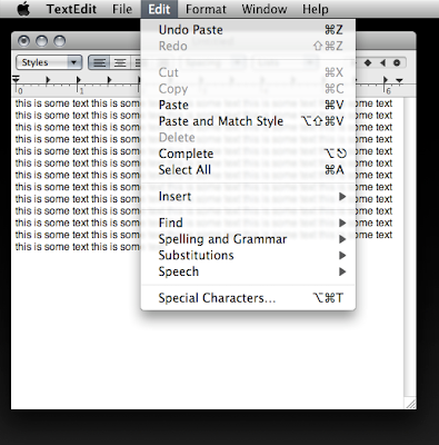
Leopard Pulldown Transparency: A "Serious Misstep." Really?
(click image for larger view)
UPDATE:
Oddly, Firefox's group bookmark pulldowns exhibit the old-style, non-blurred menu transparency, minus the pinstripes of course. I can't find another application that does this. Weird.
Leopard Menu Text
It's not a difference you'd probably ever really notice, but Leopard's standard menus now use color to create the dark gray text you see throughout the interface (though not in the menubar).
I'm not sure the reason for the change — perhaps to add a warmth and a softness to the text.
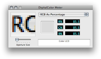
Leopard's Menu Text: Now in Full Color
(click image for larger view)
UPDATE:
John Gruber has the answer over at Daring Fireball, actually. Turns out this is nothing new and not a difference between Leopard and Tiger. What you're seeing here, generally, is the difference between standard and sub-pixel anti-aliasing, two techniques for anti-aliasing text. What you're seeing, specific to my two computers, is the difference between the "Standard" and "Light" Font smoothing style settings in the Appearance Preferences. "Standard," as you might guess, uses standard anti-aliasing — i.e. shades of gray — to anti-alias text, whereas any of the other settings use sub-pixel anti-aliasing, which uses color to achieve the same effect. Turns out I've always preferred standard, even on LCDs. Weird.
More details here.
Hallelujah Items
Two hallelujah items today: First, Google Mail now supports IMAP. This is great news for us POP haters, particularity to the extent that we love ourselves some serious GMail. As of this writing, GMail's IMAP capabilities aren't available to everyone, but should be in the next few days. According to Google:
Don't fret if you don't see "IMAP Access" yet under the Settings menu. We're rolling it out to everyone over the next few days.
Second, the hideous Leopard Dock will now, apparently, be optional. And what's awesome is that the attractive replacement actually looks to be an improvement over the current, Tiger Dock, at least from my aesthetic perspective.
Neat-O!

The Tiger Dock of Yore: All Good and Well, and Square
(click image for larger view)
The Godawful Leopard Dock: My Eyes!
(click image for larger view)
At least that's what being reported as of today, two days before Leopard's actual release. We'll see how it actually goes. Either way, I'm happy.

