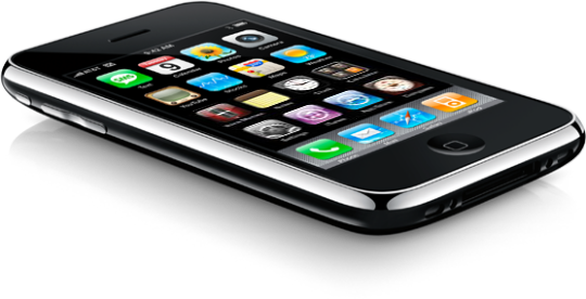
Much of the press surrounding the iPhone 3GS deals with whether or not this is a compelling upgrade to the 3G iPhone. No one is really comparing it much to the 1st Generation iPhone, which is what I'm upgrading from.
Some write-ups are describing the iPhone 3GS as "evolutionary, but not revolutionary." Funny, 'cause that was how I felt (and what a lot of people wrote) when the 3G came out. It didn't seem like a big, huge leap forward from my 1st Gen model, and in terms of battery life it was actually a step backwards. So I stuck it out and waited for the next, next version. And now it's here.
While going from the 3G to the 3GS might seem like a mere evolutionary step, going from a 1st Gen iPhone to a 3GS feels like evolutionary leapfrog. Like when proto-humans discovered that big, black monolith and suddenly got the idea for tools and beating the tar out of each other. It's big, my friends, for me anyway.
In addition to all the cool new stuff you've been reading about, new for me is also GPS and faster network access thanks to the addition of 3G, and the new (again, to me) case style, which I must admit I love the feel of despite preferring the look of the 1st Gen's metal back. The plastic model feels almost perfect in your hand. The way the edges are tapered gives the phone a light, comfortable handling, and the texture of the plastic should keep me (and my mom) from dropping the damn thing so much. These models make the 1st Gens feel clumsy and awkward by comparison.
But the real reasons I've upgraded — the real evolutionary jumps for me, the things I've been longing for the most — are:
- Improved call quality
- Performance
- Video
Two of these represent, to me, the most annoying things about my current iPhone — the crappy call quality and the glacial speed with which applications open. The last, video, is just something I've wanted for a long, long time. Just something cool. Let me just talk briefly about each.
Improved Call Quality
Though it didn't bother me at first, so enamored of my iPhone was I, the call quality on my 1st Gen really leaves much to be desired. Which is a nice way of saying it sucks ass. Audio drops out as a matter of course on pretty much every call. And it seems to be more the phone's issue than AT&T's as it even happens during the ring period before the person I'm calling picks up. This makes simply ordering delivery torturous, and now I'm so instantly cranky whenever I'm on the phone that all my friends think I hate them. (I don't hate you, friends, I promise!)
Results
So far I'd describe the improvement in call quality as marginal at best. The 3GS is a bit louder than my old phone, and that helps. But the dropouts still occur, and that's disappointing. I was really hoping the call quality was appreciably better on the 3GS as it's one of my least favorite things about my 1st Gen. This is something I'll have to suss out more over time. But overall I'd say the gain here is only a slight one. Disappointing.
Performance
When the Notes application takes 20 seconds to launch, you know your computing device is slow. This may well be due to the fact that I have so many damned notes in there, sure. But that only underscores my need for speed. Maybe when the phone was new and not laden with data I could get away with the slower hardware. But it's not so data-free now, and that's not going to change. So it's great that Apple's focused on speed for this model. It's been another big aggravation as my iPhone use has matured. And not just in Notes, but in Safari, Contacts and the Camera as well. These are apps in which a lack of speed gets annoying fast. I mean, uh, quickly.
Battery life is also a crucial part of performance (or I'll lump it in with performance for lack of a better place), and a big reason I didn't upgrade to the 3G. As I alluded to earlier, battery life in the 3G was actually inferior to the 1st Gen models. I can get by fine as long as my battery lasts a full day; I don't mind charging every night. But the 3G, by most accounts, often needed charging before day's end. And while I could get used to it, I'd rather not.
Results
Well, again, it remains to be seen whether performance decreases as I continue to use the device. But so far I'm very pleased to report that the performance gains going from a 1st Gen iPhone to the 3GS are significant. I can begin editing notes now immediately after launching the application — I'd call zero seconds down from 20 a big gain. All my applications, in fact, launch much more quickly. And browsing the web in Safari is much faster than it used to be, both because of the hardware improvements and because I'm now on 3G. Many things that were just impractical before — like finding something in the Maps application, which used to be so slow I'd stopped using it unless I was on WiFi — are now acceptably fast. Sometimes even pleasantly speedy. Though I don't need to reboot very often, it's nice to see that even boot times are much faster — my phone boots in about 22 seconds. And, fortunately, as reported, the 3GS's battery, like my trusty 1st Gen, seems to regularly make it to bedtime without much trouble. Overall, I'd say the performance gains are a huge win when comparing the 3GS to the 1st Gen model.
Video
Long ago I opined the iPhone's lack of video capabilities (and then ran out and bought a Flip Mino HD). It always seemed like something Apple could have included as a software update. But as the updates have progressed this looks not to be the case (or at least not something that's ever going to happen, for, I'm assuming, good reasons). Alas, in the end, video acquisition on the iPhone requires a hardware update. And now that it's here I can finally leave the Flip at home from now on. Video's become just one more thing I can do without the need for an extra device. My pockets are so empty these days!
Results
The video produced by the iPhone 3GS is surprisingly good in my initial tests. Though it's not HD, compared to the Flip the color is quite good. And it seems to handle both camera and subject movement — big problems on the Mino HD — pretty well. Don't get me wrong. This is still a phone camera. But it's easily the best phone camera for video I've ever seen. And the editing and upload capabilities make it all the more fun. But more than anything, it's the convenience of having decent video in your pocket at all times that makes this a great feature. I'm pretty excited to start really shooting more with this thing. Its ubiquity may just make it my primary video camera. Another big win for the 3GS.
Anyone want to buy a Mino?
Other Upgrade Faves
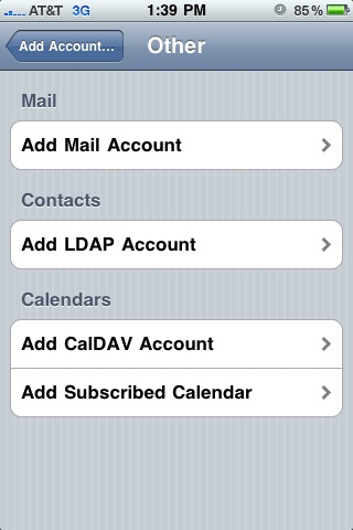
CalDAV calendar access in iCal Mobile
I've been wanting this for a while. I've been using the sync function in iTunes in the interim. But CalDAV support on the phone — in fact, CalDAV support everywhere — is just the right way to do this.
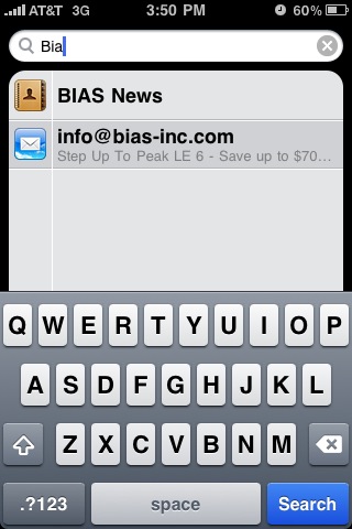
Search! Everywhere and Anywhere
This is one of those features that, after a while, you start wishing you had. You don't notice it at first, but the more you start using your phone like the computing device it is, the more you start drawing comparisons to computers, not phones. That's the point at which certain inequities become increasingly obvious and painful. So it is with Search. It was great when we got it in Contacts. But having it one place only made me crave it in others. Glad it's finally here.
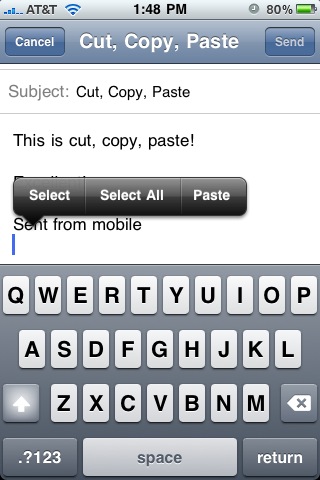
Cut, Copy, Paste (of course)
I will say, I've been fine without this feature until fairly recently as well. In fact the timing of all this stuff is pretty good from where I sit. The 1st Gen iPhone was good enough to keep me busy and happy for the past two years, and only in the last few months of those two years have I really started to long for things like Search and Cut, Copy, Paste. Again, as I use my phone more and more like a computer, these things become more important.
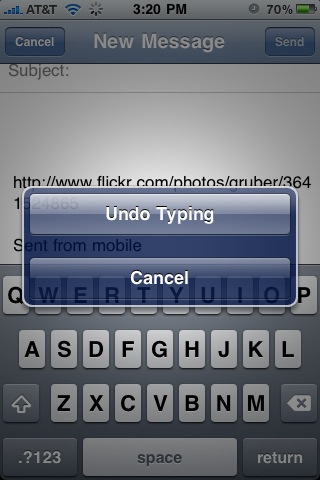
Undo
What computer would be complete without an undo feature? Well, iPhones have been for some time now. But no longer. Undo is here and it's even fun! Just shake to activate. (No, the phone, silly!)
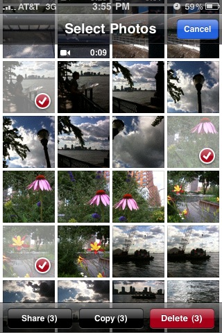
Camera Roll
New to the Camera Roll, both when accessing it from the Camera or from the Photos app, is the ability to multiple-select items for sharing, deleting or copying. It's a nice implementation, and something I turn out to be using a lot, especially as I write this article.
Macro, Focus and Exposure Control
The camera in the iPhone 3GS now features focus and exposure control, which will really help make photos look a lot nicer and add to the types of photos you can take with the phone. And the macro ability adds a great deal of functionality. Ever try to take a close-up with the original iPhone camera? Blur city! Now you can take photos of printed text, computer monitors and yes, even bugs. Okay, maybe not tiny bugs. But probably big ol' water bugs.
Compass
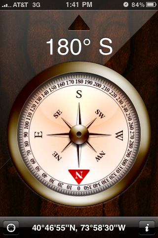
Folks outside of New York might not appreciate the compass in and of itself, but if you ever have to take a subway in this town you know that disoriented feeling you get when you step out of the station into the daylight. "Okay," you think to yourself, "Which way is north." Any New Yorker can find her way with that simple piece of information, but sometimes getting it requires walking a block in the wrong direction, and if you're anywhere south of Houston, god help you. Well, no more! From here on out, discombobulated commuters will simply activate the compass on their iPhones and be on their merry ways. And that's all we ever really wanted.
Maps Reborn
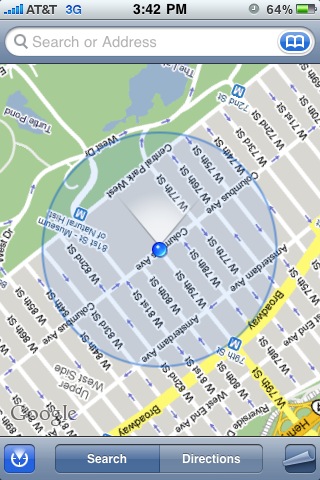
Maps, combined with the new compass and the new (to me) 3G are a whole new, wonderful ballgame for me now. I've already used Maps a couple times now, both to find places and to orient myself. It's fantastic!
What's Old is New Again
So, am I happy with my new phone? Yes. Very.
Am I ecstatic?
Here's the thing. On the whole, after transferring over all my apps and information, the iPhone 3GS is, in more ways than not, the same phone as my 1st Gen. I'd say 75-80 percent of what I do with my phone and how I use it will remain unchanged. I mean, there's just not much that can compare to your first iPhone experience, right? After that, nothing seems radical. But least of all a phone that looks and feels almost identical to your last one, that has mainly the same set of features, and whose improvements are mostly on the inside. It does all the same stuff, it just does it a lot better.
Overall the iPhone 3GS is a big step up for me. And while call quality could still be a lot better, this upgrade addresses two of my biggest complaints about my last model with aplomb: the slowness and the lack of video. And that alone makes upgrading worthwhile to me. The other improvements, partly due to software updates I could have gotten on my old phone, are great and help make the entire experience very satisfying. It's very much like getting a faster computer. It's the same sort of feeling. It's a refresh of a product you've know and loved for years.
It's the same thing, only better. And it was already so good.

