Shocked to Shit

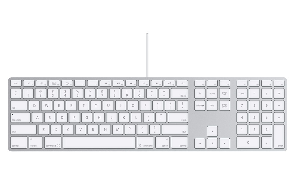
I really like my Apple aluminum keyboard. I really do. It's compact and attractive, and hairs don't get all caught in it, or if they do you can't see them. The keyboard is springy and resistive; it's got a really nice feel to it. Unless, of course, you've just walked up to it across a carpeted room. Then it's, all like, "Bzzzt!" and my hair's all standing on end.

Aluminum keyboard owners all know exactly what I'm talking about.

Apple Aluminum Keyboard: Shocking!

I'm assuming the thing's grounded as it hasn't toasted anything yet, and so it isn't bad for my computer. But man is it hard on my nerves. Every time — and I mean every time — I touch the damn thing I get, like, twelve-thousand volts coursing through my poor frazzled little index finger. It's getting a little annoying.

Who knows? Maybe they don't get static charges in Cupertino like we do in New York, but you'd think the brainiacs at Apple might've built something in to their fabulous keyboard to prevent this sort of thing from happening.

As it is, I may have to start wearing gloves.

Design vs. Data

There's a fascinating discussion that ties nicely into into my recent post on workflows, that's recently picked up since Doug Bowman decided to leave Google. Mr. Bowman is a designer, and has had some issues regarding Google's priorities. The general takeaway from all this has been that Google places engineers' data and statistics above the aesthetic sensibilities of the designer.

While I don't work at Google, and I certainly don't know the actual priority Google places on design, I've certainly had my gripes about their products in the past. And the main gripe therein generally revolves around design. Google's applications — particularly their web apps such as Gmail — do function wonderfully. Gmail, in fact, works in ways that I've begun to find superior to desktop apps, even ones designed by Apple. The problem is, Google's apps look like ass.

Yes, I have switched almost entirely to Gmail. Why? Because, frankly, it works better for me. It scales beautifully and offers features that no other client does without me ever having to manage it locally. Why, then, am I just making this move now, after years of doing it the Desktop way? Well, partly because Google's apps look like ass. And if it's email we're talking about, that's an ass I have to look at all frickin' day long.

I should say, Gmail has gotten appreciably better over time. But it still lacks anything even remotely resembling the charm of an Apple-designed desktop application. Or even the panache of many websites, Apple's MobileMe among them.

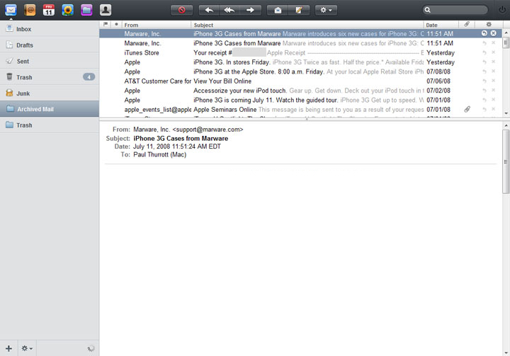
Apple's MobileMe Mail

I understand the approach they're taking — blue links, black text, efficiency and clarity. And that's great. But — and I hate that I'm even saying this — it's so very Web 1.0. Seriously. It's time to get over it.

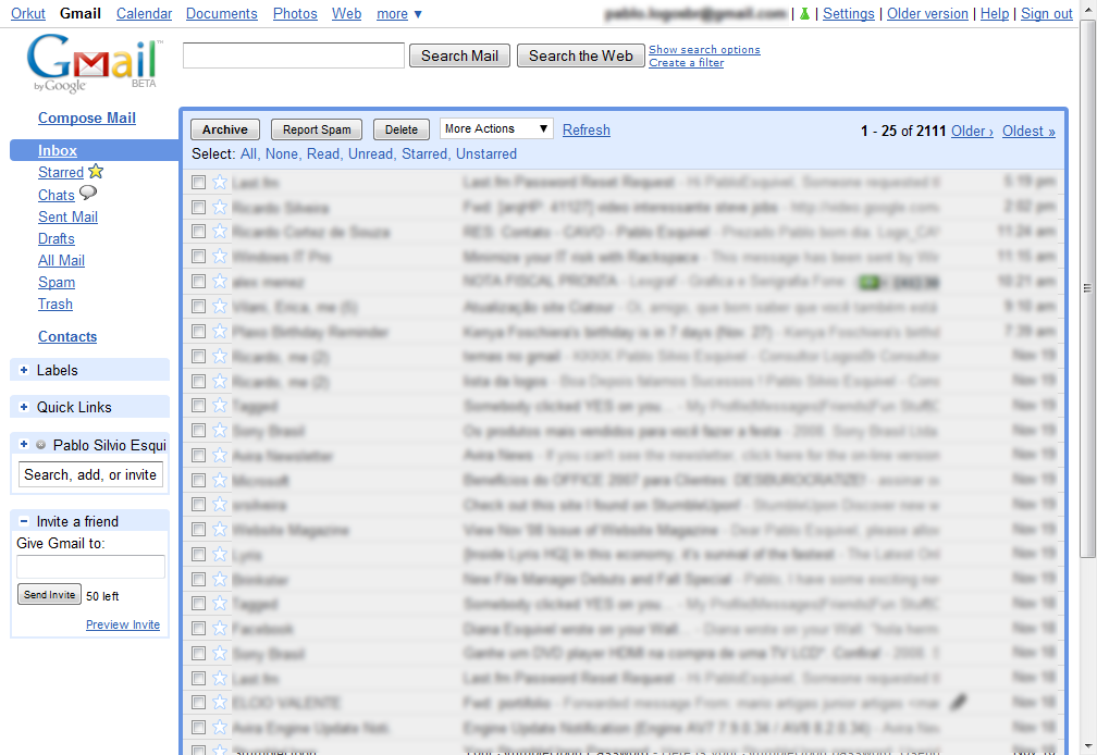
Gmail's Latest Default Theme

I don't advocate Gmail aping Apple's mail clients by any means. But I do wish they'd pay a bit more attention to design. Or, if they are paying attention to design, do it better. The comparison here is stark. Google's mail app looks like it came out of 1997. Which, in fact, it did. How is it that the best, most amazing mail client you can get for free looks like Windows 2000? It's sad. Big, clunky, grayscale buttons; gray lists of black text; a blue border around the conversations list? This could look better, guys. I'm sure of it.

But why does all this matter? Well, I'm of an opinion, frankly, that the way things look is a part of your environment, and ugly things contribute to an ugly environment. And that ultimately hurts usability. I think that if Google were to make attempts to improve the design of Gmail — and I'm not just talking about themes here — they would discover numerous ways to improve the usability along the way. And that would make users happy. And that's good for everyone.

Apple is, in fact, a great example of the triumph of design in usability as well as corporate success. Their computers since the clear-plastic, fruit-flavored iMacs have made everyone else look antiquated and backwards. This has thrust their image ahead of their competitors and has ultimately gained them marketshare.

I've said it before, and I'll say it again. The way things look is important. It speaks volumes. Google's been immensely successful, and deservedly so. They make great stuff. But if they want to be even more successful they should really start taking design seriously. It's a niche they're leaving wide open for companies who do.

Workflow Design

I've long described my professional self as someone who designs workflows. And as I design more of these workflows, I find myself more and more creating — and obsessing over — the interfaces to them. I have no formal training in the field of interface design, but I find it fascinating and I'm definitely an admirer of great workflow and interface design. Over the course of the last few months, in which I've been focused almost entirely on workflows and their interfaces, I've made some observations. These are certainly not earth-shattering revelations, and real interface designers will probably have codified these in some formal way a long time ago. But for me this is all very new, and so I wanted to get down in writing some of my early impressions of the process.

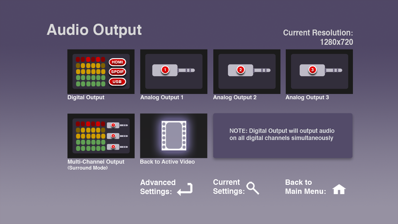
audio-interface

What's a Workflow?

Before I start, let me talk about what I mean when I say "workflow" as the notion goes a bit beyond just interface design. Generally, when I'm designing a workflow, I'm designing the process by which a user will complete a complex task. A workflow often involves a number of steps using a variety of tools, from the web to a remote control to shell scripts. Often I am directly responsible for the design of each of these workflow components, their guts as well as their surfaces; sometimes I find myself working on only one facet of them. But that, in a nutshell, is generally how I think of this concept I'm calling the workflow: a series of steps and tools used for completing a large, complex task.

So, on to some observations.

Keep It Simple

First of all, the simpler and easier you can make a workflow, the better. This is always the case, though simple can be a bit of a relative term. Sometimes you can make something so simple that it fails to meet the user's needs (yes, this has happened to me). Which brings us to my next observation.

Know Your Goals

The first, and often most difficult, but certainly most important aspect of designing a good workflow and the interface to it is knowing exactly what you want to accomplish with the workflow. It is essential to figure this out as early on in the process and as accurately as possible, though some amount of discovery can be a part of the early design process. That said, you really want to nail it down as soon as you can.

Know Your Users and Your Tools

You also need to quickly determine who will use the workflow — and by who I mean, what is the userbase and what is their particular skill set — as well as the context for the workflow, and the most appropriate tools for both the job of creating the workflow and accessing it.

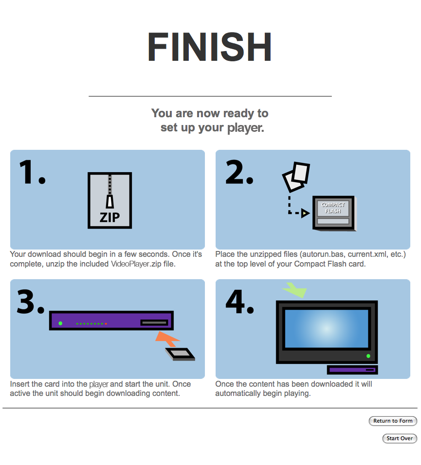
test

Looks Are Important

The way things look and sound is paramount. These communicate everything about the workflow, from how it works to a certain mood. It's weird to think of a workflow having a mood, but it really helps to set a tone. If your workflow is for novice users, for instance, creating a mood that is not intimidating can help a great deal with discoverability. This can be achieved through choice of graphics as well as the use of language. These things are important.

Simplicity Is Hard

While simplicity is always the goal (not one unnecessary click, I always say!) it is also deceptively difficult to achieve. Generally the tools for creating workflows are extremely complex; boiling those tools down to something simple is the challenge of the designer.

Get Out of Your Shell

Testing on real people — preferably the people that will be using the workflow — as often as possible, or near milestones in the project, is crucial. As the designer you tend to lose a great of objectivity when it comes to the project, and the more you can try to see things through the eyes of your end-user the better. There is no better way to do this than to let them use use the workflow. You'll instantly see where your design breaks down, where it succeeds and where it fails. It will test all your assumptions about your workflow and about the way people interact with it. Watch closely and take notes!

This is also a great way to get to know your user (or at least more about them), if you don't already.

Make It Look Easy

Lastly, and perhaps somewhat frustratingly, if (when!) you are successful in making something that is simple and elegant and still functional, people will not understand how difficult that balance was to achieve and will think that your workflow sprang forth from the ether, fully formed. They will think it is native; they will think "it couldn't have been hard." They will say things like, "how hard could it be to add such and such a feature?"

While sometimes maddening, you should take it as a sign that you've done something right.

iMovie 8

As promised at the announcement of iLife '09, I've been poking at the new iMovie. It's an interesting beast, like nothing I've ever seen. And I agree with many of the comments floating around about it. One thing that's been noted is that, because iMovie 8 is completely unlike traditional professional NLEs, the learning curve is greater for folks who are used to typical, timeline-based editing systems. I'd say that's about right. But, while it would be extremely difficult to do the sort of editing I normally do — very precise, layered cuts editing — iMovie offers such a completely different paradigm to video editing that it actually changes the way I think about and approach editing. And I have a sneaking suspicion I'll use it to create something very different than what I've made in the past.

iMovie 8: Icon

No Save

John Gruber recently wrote about what he calls "Untitled Document Syndrome," the phenomenon wherein a user opens an application and begins working in a new, untitled document before ever saving it. He specifically cites the iLife suite as being one in which the saving of documents is handled automatically, rather than foisting the burden on the user:

"Everything on your computer is ultimately saved somewhere in the file system. But that doesn’t mean that you want to handle the actual filing by hand for everything. You don’t really want to know a lot of things about the specific technical details of how your data is saved, or if you did, you’d write your own app."

Gruber talks in particular about iPhoto and iTunes being applications that remove the need for the user to really think much about where their files are. But iPhoto and iTunes are cataloging applications. You don't ever really create documents in either of these apps. In fact, it could be argued that the entire point of iPhoto and iTunes is to remove the filesystem from the equation. They are aggregators, of a sort. The approach becomes much more novel in an application that is document based, an application like, say, iMovie. Certainly one of the things that heralds just how radical iMovie 8 is is the fact that there is no "Save." It simply doesn't exist.
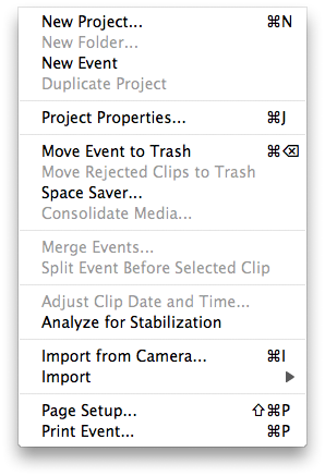
imovie8-nosave

This is the direct antithesis of Final Cut, in which you can work for hours having never saved your project. This can be a real problem in FCP, as capture scratch folders get named for the project the media was captured from. So the first thing I always tell my students is that they must name and save their project when they create it. This is something I often overlook myself, creating projects with media folders called "untitled project" all over the place. It's getting a bit annoying. iMovie 8 is further evidence that Apple is far more willing — or perhaps more interested in — innovating at the consumer level than they are at the pro level. When was the last time we've seen such thought given to a pro application? When was the last time someone tried to actually make pro editing easier and more intuitive, rather than just adding features. (The answer is with the introduction of Motion, several years ago. But that's another story.)

Interface Layout

But the lack of Save is only the beginning. Along with opening and saving documents, iMovie 8 eschews the traditional multi-track timeline editor found in most non-linear suites. The timeline has been the mainstay of NLEs for ten or so years now, and removing it is jarring to someone who's been using one for those ten years. In fact, my first question was, "Just how am I supposed to edit without a timeline?"

iMovie 8: Blank Slate

Actually, iMovie 8 is not as radically different from Final Cut Pro as it first appears. By default, the application is divided into four main quadrants. The upper left quadrant contains your Project, which could best be described as, yes, a timeline. The lower left quadrant is labeled the "Event Library," but it's really just an iMovie-centric representation of your files on disk (it can even be toggled into a mode that shows a more traditional view of the filesystem, should you desire it).
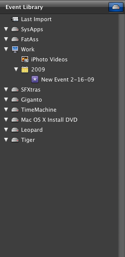
iMovie 8: Event Library Expanded

The lower right quadrant is where you keep all the source material for a given project, just like in FCP's Browser. And finally, the upper right quadrant is a viewer window for watching either individual media or edited clips, as well as for cropping clips (like a combination of Final Cut's Viewer and Canvas windows). If you hit the magic toggle button you can even swap the locations of the Events and Projects sections.
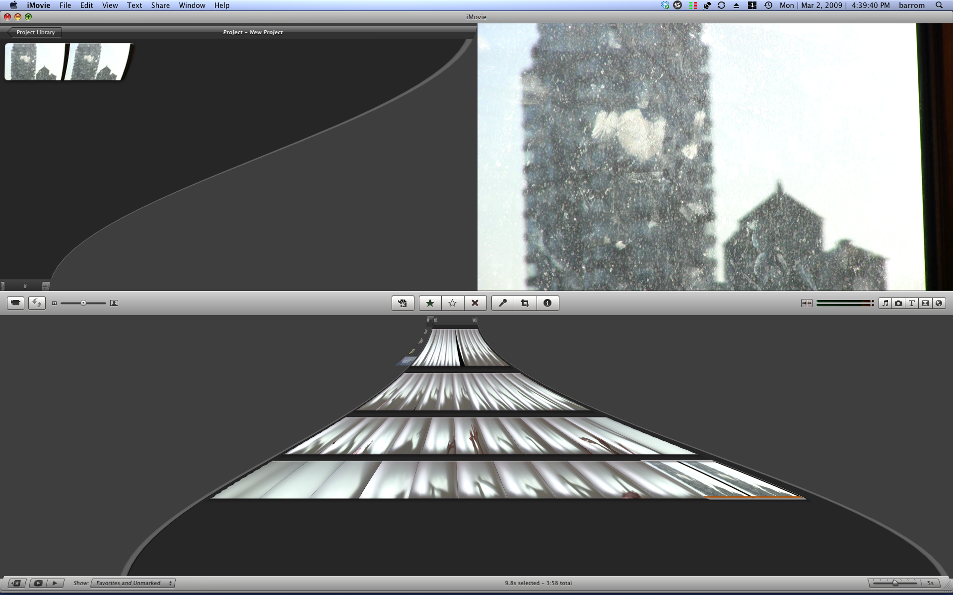
iMovie 8: Toggle Windows

Doing so arranges the application in a way that very closely resembles the default layout of Final Cut Pro, except without all the ugliness (Final Cut looks like iMovie's ugly sister). That simple act, actually put me much more at ease in the program.
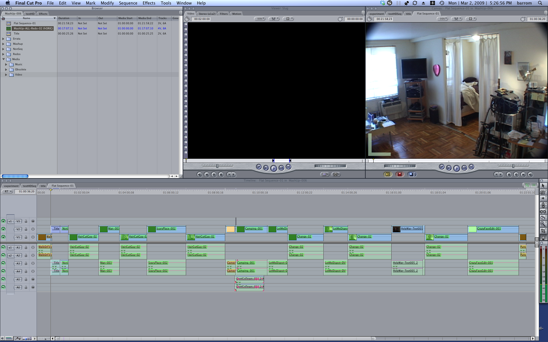
Final Cut Pro: Window Layout

Basic Usage

To get started in iMovie you'll want to make a New Project. New Project creation is the only time you'll ever be asked to — or have need to — save anything, so don't get used to it. And iMovie keeps the location of your projects close to the vest. Suffice to say, they'll be saved somewhere sensible. (Oh, alright! They're stored in your Movie folder in your home account. Happy now?)
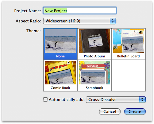
iMovie 8: New Project

To populate the app, iMovie 8 will find any media you've stored in your iPhoto (not iTunes) library and present it to you for import from the Event Library, which is a nice touch that we're starting to really see a lot of throughout Apple's applications. If you're in the habit of keeping video clips in iPhoto or one of the other locations automatically searched by iMovie, you'll be ready to roll right out of the box. More traditional means are available from the File menu as well, where you can simply import video and audio files. And, as always, drag-and-drop is available for getting media to into the project. You can, of course, digitize material from supported cameras as well. And here again, unlike in Final Cut Pro, the media goes someplace sensible, and the user is never bothered with the question of where.
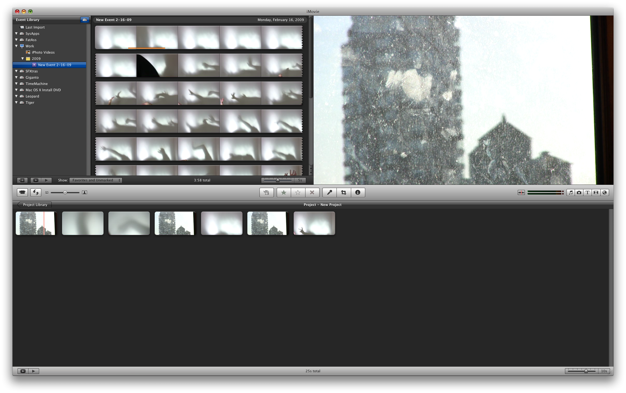
iMovie 8: The Populated Interface

Once you have some media, it's time to begin editing. Rolling over clips with your mouse will scrub through the clip. (I must admit I prefer this to having to click, hold and drag like you do in Final Cut. It's another example of someone really rethinking things in this app in ways that no one has in some time at the pro level. Since when does adding clicks — making things harder — make an application "professional grade?") To put media in your "Project" (timeline) simply drag and drop it from the Event Library. Dragging a clip onto another clip presents you with some sensible insert and/or overwrite options, but otherwise the clips will go in the chronological order you place them in. To grab portions of clips, click and drag on the clip. Handlebars appear that represent the in and out points. Dragging a clip so highlighted will insert only that portion of said clip. Portions of clips that are already in use are underscored with an orange line. Much of this is entirely alien to a Final Cut editor, but it's so intuitive, and in many cases preferable, that I truly wish some of these behaviors would make it into FCP.
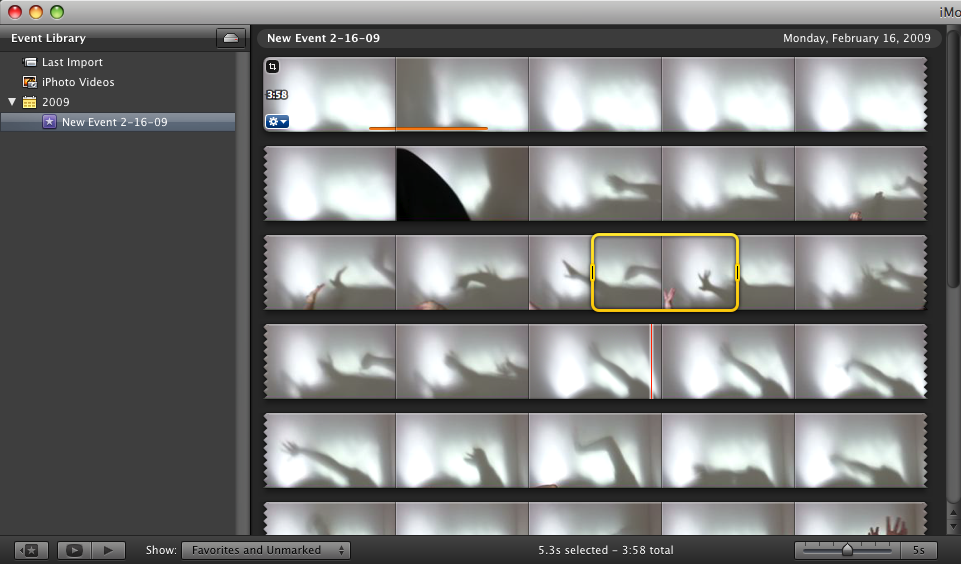
iMovie 8: Trimming

Clicking the little blue widget in the lower left corner a clip also brings up a contextual menu that will allow you to make further clip-specific edits.
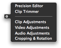
iMovie 8: Contextual Menu

And here you can find the now famed Precision Editor, which I suppose I'd better mention on fear of public flogging. Yes, the precision editor gives you precise control over edits, allowing you to trim down to the frame if need be. I never used the previous version of iMovie, so I can't speak to life before the precision editor, but I can imagine it would be immensely frustrating.
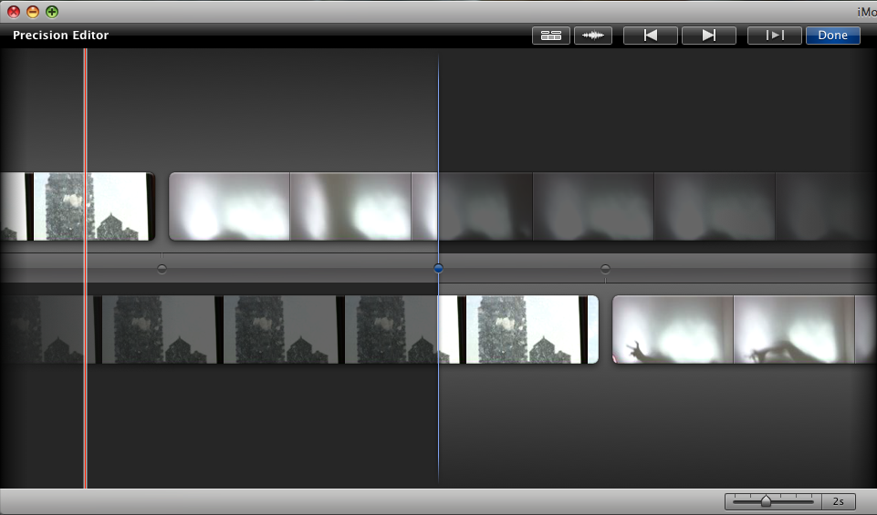
iMovie 8: Precision Editor

Output options for iMovie are good and, like so much about the app, somewhat innovative. The Share menu yields: standard Quicktime export options (good!); Final Cut XML options (awesome!); and a simple "Export Movie" option that allows for easy export to a number of popular formats in a variety of sizes and quality levels (coolio!). There are also options for sharing your movie with other members of the iLife suite, like iDVD for instance.
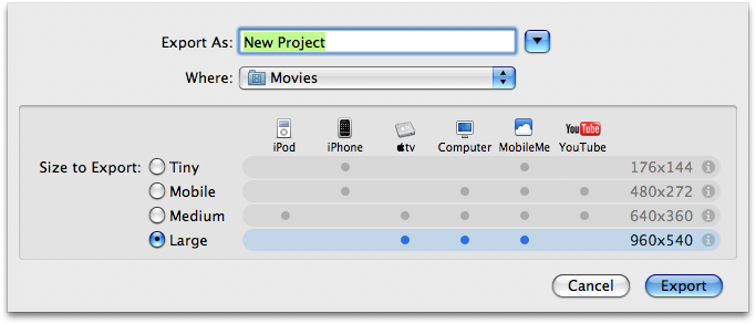
iMovie 8: Export Movie

A Lack of Time

The big difference between iMovie 8 and its Pro brethren, in my mind anyway, is less the lack of timeline as the fact that there seems to be no sense of numeric time anywhere in the editor. There is no visual indicator of time as there is in a Final Cut timeline. This is a decided problem if you need the sort of absolute precision you see on network television, where a 30 second spot must be exactly 30 seconds. For many folks this might not be a big deal. But if you're used to seeing it, it's scary to suddenly have no timecode in your timeline. In fact, the sense of time is almost completely absent in the Project view.

iMovie 8: 2 and 4 Second Clips

Unless you adjust the number of frames per thumbnail in the project browser, a 2 second clip will be the same sized blob as a 4 second clip. This makes it hard to get a sense of the timing of the piece by simply looking at it, and it's probably my biggest problem with the application. Editing is all about time and timing, and iMovie fails to understand this in a big way.

That said, there is something kind of fun about letting go of all that control. You know? In iMovie 8 you're forced to get a sense of the timing of the piece by watching your piece. This, at least for me, allowed for a true shift in focus. Suddenly I found myself much more engaged in the sound and imagery than the timing. And in my own sense of time, rather than that of actual, precise, numeric time. This was somewhat magical. Even though I found myself unable to edit the way I normally do, I gradually found myself editing in new ways, ways I'd never considered before. It's hard to describe, but some sort of mindshift had occurred.

From my vantage point, which is that of a longtime Final Cut Pro user who finds that application getting old and stale, there is much to like about iMovie 8. Most importantly is what it represents, and that is a very fresh approach to video editing. While iMovie 8 may not be the perfect editor, it's so beautiful and so extermely clever and fun to use that I see myself using it for its own sake, and conforming certain projects to its limitations. I can almost see it becoming part of my creative process, at least to some extent. That's no small feat.

For an application to allow an artist to approach his medium with fresh eyes is, in my opinion, quite possibly the highest compliment imaginable. iMovie 8 may just be such an application. If nothing else, it's an extremely fresh, yet entirely discoverable approach to digital video editing. In some ways it's the iPhone of NLEs. I only hope Apple brings some of the same fresh thinking and innovation to the next version of Final Cut Pro and the suite of Pro Apps as well.

The Saga of the New Web Hosting Provider

As I mentioned a while back, I recently switched to a new web hosting provider, Media Temple. I wanted to provide a bit more detail as to why.

About a month-and-a-half ago I was uploading some new content to my personal site, which hosts a fair amount of video and audio for download, on my old web hosting provider, Web Hosting Buzz, when suddenly I was unable to connect to my site, either via FTP or the web. This had happened before, and I was starting to get concerned, so I decided to start a Live Chat session with tech support. After some poking around, the technician was able to determine that my site was available to everyone but me, the owner, and that my uploads had resulted in the blocking of my IP address. Seems they only allow a certain number of connections, and my FTP client (the venerable Yummy FTP) was set beyond their threshold. The tech person I was chatting with helpfully advised me to set the number of concurrent sessions to two or less. I set mine to one. He unblocked my IP address and all was again well with the universe.

Cut to the next day: Wash, rinse, repeat. Same problem, only this time the tech online told me that I was in violation of their acceptable usage policy, and directed me to the Disk Usage Provision section of that policy:

"90% or more of your content on your website must be linked from an HTML or similarly coded web page where all content is freely available to the public. Your website consists of web pages of a standard design, essentially HTML based text and graphics. Downloadable files, media, streaming content or any file which consumes more than 500kb of space must not exceed 10% of your total used disk quota." [Emphasis added]

Yikes!

This time the technician informed me that I had too many files that exceeded 500kb, and that I would need to remove all media that was in violation of this policy. Funny thing was, I'd been in violation for months. Why had no one informed me? Why was this suddenly a problem? I asked the tech. He said it had been their mistake, but that it was my fault for not having read the policy.

Ah, customer service! Ya gotta love it!

In fact, I had read the policy, but I'd kinda glossed over the whole, "You can't actually, feasibly use the total amount of disk space we claim to give you," part. I mean, really. Who would think that a company would offer you 1250GB of storage and then make it practically impossible to use said storage?

Call me naive.

So, after explaining to the technician that their "mistake" had cost me a great deal of time and effort, I asked him how I was to remove the content if my IP was still blocked. He told me he would unblock the IP for 24 hours if I promised to remove the files that violated the policy. During this conversation there was very much a sense that my site was being held hostage, so I didn't want to say anything, but it was at that point that I had decided to switch to a new web hosting provider as soon as I had a backup of my site in hand.

And by gum, that's just what I did.

Media Temple: Killer Icon

I'm currently hosting this site, as well as a few others, on a Media Temple (gs) Grid-Service account. Media Temple is famed for their customer service, which is a big deal considering how rudely I was treated over at WHB. But I've yet to even need MT's customer service. This is mostly due to their phenomenal online KnowledgeBase, which has managed to answer my every question, and believe me, I've had some doozies. Uptime and speed have been acceptable; I've had decent speed — faster than WHB by a smidge perhaps — and only the occasional, short-lived drop-outs, which seems to be about par for the course with consumer-level services. But perhaps best of all, I can't even find MT's acceptable usage policy. They don't seem to place any restrictions on what you can do with your disk space. Sure, there are bandwidth and capacity limits, and the capacity limit is smaller than I had with WHB. But at least now I have a chance of actually hitting it.

It's only been a month. A little early, I realize, to fully endorse Media Temple. But so far, so good.

Today I canceled my Web Hosting Buzz account. Nothing like the taste of sweet, sweet consumer revenge. I just have to wonder, when will companies realize that consumers can and do exercise their freedom of choice? It just doesn't ever pay to treat customers — or, hell, let's call them what they are, people — like shit. There's little I take greater pleasure in than dumping a company that does so.

UPDATE:

Lots of great comments on this post so far. In particular, one reader points out that Media Temple does have a usage policy (I figured!) on their legal page (not in their support pages or KnowledgeBase, which is where I was looking). Of particular interest, said reader points to the following passage:

"75% of customer’s content files stored on Provider’s server must have associated HTML, or PHP files inside the account linking to the content stored on that account."

So, yes, there are some restrictions on the sorts of files that can be stored in your Media Temple account. But I understand this rule. It's there to prevent you from simply using the allotted disk space as storage. Media Temple wants you to use the space to serve websites, not as an online storage repository. Web Hosting Buzz has a similar clause in their policy. But, to be clear, the Web Hosting Buzz policy goes an additional step in limiting the size of the files I can put in my account to a measly 500kb, regardless of whether or not they are linked via HTML, PHP or the like. (For the record, 10% of your files can exceed this limit.) The way I read this is that you can only use your WHB account for serving basic HTML/PHP sites that use mainly text and/or image files, and not particularly large image files at that. And that'd be fine if it were clear from the start, in which case I never would have used them. But, while this policy is buried in an otherwise seemingly reasonable usage policy, WHB boastfully offers 1250GBs of storage on their main page. This is what you see most prominently when you sign up for their service. It's plastered all over their site. But when taking the usage policy into account, it becomes clear that that 1250GBs is pretty impossible to actually use; it would require hundreds of thousands of HTML and image files, more than even the largest websites use. A 1250GB quota suggests, to me anyway, that you can use this space to host decent sized media files like audio and video. But this is clearly not the case. So, yes, I find the offer of a virtually unreachable 1250GB quota misleading. Is WHB intentionally tricking people into purchasing their service in order to make a fast buck? I don't know. And it's very possible that I am misunderstanding something. But my experience certainly made me feel cheated. The second technician I dealt with was neither apologetic about the situation (which was referred to by said technician as a "mistake" on their part for not having caught the overage) nor helpful about a resolution to the problem. I was simply told to remove the problematic files (which would render my website essentially useless) or have my account suspended.

Emotions aside, ultimately the 500kb file size limit is, quite simply, a deal breaker for me. There's no way I can run my other sites with such a restriction in place. So, whether or not WHB is misleading folks, I have no choice but to make changes to my service. Had the WHB tech been a bit more helpful about the situation, a bit more symapthetic, I might have considered upgrading my WHB service to one that could accomodate my needs. Unfortunatley, that's not how things played out.

Thankfully, Media Temple does not seem to have the same sort of restrictions in their usage policy (and, in what is probably a good sign, they do not offer nearly as much disk space, though it's certainly more than enough). But, as I said, the jury's still out. And I'll take, as always, a wait-and-see approach. If I encounter problems, I will take my business elsewhere. But I'm hopeful that, at least for a while, I've found a new home in Media Temple.

UPDATE 2:

I've edited the post for clarity.